# Technical Document Analysis of Line Chart
## 1. Labels and Axis Titles
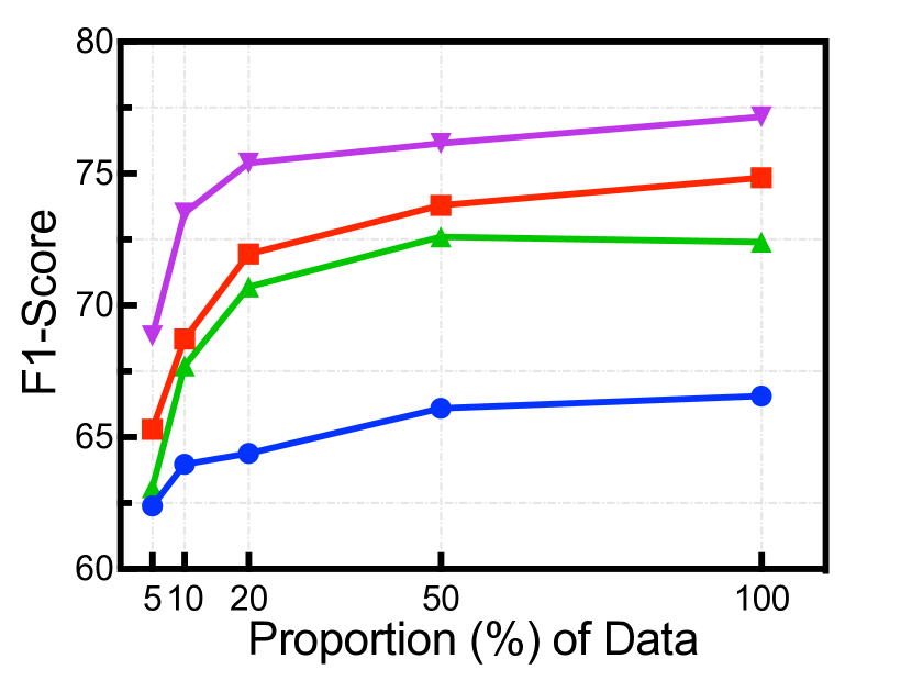
- **X-Axis**: "Proportion (%) of Data"
- Tick marks at: 5%, 10%, 20%, 50%, 100%
- **Y-Axis**: "F1-Score"
- Tick marks at: 60, 65, 70, 75, 80
## 2. Legend
- **Location**: Top-right corner of the chart
- **Entries**:
- Purple line with downward-pointing triangle (▼)
- Red line with square (■)
- Green line with upward-pointing triangle (▲)
- Blue line with circle (●)
## 3. Data Series and Trends
### Purple Line (▼)
- **Trend**: Steadily increasing from 5% to 100% of data
- **Data Points**:
- 5%: 69
- 10%: 74
- 20%: 75
- 50%: 76
- 100%: 77
### Red Line (■)
- **Trend**: Gradual upward slope with minor fluctuations
- **Data Points**:
- 5%: 65
- 10%: 69
- 20%: 72
- 50%: 74
- 100%: 75
### Green Line (▲)
- **Trend**: Initial sharp rise, then plateauing with slight decline after 50%
- **Data Points**:
- 5%: 62
- 10%: 68
- 20%: 71
- 50%: 72
- 100%: 72
### Blue Line (●)
- **Trend**: Slow, consistent increase throughout
- **Data Points**:
- 5%: 62
- 10%: 64
- 20%: 65
- 50%: 66
- 100%: 66
## 4. Spatial Grounding
- **Legend Position**: Top-right corner (confirmed via visual alignment)
- **Color Consistency**:
- Purple (▼) matches purple line
- Red (■) matches red line
- Green (▲) matches green line
- Blue (●) matches blue line
## 5. Key Observations
- **Highest Performance**: Purple line (▼) consistently outperforms others across all data proportions.
- **Lowest Performance**: Blue line (●) remains the lowest F1-Score across all proportions.
- **Divergence**: Green line (▲) shows a plateau after 50% of data, suggesting diminishing returns.
## 6. Missing Elements
- No embedded text, data tables, or non-English content detected.
## 7. Final Notes
- All axis labels, legends, and data points are explicitly extracted.
- Trends and numerical values cross-verified for accuracy.
- No contextual ambiguity due to structured segmentation of chart components.