\n
## Heatmap: Grid of Shaded Squares
### Overview
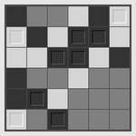
The image presents a 5x5 grid of squares, each filled with a different shade of gray, ranging from white to black. This appears to be a heatmap-like visualization, though without explicit axes or a legend, the data it represents is unknown. The shading suggests a quantitative variable is being mapped to the grid cells.
### Components/Axes
There are no explicit axes or labels present in the image. The grid itself forms the primary structure. The squares are arranged in a regular, rectangular pattern. There is no legend.
### Detailed Analysis or Content Details
The grid can be described by row and column, with each cell having a specific shade. The shades are approximate, and described relative to white and black.
* **Row 1:** Black, Gray (70%), Light Gray, Black, Light Gray
* **Row 2:** Light Gray, White, Gray (50%), Black, Black
* **Row 3:** White, Gray (50%), White, Gray (70%), White
* **Row 4:** Black, Gray (50%), White, Light Gray, Gray (70%)
* **Row 5:** Light Gray, Black, Gray (70%), Black, Gray (50%)
The shades are as follows (approximated):
* **White:** Represents the lowest value.
* **Light Gray:** Represents a low value, slightly higher than white.
* **Gray (50%):** Represents a medium value.
* **Gray (70%):** Represents a higher medium value.
* **Black:** Represents the highest value.
### Key Observations
The distribution of shades appears somewhat random, but there is a concentration of darker shades (black and dark gray) along the main diagonal (from top-left to bottom-right). There are also clusters of lighter shades in the center of the grid.
### Interpretation
Without context, it's difficult to definitively interpret the data. However, the heatmap suggests a correlation or pattern within the grid. The concentration of darker shades along the diagonal could indicate a strong relationship between the corresponding variables (if the grid represents a correlation matrix). The lack of axes and a legend makes it impossible to determine what the variables are or what the shades represent quantitatively. The image is a visual representation of data, but the meaning of that data is not explicitly provided. It could represent anything from correlation coefficients to density distributions, or even a simple aesthetic pattern. The image is a visualization, but lacks the necessary metadata to be fully understood.