# Technical Document Extraction: Line Chart Analysis
## Image Description
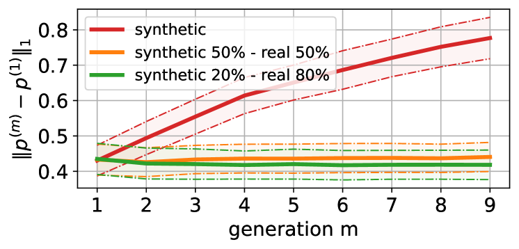
The image is a line chart visualizing the norm of the difference between two probability distributions (`||p^(m) - p^(1)||₁`) across generations (`m`). The chart includes three data series with distinct line styles and colors, along with shaded confidence intervals.
---
### Labels and Axis Titles
- **X-axis**: Labeled "generation m" with integer markers from 1 to 9.
- **Y-axis**: Labeled "||p^(m) - p^(1)||₁" with values ranging from 0.4 to 0.8 in increments of 0.1.
---
### Legend
- **Location**: Top-right corner of the chart.
- **Entries**:
1. **Red (solid line)**: "synthetic"
2. **Orange (dashed line)**: "synthetic 50% - real 50%"
3. **Green (dotted line)**: "synthetic 20% - real 80%"
---
### Key Trends and Data Points
#### 1. Synthetic (Red, Solid Line)
- **Trend**: Steadily increasing from generation 1 to 9.
- **Data Points**:
- Generation 1: ~0.4
- Generation 3: ~0.55
- Generation 5: ~0.65
- Generation 7: ~0.75
- Generation 9: ~0.8
- **Confidence Interval**: Shaded red area widens progressively, indicating increasing uncertainty.
#### 2. Synthetic 50% - Real 50% (Orange, Dashed Line)
- **Trend**: Relatively flat with minor fluctuations.
- **Data Points**:
- Generation 1: ~0.45
- Generation 5: ~0.45
- Generation 9: ~0.45
- **Confidence Interval**: Narrow orange shading, suggesting stable performance.
#### 3. Synthetic 20% - Real 80% (Green, Dotted Line)
- **Trend**: Nearly flat with slight oscillations.
- **Data Points**:
- Generation 1: ~0.42
- Generation 5: ~0.42
- Generation 9: ~0.42
- **Confidence Interval**: Very narrow green shading, indicating high stability.
---
### Spatial Grounding and Validation
- **Legend Colors**:
- Red matches the solid line (synthetic).
- Orange matches the dashed line (synthetic 50% - real 50%).
- Green matches the dotted line (synthetic 20% - real 80%).
- **Axis Markers**:
- X-axis markers (1–9) align with generation labels.
- Y-axis markers (0.4–0.8) correspond to the norm values.
---
### Component Isolation
1. **Main Chart**:
- Three lines with distinct styles/colors.
- Shaded regions represent confidence intervals.
2. **Legend**:
- Positioned independently in the top-right corner.
3. **No Additional Components**: No headers, footers, or secondary axes.
---
### Conclusion
The chart demonstrates that the synthetic distribution diverges significantly from the baseline (`p^(1)`) over generations, while hybrid approaches (50% synthetic, 20% synthetic) maintain stability. Confidence intervals highlight the uncertainty in the synthetic case.