\n
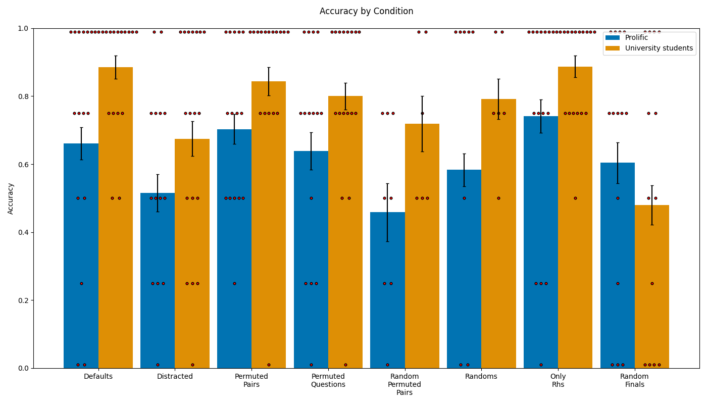
## Bar Chart: Accuracy by Condition
### Overview
This is a grouped bar chart comparing the accuracy scores of two participant groups ("Prolific" and "University students") across eight different experimental conditions. The chart includes error bars for each bar and scattered data points (small brown dots) overlaid on the bars, likely representing individual participant scores or a distribution of results.
### Components/Axes
* **Title:** "Accuracy by Condition" (centered at the top).
* **Y-Axis:** Labeled "Accuracy". Scale ranges from 0.0 to 1.0, with major tick marks at 0.0, 0.2, 0.4, 0.6, 0.8, and 1.0.
* **X-Axis:** Lists eight categorical conditions. Labels are:
1. Defaults
2. Distracted
3. Permuted Pairs
4. Permuted Questions
5. Random Permuted Pairs
6. Randoms
7. Only Rhs
8. Random Finals
* **Legend:** Located in the top-right corner.
* Blue square: "Prolific"
* Orange square: "University students"
* **Data Series:** Two bars per condition, one blue (Prolific) and one orange (University students). Each bar has a black error bar extending vertically from its top.
* **Overlaid Data Points:** Numerous small, brown, circular dots are scattered vertically above and within each bar, indicating the distribution of individual data points for each group in each condition.
### Detailed Analysis
The following table reconstructs the approximate accuracy values (bar heights) and the range of the error bars for each group and condition. Values are estimated from the visual chart.
| Condition | Prolific (Blue) Accuracy | Prolific Error Range | University Students (Orange) Accuracy | University Students Error Range |
| :--- | :--- | :--- | :--- | :--- |
| **Defaults** | ~0.66 | ~0.61 to ~0.71 | ~0.88 | ~0.85 to ~0.92 |
| **Distracted** | ~0.52 | ~0.46 to ~0.57 | ~0.67 | ~0.62 to ~0.73 |
| **Permuted Pairs** | ~0.70 | ~0.66 to ~0.75 | ~0.84 | ~0.80 to ~0.88 |
| **Permuted Questions** | ~0.64 | ~0.59 to ~0.69 | ~0.80 | ~0.76 to ~0.84 |
| **Random Permuted Pairs** | ~0.46 | ~0.38 to ~0.55 | ~0.72 | ~0.64 to ~0.80 |
| **Randoms** | ~0.59 | ~0.54 to ~0.63 | ~0.79 | ~0.74 to ~0.85 |
| **Only Rhs** | ~0.74 | ~0.69 to ~0.79 | ~0.88 | ~0.85 to ~0.92 |
| **Random Finals** | ~0.60 | ~0.55 to ~0.66 | ~0.48 | ~0.42 to ~0.54 |
**Trend Verification:**
* **Prolific (Blue):** The trend is variable. Accuracy is highest in "Only Rhs" (~0.74) and "Permuted Pairs" (~0.70), and lowest in "Random Permuted Pairs" (~0.46). There is no single upward or downward slope across all conditions.
* **University Students (Orange):** Accuracy is consistently high (≥0.79) for six of the eight conditions, peaking at ~0.88 in "Defaults" and "Only Rhs". A significant drop occurs only in the final condition, "Random Finals" (~0.48).
**Spatial Grounding & Component Isolation:**
* **Header:** Contains only the title.
* **Main Chart:** The plot area. The legend is positioned in the top-right, inside the plot area but not overlapping data. The y-axis is on the left, x-axis at the bottom.
* **Footer:** None.
* **Scattered Dots:** These dots are clustered at specific accuracy levels (e.g., near 1.0, 0.75, 0.5, 0.25, 0.0) across all conditions, suggesting discrete possible scores or a bimodal/multimodal distribution of individual results.
### Key Observations
1. **Group Performance Gap:** In 7 out of 8 conditions, the "University students" group has a higher mean accuracy than the "Prolific" group. The gap is most pronounced in "Random Permuted Pairs" (a difference of ~0.26).
2. **Notable Reversal:** The "Random Finals" condition is the sole exception, where "Prolific" participants (~0.60) outperform "University students" (~0.48).
3. **High Variability:** The error bars, particularly for "Random Permuted Pairs" (Prolific) and "Randoms" (University students), indicate substantial variability in performance within those groups for those conditions.
4. **Discrete Data Points:** The overlaid brown dots are not randomly scattered but appear at fixed horizontal lines (e.g., at y=1.0, 0.75, 0.5, 0.25, 0.0). This strongly suggests the underlying accuracy metric is based on a discrete scale (e.g., percentage of correct answers out of a small number of trials, leading to scores like 0%, 25%, 50%, 75%, 100%).
### Interpretation
The data suggests that the "University students" group generally performs better on the tasks presented in these conditions, indicating potentially higher familiarity, skill, or motivation related to the experimental material. Their performance is robust across most conditions, only failing dramatically in the "Random Finals" scenario.
The "Prolific" group shows more variable performance, struggling most with "Random Permuted Pairs" but performing relatively well in structured conditions like "Only Rhs" and "Permuted Pairs." Their superior performance in "Random Finals" is a key anomaly; it implies that under that specific type of randomization or task structure, the Prolific sample may have an advantage or the University student sample encounters a specific difficulty.
The discrete clustering of the overlaid data points is a critical finding. It reveals that the "Accuracy" is not a continuous measure but likely a proportion derived from a limited number of binary trials (e.g., 4 trials leading to scores of 0, 0.25, 0.5, 0.75, 1). This explains the horizontal banding of the dots and means the error bars represent confidence intervals around a proportion, not standard deviation of a continuous variable. The chart effectively shows both the group-level summary (bars) and the granular, discrete nature of the underlying data (dots).