\n
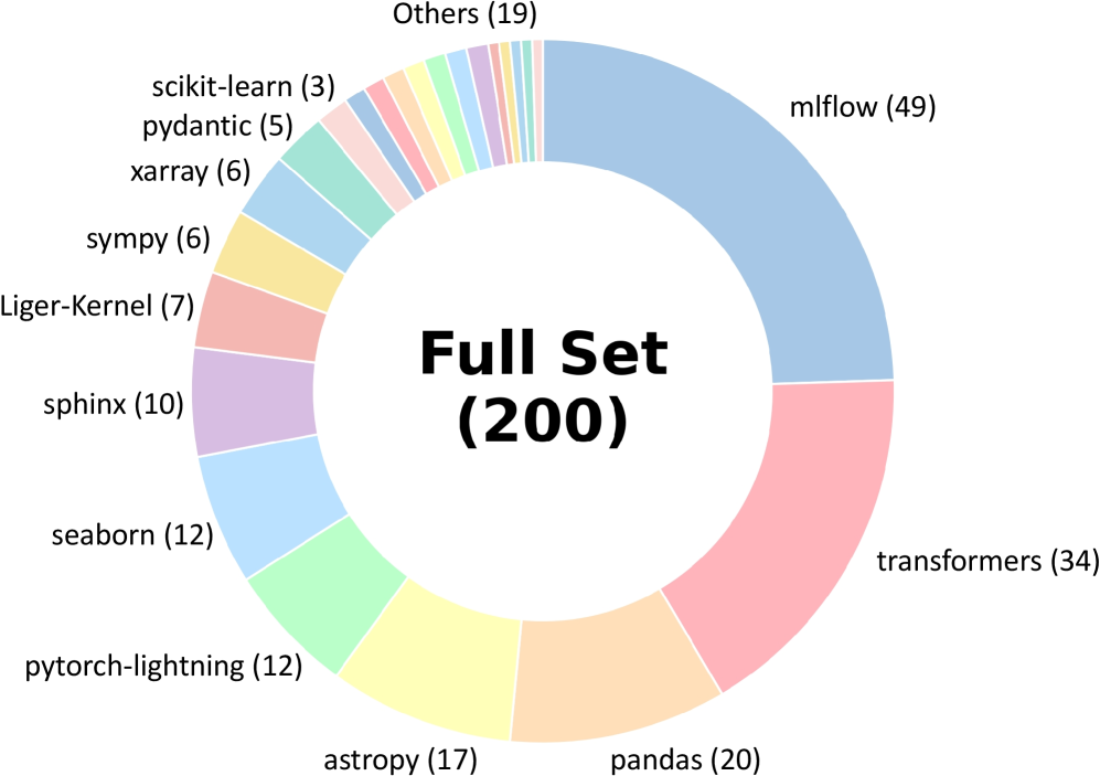
## Donut Chart: Library Distribution in a Full Set of 200 Items
### Overview
The image displays a donut chart (a pie chart with a central hole) titled "Full Set (200)". It visualizes the distribution of 200 items across various software libraries or frameworks, primarily from the Python data science and machine learning ecosystem. Each segment of the donut represents a library, labeled with its name and a count in parentheses. The segments are colored distinctly, and the labels are placed around the outer perimeter of the chart.
### Components/Axes
* **Chart Type:** Donut Chart.
* **Central Title:** "Full Set (200)" - indicating the total sample size is 200.
* **Data Series (Segments):** Each segment is a category representing a library. The label format is `Library Name (Count)`.
* **Legend/Labels:** The legend is integrated directly into the chart, with labels positioned adjacent to their corresponding segments around the donut's circumference. There is no separate legend box.
* **Spatial Layout:** The largest segment (mlflow) starts at the top-right (approximately 12 o'clock position) and proceeds clockwise in descending order of size. The smallest segments are clustered in the top-left quadrant.
### Detailed Analysis
The chart breaks down the 200 items as follows, listed in clockwise order starting from the largest segment:
1. **mlflow (49)** - Light blue segment. This is the largest single category.
2. **transformers (34)** - Pink segment.
3. **pandas (20)** - Light orange segment.
4. **astropy (17)** - Yellow segment.
5. **pytorch-lightning (12)** - Light green segment.
6. **seaborn (12)** - Light blue segment (different shade from mlflow).
7. **sphinx (10)** - Light purple segment.
8. **Liger-Kernel (7)** - Salmon/pink segment.
9. **sympy (6)** - Yellow segment (different shade from astropy).
10. **xarray (6)** - Light blue segment (different shade from others).
11. **pydantic (5)** - Light pink segment.
12. **scikit-learn (3)** - Light blue segment (different shade).
13. **Others (19)** - A multi-colored segment composed of many very thin slices, representing the aggregation of all other libraries not individually listed. This is the third-largest group after mlflow and transformers.
**Approximate Percentage Breakdown (Calculated from counts):**
* mlflow: ~24.5%
* transformers: ~17.0%
* pandas: ~10.0%
* astropy: ~8.5%
* pytorch-lightning & seaborn: ~6.0% each
* sphinx: ~5.0%
* Liger-Kernel: ~3.5%
* sympy & xarray: ~3.0% each
* pydantic: ~2.5%
* scikit-learn: ~1.5%
* Others: ~9.5%
### Key Observations
1. **Dominance of Two Libraries:** `mlflow` and `transformers` together account for over 41% of the entire set, indicating a heavy concentration.
2. **Long Tail Distribution:** After the top 4-5 libraries, the counts drop off significantly, creating a "long tail" of many libraries with small representation (counts of 12 or less).
3. **Significant "Others" Category:** The "Others" group (19 items, ~9.5%) is larger than any single library except the top two, highlighting the vast diversity of tools in this ecosystem beyond the most popular ones.
4. **Color Coding:** Colors are used to differentiate segments but do not appear to follow a specific semantic scheme (e.g., all ML libraries are not one color). Multiple shades of blue and yellow are used for different libraries.
### Interpretation
This chart likely represents the composition of a dataset, benchmark, or code corpus related to Python-based scientific computing and machine learning. The data suggests:
* **Tooling Focus:** The prominence of `mlflow` (an ML lifecycle platform) and `transformers` (a state-of-the-art NLP library) points to a context heavily involved in modern machine learning operations and natural language processing.
* **Ecosystem Breadth:** The presence of libraries from diverse domains—astronomy (`astropy`), data visualization (`seaborn`), documentation (`sphinx`), deep learning (`pytorch-lightning`), and dataframes (`pandas`, `xarray`)—indicates the full set is not narrowly focused but spans a wide range of scientific and engineering tasks.
* **Pareto Principle:** The distribution loosely follows the Pareto principle (80/20 rule), where a small number of libraries (the vital few) constitute a large portion of the usage or representation, while the majority (the useful many) make up the remainder. This is common in technology adoption landscapes.
* **Potential Bias:** If this chart represents, for example, "libraries used in a set of tutorials" or "dependencies in a popular project," it reveals a bias towards specific tools. The low count for a foundational library like `scikit-learn` (3) is notable and might indicate a specific niche (e.g., deep learning-focused) for the source data.