## Data Pipeline Diagram: Data Creation to Deployment
### Overview
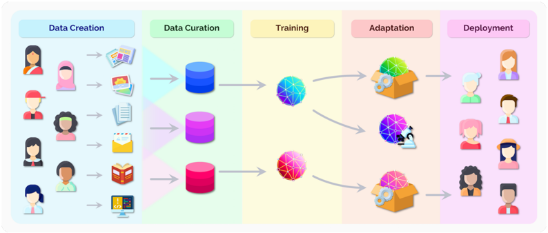
The image is a diagram illustrating a data pipeline, showing the progression of data from its creation through curation, training, adaptation, and finally, deployment. The diagram uses icons to represent different stages and types of data.
### Components/Axes
The diagram is divided into five stages, each labeled with a rectangular box at the top:
1. **Data Creation** (light blue background)
2. **Data Curation** (light green background)
3. **Training** (light yellow background)
4. **Adaptation** (light pink background)
5. **Deployment** (light purple background)
Each stage contains icons representing the data or processes involved. Arrows indicate the flow of data between stages.
### Detailed Analysis or ### Content Details
**1. Data Creation:**
* Icons of people (various ethnicities and genders) are shown on the left.
* Arrows point from each person icon to various data types:
* Newspaper clippings/articles
* Photographs
* Documents
* Email
* Book
* Computer screen displaying code
**2. Data Curation:**
* Three cylindrical databases are shown, each with a different color gradient:
* Top: Blue
* Middle: Purple
* Bottom: Red
**3. Training:**
* Three spherical objects are shown, each with a different color scheme:
* Top: Blue and Green
* Middle: Blue and Purple
* Bottom: Red and Pink
**4. Adaptation:**
* Three icons representing adaptation processes are shown:
* Top: A cardboard box with gears and the green/blue sphere inside.
* Middle: A microscope pointed at the purple/blue sphere.
* Bottom: A cardboard box with gears and the red/pink sphere inside.
**5. Deployment:**
* Icons of people (various ethnicities and genders) are shown on the right.
### Key Observations
* The diagram illustrates a sequential process, with data flowing from left to right.
* The color-coding suggests different categories or types of data being processed.
* The icons used are simple and easily understandable.
### Interpretation
The diagram depicts a typical data pipeline, starting with the creation of data from various sources (people and their activities). This data is then curated (organized and cleaned) before being used to train a model. The adaptation stage suggests fine-tuning or modifying the model based on the training results. Finally, the model is deployed, presumably to be used by or interact with people.
The use of different colors for the databases and training spheres likely represents different categories or types of data being processed separately. The adaptation stage shows different tools being used to adapt the models, suggesting different adaptation strategies depending on the data type.