\n
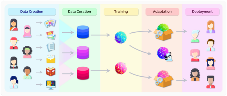
## Diagram: AI Lifecycle - Data Creation to Deployment
### Overview
The image depicts a diagram illustrating the lifecycle of an Artificial Intelligence (AI) system, from initial data creation through to deployment. The process is segmented into five stages: Data Creation, Data Curation, Training, Adaptation, and Deployment. Each stage is visually represented with icons and arrows indicating the flow of information. The diagram emphasizes the human element in both data creation and the final deployment phase.
### Components/Axes
The diagram is divided into five distinct, vertically oriented sections, each with a header indicating the stage of the AI lifecycle. There are no explicit axes in the traditional sense, but the flow is clearly left-to-right. The sections are:
* **Data Creation:** Represented by a light blue background.
* **Data Curation:** Represented by a purple background.
* **Training:** Represented by a yellow background.
* **Adaptation:** Represented by an orange background.
* **Deployment:** Represented by a pink background.
Each section contains icons representing the activities within that stage. Arrows connect the stages, showing the progression of the AI lifecycle.
### Detailed Analysis or Content Details
**1. Data Creation (Light Blue):**
This stage shows a series of diverse human figures (approximately 7 individuals) on the left side. Each figure is associated with a different data source icon, including:
* Documents/Reports
* Financial Reports
* Lists/Checklists
* Emails
* Books
* Graphs/Charts
* Computer/Code
The arrows point from each human figure/data source combination towards the Data Curation stage.
**2. Data Curation (Purple):**
This stage features three cylindrical shapes, colored in shades of purple (dark purple, medium purple, and a lighter purple). These likely represent data storage or databases. Arrows originate from the Data Creation stage and converge on these cylinders.
**3. Training (Yellow):**
This stage contains two spherical, network-like structures. The top sphere is predominantly blue and green, while the bottom sphere is pink and purple. Arrows originate from the Data Curation stage and point towards these spheres, indicating the data is used for training.
**4. Adaptation (Orange):**
This stage shows two open box icons. The top box is multicolored (green, yellow, and blue), while the bottom box is pink and purple. Arrows originate from the Training stage and point towards these boxes, suggesting the AI model is being adapted. There is a bidirectional arrow between the two spheres in the Training stage and the boxes in the Adaptation stage, indicating a feedback loop.
**5. Deployment (Pink):**
This stage features a series of human figures (approximately 6 individuals) on the right side. Arrows originate from the Adaptation stage and point towards these figures, indicating the AI model is being deployed to end-users.
### Key Observations
* The diagram emphasizes the iterative nature of the AI lifecycle, particularly between the Training and Adaptation stages.
* The diversity of data sources in the Data Creation stage suggests a broad range of input data.
* The human representation in both the Data Creation and Deployment stages highlights the importance of human involvement in the AI lifecycle.
* The color scheme is consistent throughout the diagram, with each stage having a distinct color.
### Interpretation
The diagram illustrates a simplified, high-level overview of the AI lifecycle. It demonstrates the flow of data from its creation through curation, training, adaptation, and ultimately, deployment to end-users. The feedback loop between Training and Adaptation suggests a continuous improvement process, where the model is refined based on its performance. The inclusion of diverse human figures in the Data Creation and Deployment stages underscores the importance of considering human factors and ensuring inclusivity in AI development. The diagram doesn't provide specific data points or numerical values, but rather focuses on the conceptual flow and key stages of the AI lifecycle. It serves as a visual aid for understanding the overall process and the relationships between different components. The diagram is a conceptual illustration and does not contain factual data.