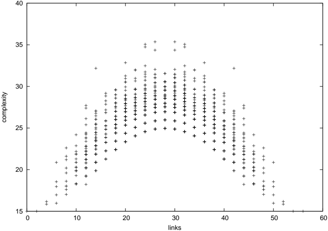
## Scatter Plot: Complexity vs. Links
### Overview
The image is a scatter plot displaying the relationship between two variables: "links" on the horizontal axis and "complexity" on the vertical axis. The data points, represented by black plus signs (`+`), form a distinct, roughly symmetric, inverted U-shaped or bell-shaped distribution. The plot suggests a non-linear relationship where complexity initially increases with the number of links, reaches a peak, and then decreases.
### Components/Axes
* **X-Axis (Horizontal):**
* **Label:** `links`
* **Scale:** Linear scale ranging from 0 to 60.
* **Major Tick Marks:** Labeled at intervals of 10 (0, 10, 20, 30, 40, 50, 60).
* **Minor Tick Marks:** Present between major ticks, indicating intervals of 2 units.
* **Y-Axis (Vertical):**
* **Label:** `complexity`
* **Scale:** Linear scale ranging from 15 to 40.
* **Major Tick Marks:** Labeled at intervals of 5 (15, 20, 25, 30, 35, 40).
* **Minor Tick Marks:** Present between major ticks, indicating intervals of 1 unit.
* **Data Series:**
* **Marker:** Black plus sign (`+`).
* **Legend:** No legend is present, indicating a single data series.
* **Plot Area:** A standard rectangular frame with tick marks on all four sides (bottom, left, top, right). The top and right axes mirror the scales of the bottom and left axes, respectively, but without numerical labels.
### Detailed Analysis
The data points are densely clustered, forming a clear pattern:
1. **Left Slope (Ascending):** Starting from approximately (links=5, complexity=16), the complexity values rise as the number of links increases. The points are tightly grouped along this upward trend.
2. **Peak Region:** The distribution reaches its maximum complexity values in the central region, roughly between **25 and 30 links**. The highest individual data points are located near **links=28-30**, with complexity values approaching **35**. The peak is not a single point but a plateau of high values.
3. **Right Slope (Descending):** Beyond approximately 30 links, the complexity values begin to decrease as the number of links continues to increase. The downward trend mirrors the left slope. The data extends to approximately (links=55, complexity=16).
4. **Data Spread:** At any given x-value (number of links), there is a vertical spread of complexity values. This spread is narrowest at the extremes (very low and very high link counts) and widest in the central peak region (around 20-35 links), where complexity values for a similar number of links can vary by approximately 5-8 units.
### Key Observations
* **Non-Linear Relationship:** The relationship is clearly non-linear and best described by a quadratic or inverted-U function.
* **Symmetry:** The distribution is approximately symmetric around a central axis near **links = 28**.
* **Maximum Complexity:** The highest observed complexity values (~35) occur within a specific, intermediate range of links (approximately 25-32).
* **Minimum Complexity:** The lowest complexity values (~16) are observed at both the low end (~5 links) and the high end (~55 links) of the x-axis range shown.
* **Density:** The highest density of data points is concentrated in the central region of the plot, between 15 and 40 links.
### Interpretation
The scatter plot demonstrates a classic **"inverted-U" or "Goldilocks" relationship** between the number of links and complexity. This pattern suggests that:
1. **Optimal Range:** There exists an intermediate, optimal range of "links" (approximately 25-30) that is associated with the highest levels of "complexity." This could imply that a system or entity requires a certain critical mass of connections to achieve high complexity, but beyond that point, additional links may lead to simplification, overload, or a different organizational principle.
2. **Trade-off or Phase Transition:** The decline in complexity after the peak indicates a potential trade-off. For example, in network theory, adding too many links might create redundancy or force a shift towards a more regular, less complex structure. In a cognitive or organizational context, it could represent a point where managing additional connections becomes counterproductive, leading to streamlined but less complex processes.
3. **Predictive Power:** The tight clustering along the curve suggests a strong, predictable relationship between these two variables within the observed domain. The vertical spread, however, indicates that other factors not plotted here also influence complexity.
4. **Underlying Principle:** This pattern is frequently observed in systems where performance, efficiency, or emergent properties are maximized at an intermediate level of a given parameter (e.g., connectivity, diversity, stress). The data visually argues against a simple "more is better" or "less is better" linear assumption.