## Scatter Plot: Complexity vs. Links
### Overview
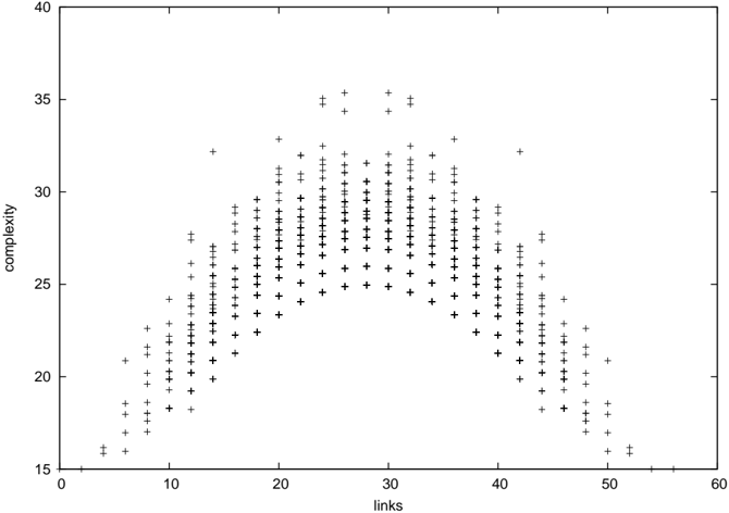
The image is a scatter plot visualizing the relationship between "links" (x-axis) and "complexity" (y-axis). Data points are represented as black plus signs ("+"), with a legend confirming this symbol corresponds to "Data Points." The plot exhibits a bell-shaped distribution, peaking around 30 links with a complexity of approximately 35. The axes range from 0–60 for links and 15–40 for complexity.
### Components/Axes
- **X-axis (Links)**: Labeled "links," scaled from 0 to 60 in increments of 10.
- **Y-axis (Complexity)**: Labeled "complexity," scaled from 15 to 40 in increments of 5.
- **Legend**: Located in the top-right corner, featuring a black plus sign ("+") labeled "Data Points."
- **Data Points**: Black plus signs distributed across the plot, forming a symmetric, unimodal distribution.
### Detailed Analysis
- **Trend**: The data points form a clear bell curve, with complexity increasing as links approach 30, then decreasing symmetrically.
- **Peak**: The highest complexity (~35) occurs at ~30 links.
- **Spread**:
- Links: 10–50 (most points clustered between 15–45).
- Complexity: 18–33 (lowest at ~18 for 5–10 links, highest at ~35 for 30 links).
- **Density**: Points are densest around 20–40 links, with sparser data at the extremes (e.g., <10 or >50 links).
- **Symmetry**: The distribution is roughly symmetric around 30 links, suggesting a normal-like distribution.
### Key Observations
1. **Optimal Link Threshold**: Complexity peaks at ~30 links, implying an optimal number of links for maximum complexity.
2. **Diminishing Returns**: Beyond 30 links, complexity decreases, suggesting redundancy or inefficiency in adding more links.
3. **Symmetry**: The bell shape indicates a balanced relationship between links and complexity, with no significant outliers.
4. **Data Distribution**: Points are evenly distributed around the peak, with no abrupt jumps or gaps.
### Interpretation
The data suggests a **non-linear relationship** between links and complexity, where increasing links initially enhances complexity but eventually reduces it. This could reflect:
- **System Design**: In networks or models, adding links beyond a critical point may introduce redundancy, reducing overall complexity.
- **Efficiency Trade-offs**: The peak at 30 links might represent an optimal balance between connectivity and simplicity.
- **Statistical Pattern**: The symmetry and bell shape align with a normal distribution, though the exact statistical properties (e.g., standard deviation) cannot be confirmed without raw data.
The absence of outliers and the clear peak imply a consistent, predictable relationship, useful for optimizing systems where link complexity is a critical factor.