## Line Charts: Qwen3-8B and Qwen3-32B Layer-wise ΔP Analysis
### Overview
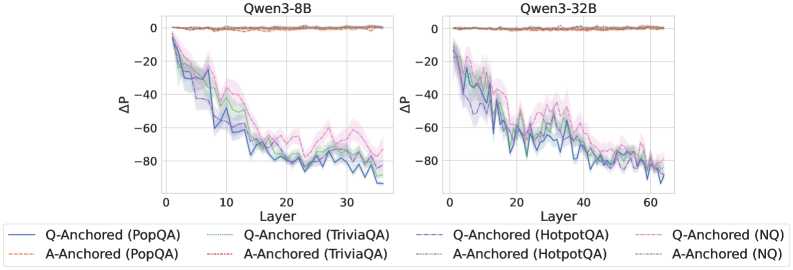
The image displays two side-by-side line charts comparing the layer-wise change in probability (ΔP) for two different-sized language models: Qwen3-8B (left) and Qwen3-32B (right). Each chart plots the ΔP metric across the model's layers for four different question-answering datasets, using two distinct anchoring methods (Q-Anchored and A-Anchored).
### Components/Axes
* **Chart Titles:** "Qwen3-8B" (left chart), "Qwen3-32B" (right chart).
* **X-Axis:** Labeled "Layer". Represents the sequential layers within the neural network model.
* Qwen3-8B chart: Scale from 0 to 30, with major ticks at 0, 10, 20, 30.
* Qwen3-32B chart: Scale from 0 to 60, with major ticks at 0, 20, 40, 60.
* **Y-Axis:** Labeled "ΔP". Represents a change in probability metric. The scale is negative, ranging from 0 at the top to -80 at the bottom, with major ticks at 0, -20, -40, -60, -80.
* **Legend:** Positioned at the bottom, spanning the width of both charts. It defines eight data series using a combination of color and line style:
* **Solid Lines (Q-Anchored):**
* Blue: Q-Anchored (PopQA)
* Green: Q-Anchored (TriviaQA)
* Purple: Q-Anchored (HotpotQA)
* Pink: Q-Anchored (NQ)
* **Dashed Lines (A-Anchored):**
* Orange: A-Anchored (PopQA)
* Red: A-Anchored (TriviaQA)
* Gray: A-Anchored (HotpotQA)
* Light Blue: A-Anchored (NQ)
* **Data Series:** Each chart contains eight lines (four solid, four dashed) with shaded regions around them, likely indicating variance or confidence intervals.
### Detailed Analysis
**Trend Verification & Data Point Extraction (Approximate):**
* **A-Anchored Series (All Dashed Lines):** In both charts, all four A-Anchored lines (orange, red, gray, light blue) remain very close to ΔP = 0 across all layers. They exhibit minimal fluctuation, forming a nearly flat band at the top of the chart. This trend is consistent for both the 8B and 32B models.
* **Q-Anchored Series (All Solid Lines):** All four Q-Anchored lines show a pronounced downward trend as layer number increases.
* **Qwen3-8B Chart (Layers 0-30):**
* The lines start near ΔP = 0 at Layer 0.
* They descend steeply, reaching approximately ΔP = -60 to -70 by Layer 10.
* The descent continues, albeit with more volatility, reaching a range of approximately ΔP = -70 to -85 by Layer 30.
* The pink line (Q-Anchored (NQ)) appears to be the highest (least negative) among the Q-Anchored series in the later layers, while the blue line (Q-Anchored (PopQA)) is often the lowest (most negative).
* **Qwen3-32B Chart (Layers 0-60):**
* The lines start near ΔP = 0 at Layer 0.
* They descend to approximately ΔP = -40 to -50 by Layer 20.
* The downward trend continues, reaching approximately ΔP = -70 to -85 by Layer 60.
* The pattern of the pink line (NQ) being relatively higher and the blue line (PopQA) being relatively lower among the Q-Anchored series is also visible here.
**Spatial Grounding:** The legend is centered at the bottom. The Qwen3-8B chart occupies the left half of the image, and the Qwen3-32B chart occupies the right half. Within each chart, the A-Anchored lines are consistently positioned at the top (near y=0), while the Q-Anchored lines occupy the middle to bottom portion of the plot area, descending from top-left to bottom-right.
### Key Observations
1. **Anchoring Method Dominance:** The most striking pattern is the drastic difference between anchoring methods. A-Anchored processing results in negligible ΔP change across all layers, while Q-Anchored processing causes a large, layer-dependent decrease in ΔP.
2. **Layer-Dependent Effect:** For Q-Anchored methods, the ΔP metric is not static; it degrades progressively as information moves through the network layers.
3. **Model Scale Consistency:** The qualitative trends are remarkably consistent between the 8-billion-parameter and 32-billion-parameter models, suggesting the observed phenomenon is a property of the architecture or method, not model size.
4. **Dataset Variation:** While all Q-Anchored lines follow the same downward trend, there is consistent separation between datasets. The NQ dataset (pink) generally shows the smallest decrease, while PopQA (blue) often shows the largest decrease.
### Interpretation
This visualization provides strong evidence that the choice of "anchoring" (likely referring to which part of the input—Question or Answer—is used as a reference point for some internal measurement) fundamentally alters how information is processed across the layers of these language models.
* **A-Anchored Stability:** The flat lines for A-Anchored methods suggest that when the model's internal state is measured relative to the *Answer*, the metric ΔP remains stable. This could imply the answer representation is preserved or consistently referenced throughout the network.
* **Q-Anchored Drift:** The steep decline for Q-Anchored methods indicates that when measured relative to the *Question*, the metric ΔP deteriorates. This suggests the model's internal representation progressively diverges from the initial question context as it processes information through deeper layers. The layer-wise progression implies this is a cumulative transformation.
* **Practical Implication:** The findings highlight that model behavior and internal metrics are highly sensitive to the experimental setup (anchoring choice). Researchers must be precise in defining their measurement baselines. The consistency across model scales suggests this is a robust characteristic worth investigating for understanding how transformers process and transform query information.
* **Dataset Sensitivity:** The consistent ordering of datasets (NQ > TriviaQA/HotpotQA > PopQA in terms of ΔP retention) might reflect differences in dataset complexity, question type, or how "answer-anchored" the model's training on those datasets was. PopQA, showing the largest drop, might contain questions that require the most significant transformation from the initial query to arrive at the answer.