\n
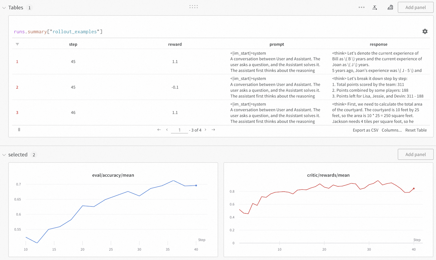
## Screenshot: Rollout Examples & Evaluation Metrics
### Overview
This screenshot displays a user interface, likely from a machine learning experiment tracking tool. The top section shows a table of "rollout examples" with columns for "step", "reward", "prompt", and "response". The bottom section presents two line graphs: one showing "eval/accuracy/mean" versus "step", and the other showing "critic/rewards/mean" versus "step".
### Components/Axes
* **Top Section (Table):**
* Columns: "step", "reward", "prompt", "response"
* Table Header: "runs.summary["rollout_examples"]"
* Pagination: "< 1 - 3 of 4 >"
* Button: "Export as CSV"
* Button: "Columns..."
* Button: "Reset Table"
* **Bottom Section (Graphs):**
* **Left Graph:**
* X-axis: "Step" (ranging from approximately 5 to 45)
* Y-axis: "eval/accuracy/mean" (ranging from approximately 0.50 to 0.70)
* Line 1 (Blue): Represents a data series with fluctuating accuracy.
* Line 2 (Orange): Represents a data series with fluctuating accuracy.
* **Right Graph:**
* X-axis: "Step" (ranging from approximately 5 to 45)
* Y-axis: "critic/rewards/mean" (ranging from approximately 0.0 to 0.8)
* Line 1 (Blue): Represents a data series with fluctuating rewards.
### Detailed Analysis or Content Details
**Table Data (Rollout Examples):**
| Step | Reward | Prompt |
|---|---|---|