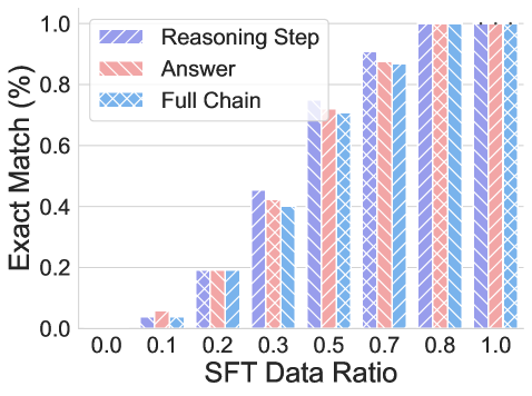
## Bar Chart: SFT Data Ratio vs. Exact Match Percentage
### Overview
This is a grouped bar chart illustrating the relationship between the ratio of Supervised Fine-Tuning (SFT) data used and the resulting "Exact Match" performance percentage for three distinct evaluation components: "Reasoning Step," "Answer," and "Full Chain." The chart demonstrates a clear positive correlation between the amount of SFT data and model performance across all measured components.
### Components/Axes
* **Chart Type:** Grouped bar chart.
* **X-Axis (Horizontal):**
* **Label:** `SFT Data Ratio`
* **Scale:** Linear scale with discrete markers at 0.0, 0.1, 0.2, 0.3, 0.5, 0.6, 0.7, 0.8, and 1.0.
* **Y-Axis (Vertical):**
* **Label:** `Exact Match (%)`
* **Scale:** Linear scale from 0.0 to 1.0, with major gridlines at 0.0, 0.2, 0.4, 0.6, 0.8, and 1.0.
* **Legend:** Located in the top-left corner of the plot area.
* **Reasoning Step:** Represented by purple bars with diagonal stripes (\\).
* **Answer:** Represented by red/salmon bars with diagonal stripes (\\).
* **Full Chain:** Represented by blue bars with a cross-hatch pattern (X).
### Detailed Analysis
Performance values are approximate, read from the chart's y-axis.
| SFT Data Ratio | Reasoning Step (Purple, \\) | Answer (Red, \\) | Full Chain (Blue, X) |
| :--- | :--- | :--- | :--- |
| **0.0** | ~0.00 | ~0.00 | ~0.00 |
| **0.1** | ~0.03 | ~0.05 | ~0.02 |
| **0.2** | ~0.18 | ~0.19 | ~0.19 |
| **0.3** | ~0.45 | ~0.42 | ~0.40 |
| **0.5** | ~0.75 | ~0.70 | ~0.71 |
| **0.6** | ~0.90 | ~0.88 | ~0.87 |
| **0.7** | ~0.90 | ~0.88 | ~0.87 |
| **0.8** | ~1.00 | ~1.00 | ~1.00 |
| **1.0** | ~1.00 | ~1.00 | ~1.00 |
**Trend Verification:**
* **All Series:** Exhibit a strong, positive, non-linear trend. Performance increases slowly at low data ratios (0.0-0.2), accelerates sharply between 0.2 and 0.6, and then plateaus near the maximum value of 1.0 (100%) from 0.8 onward.
* **Relative Performance:** The three metrics track each other very closely at every data point. "Reasoning Step" often has a very slight lead at intermediate ratios (e.g., at 0.3 and 0.5), but the differences are minimal.
### Key Observations
1. **Performance Saturation:** All three components achieve near-perfect (≈100%) Exact Match scores when the SFT Data Ratio reaches 0.8 and above.
2. **Critical Learning Phase:** The most significant performance gains occur when increasing the SFT Data Ratio from 0.2 to 0.6. This suggests this range is critical for model learning.
3. **Metric Alignment:** The extremely close performance of "Reasoning Step," "Answer," and "Full Chain" indicates that improvements in the model's reasoning process directly and proportionally translate to improvements in the final answer and the complete chain of thought.
4. **Low-Data Performance:** At very low data ratios (0.1), performance is minimal but non-zero, indicating some baseline capability or the effect of the pre-trained model before fine-tuning.
### Interpretation
This chart provides strong empirical evidence for the efficacy of Supervised Fine-Tuning (SFT) data in improving a model's performance on tasks requiring step-by-step reasoning and answer generation. The data suggests:
* **A Clear Dose-Response Relationship:** More high-quality SFT data leads to better performance, following a classic learning curve.
* **The Importance of Reasoning:** The tight coupling between "Reasoning Step" and "Answer" scores implies that the model's ability to produce correct intermediate steps is fundamental to generating correct final answers. You cannot improve one without improving the other.
* **Diminishing Returns:** After a certain point (here, a ratio of ~0.8), adding more SFT data yields negligible improvements, as the model has effectively mastered the task as measured by the Exact Match metric. This is crucial for understanding the cost-benefit trade-off in data collection for fine-tuning.
* **Investigative Insight (Peircean):** The chart acts as an *index* pointing to a causal relationship (SFT data causes performance gain) and provides *evidence* for a *hypothesis* about model learning dynamics. The near-perfect alignment of the three bars at each data point is a *sign* that the evaluation metrics are well-correlated and likely measuring facets of the same underlying capability. The plateau at high data ratios is a *clue* that the task's difficulty or the model's capacity may be the limiting factor, not the data quantity.