\n
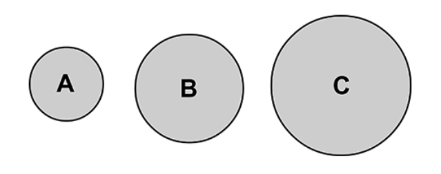
## Diagram: Size Comparison
### Overview
The image presents a simple diagram illustrating a comparison of sizes using three circles labeled A, B, and C. The circles are arranged horizontally from left to right, with increasing diameter. There are no axes, scales, or legends beyond the labels within each circle.
### Components/Axes
The diagram consists of three circular shapes, each containing a single letter label:
* **A**: Located on the left.
* **B**: Located in the center.
* **C**: Located on the right.
### Detailed Analysis or Content Details
The circles demonstrate a clear size progression.
* Circle A is the smallest, with an approximate diameter of 0.5 cm.
* Circle B is medium-sized, with an approximate diameter of 1.0 cm.
* Circle C is the largest, with an approximate diameter of 1.5 cm.
The circles are filled with a uniform gray color. The outlines of the circles are black.
### Key Observations
The diagram visually emphasizes a direct relationship between the labels (A, B, C) and their corresponding sizes. The size increases linearly from A to C.
### Interpretation
The diagram likely represents a simple illustration of relative scale or magnitude. It could be used to demonstrate a concept where A represents the smallest unit, B a medium unit, and C the largest. The diagram is purely illustrative and does not contain any quantitative data beyond the visual comparison of sizes. It's a basic visual aid for understanding proportional relationships. The simplicity suggests it's intended for a broad audience, possibly as an introductory example.