## Scatter Plot with Error Bars and Trend Line: Mean Pass Rate vs. Mean Number of Tokens Generated
### Overview
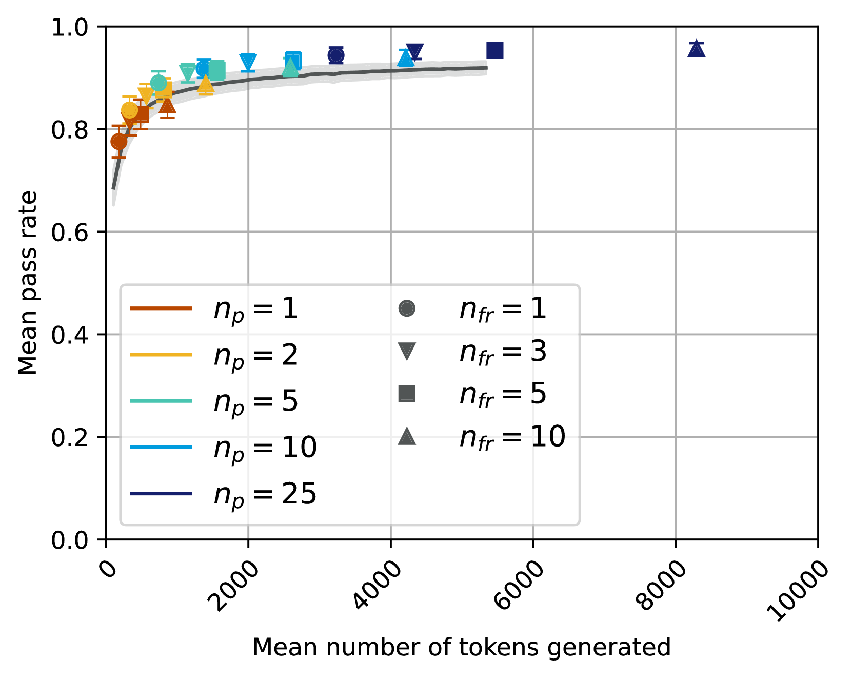
This image is a scatter plot chart displaying the relationship between the "Mean number of tokens generated" (x-axis) and the "Mean pass rate" (y-axis). The chart includes multiple data series differentiated by two parameters: `n_p` (represented by colored lines) and `n_fr` (represented by different marker shapes). A gray trend line with a shaded confidence interval is overlaid on the data points.
### Components/Axes
* **X-Axis:**
* **Title:** "Mean number of tokens generated"
* **Scale:** Linear scale from 0 to 10,000.
* **Major Tick Marks:** 0, 2000, 4000, 6000, 8000, 10000.
* **Y-Axis:**
* **Title:** "Mean pass rate"
* **Scale:** Linear scale from 0.0 to 1.0.
* **Major Tick Marks:** 0.0, 0.2, 0.4, 0.6, 0.8, 1.0.
* **Legend (Position: Bottom-Left Quadrant):**
* **Left Column (Parameter `n_p` - Colored Lines):**
* Brown line: `n_p = 1`
* Gold/Yellow line: `n_p = 2`
* Teal line: `n_p = 5`
* Light Blue line: `n_p = 10`
* Dark Blue line: `n_p = 25`
* **Right Column (Parameter `n_fr` - Marker Shapes):**
* Circle marker: `n_fr = 1`
* Downward-pointing triangle marker: `n_fr = 3`
* Square marker: `n_fr = 5`
* Upward-pointing triangle marker: `n_fr = 10`
* **Data Series:** Each data point on the plot is a combination of a color (from the `n_p` legend) and a marker shape (from the `n_fr` legend). For example, a brown circle represents `n_p=1, n_fr=1`.
* **Trend Line:** A solid gray line with a light gray shaded area around it, representing a fitted curve and its confidence interval.
### Detailed Analysis
* **Overall Trend:** The data shows a strong, positive, logarithmic-like relationship. The mean pass rate increases rapidly as the mean number of tokens generated increases from 0 to approximately 2000, after which the rate of increase slows significantly, approaching a plateau near a pass rate of 1.0.
* **Data Series by `n_p` (Color):**
* **`n_p = 1` (Brown):** Data points are clustered at the lowest token counts (approx. 0-500 tokens) and have the lowest pass rates (approx. 0.75-0.85).
* **`n_p = 2` (Gold):** Points are located at slightly higher token counts (approx. 500-1500) with pass rates approx. 0.85-0.90.
* **`n_p = 5` (Teal):** Points span a mid-range of token counts (approx. 1000-3000) with pass rates approx. 0.90-0.93.
* **`n_p = 10` (Light Blue):** Points are found at higher token counts (approx. 2000-4500) with pass rates approx. 0.93-0.95.
* **`n_p = 25` (Dark Blue):** Points are at the highest token counts (approx. 3000-5500) with pass rates approx. 0.94-0.96.
* **Data Series by `n_fr` (Marker Shape):** The marker shapes are distributed across the different `n_p` color series. For instance, the upward-pointing triangle (`n_fr=10`) appears in brown (`n_p=1`), gold (`n_p=2`), and dark blue (`n_p=25`) series.
* **Trend Line:** The gray fitted curve starts near (0, 0.7) and rises steeply, passing through the main cluster of data points. It begins to flatten around x=2000, y=0.9, and continues to rise very gradually towards the right edge of the plotted data (approx. x=5500, y=0.95). The shaded confidence interval is narrow, suggesting a good fit.
* **Notable Outlier:** There is a single, isolated data point in the top-right corner of the plot. It is a dark blue upward-pointing triangle (`n_p=25, n_fr=10`) located at approximately x=8200, y=0.96. This point has a much higher mean token count than the rest of the data but maintains a high pass rate consistent with the plateau trend.
### Key Observations
1. **Diminishing Returns:** The most significant gains in pass rate occur with the initial increase in generated tokens. Beyond ~2000 tokens, additional tokens yield progressively smaller improvements in pass rate.
2. **Parameter Correlation:** Higher values of `n_p` (darker blue colors) are associated with both higher mean token counts and higher mean pass rates. The relationship between `n_fr` (marker shape) and the other variables is less visually clear from this plot alone.
3. **Plateau Behavior:** The data suggests a performance ceiling or saturation point for the "pass rate" metric, approaching but not quite reaching 1.0 within the observed token range.
4. **High-Token Outlier:** The single point at ~8200 tokens demonstrates that very high token generation can still achieve a top-tier pass rate, though it is an exception to the main data cluster.
### Interpretation
This chart likely illustrates the performance (pass rate) of a generative model or algorithm as a function of its output length (tokens generated). The key insight is that **longer outputs are strongly correlated with higher success rates, but only up to a point.** The steep initial curve implies that very short outputs are often insufficient to complete the task successfully. The plateau indicates that beyond a certain length (~2000-4000 tokens), simply generating more text does not significantly increase the likelihood of success; other factors (captured by parameters `n_p` and `n_fr`, which might represent prompts, attempts, or refinement steps) become more critical for achieving the final few percentage points of pass rate.
The parameter `n_p` appears to be a primary driver of both output length and success. The outlier suggests that under specific configurations (high `n_p` and high `n_fr`), it's possible to generate very long outputs while maintaining high quality, but this is not the typical behavior. For system design, this data argues for targeting an optimal output length range to balance resource usage (tokens) against performance (pass rate), rather than indefinitely increasing generation length.