\n
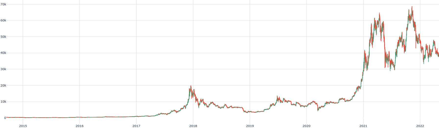
## Line Chart: Time Series Data
### Overview
The image presents a line chart displaying time series data from 2015 to 2022. The y-axis represents a numerical value, scaled up to approximately 70,000, while the x-axis represents time, with years marked from 2015 to 2022. Two lines are plotted, visually representing two different data series.
### Components/Axes
* **X-axis:** Time (Years: 2015, 2016, 2017, 2018, 2019, 2020, 2021, 2022)
* **Y-axis:** Numerical Value (Scale: 0 to approximately 70,000). The scale is linear with gridlines.
* **Line 1:** Green color.
* **Line 2:** Red color.
* **Legend:** No explicit legend is present, but the lines are distinguishable by color.
### Detailed Analysis
The chart shows two time series with similar trends, but differing magnitudes and timing.
**Line 1 (Green):**
* From 2015 to 2017, the line remains relatively flat, fluctuating around a value of approximately 2,000.
* From 2017 to 2018, the line exhibits a steep upward trend, reaching a peak of approximately 12,000.
* From 2018 to 2020, the line declines, fluctuating between approximately 8,000 and 10,000.
* From 2020 to 2021, the line experiences a significant and rapid increase, reaching a peak of approximately 62,000.
* From 2021 to 2022, the line fluctuates significantly, with values ranging from approximately 35,000 to 68,000.
**Line 2 (Red):**
* From 2015 to 2017, the line remains relatively flat, fluctuating around a value of approximately 1,000.
* From 2017 to 2018, the line exhibits a steep upward trend, reaching a peak of approximately 15,000.
* From 2018 to 2020, the line declines, fluctuating between approximately 7,000 and 10,000.
* From 2020 to 2021, the line experiences a significant and rapid increase, reaching a peak of approximately 68,000.
* From 2021 to 2022, the line fluctuates significantly, with values ranging from approximately 38,000 to 65,000.
### Key Observations
* Both lines exhibit a similar pattern of growth, decline, and resurgence.
* Line 2 consistently shows slightly higher values than Line 1, particularly after 2020.
* The period from 2021 to 2022 is characterized by high volatility for both lines.
* The most significant growth occurs between 2020 and 2021 for both series.
### Interpretation
The chart likely represents the growth of two related metrics over time. The similar trends suggest a strong correlation between the two series, potentially indicating that they are influenced by the same underlying factors. The sharp increase in 2020-2021 could be attributed to a specific event or catalyst. The volatility in 2021-2022 might indicate market instability or external factors impacting both metrics. Without knowing what the lines represent, it's difficult to provide a more specific interpretation. However, the data suggests a period of rapid growth followed by increased uncertainty. The consistent difference between the two lines could represent a constant offset or a systematic difference in the underlying processes driving each metric.