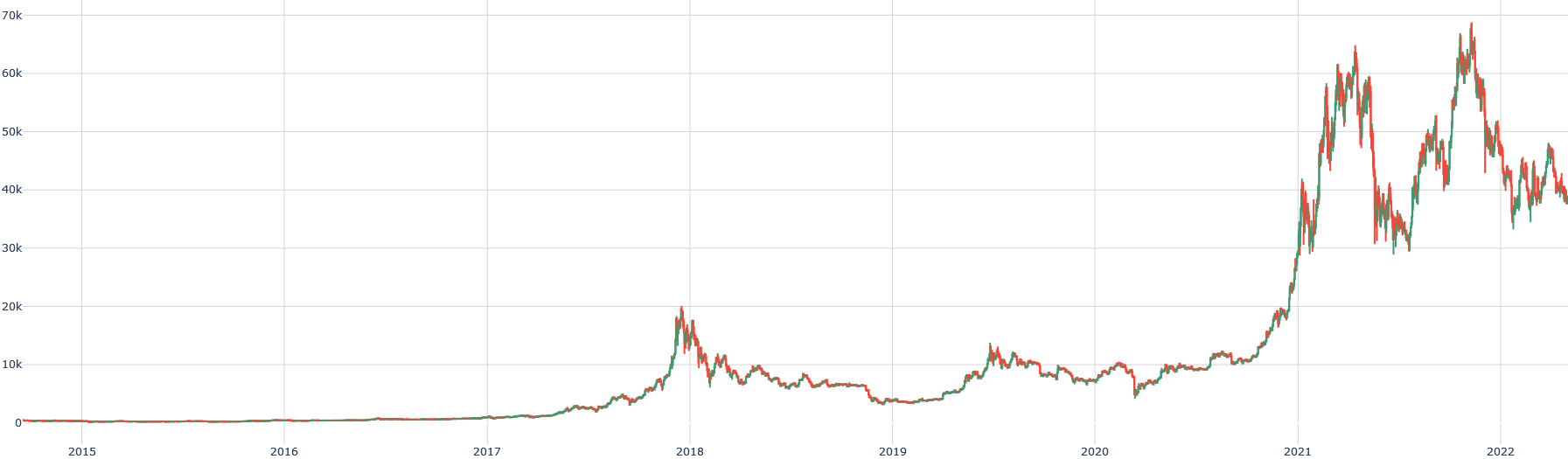
## Line Chart: Historical Price/Value Trend (2015-2022)
### Overview
The image displays a line chart tracking a numerical value over time, spanning from early 2015 to early 2022. The chart features two overlaid lines (green and red) that follow a very similar path, suggesting they represent closely related data series (e.g., opening/closing prices, two correlated assets). The data shows a period of low, stable values followed by extreme volatility and significant growth, particularly from 2020 onward.
### Components/Axes
* **Chart Type:** Dual-line chart.
* **X-Axis (Horizontal):** Represents time. Major tick marks and labels are present for the start of each year: `2015`, `2016`, `2017`, `2018`, `2019`, `2020`, `2021`, `2022`. The axis spans approximately 7 years.
* **Y-Axis (Vertical):** Represents a numerical value. Major tick marks and labels are present at intervals of 10,000: `0`, `10k`, `20k`, `30k`, `40k`, `50k`, `60k`, `70k`. The "k" denotes thousands.
* **Legend:** **Not present in the visible image.** The identity of the green and red lines is not specified.
* **Title/Axis Titles:** **Not present in the visible image.** The subject of the data (e.g., "Bitcoin Price," "Stock Index") is not stated.
* **Grid:** A light gray grid is present, with vertical lines at each year marker and horizontal lines at each 10k interval.
### Detailed Analysis
**Trend Verification & Spatial Grounding:**
The two lines are tightly correlated, moving in near unison. The green line is generally positioned slightly above the red line for most of the chart's duration, with the gap between them appearing relatively consistent.
1. **2015 - Mid-2017 (Bottom-Left to Center):**
* **Trend:** Both lines are flat and hover very close to the `0` baseline.
* **Data Points:** Values remain below approximately `1,000` for this entire period.
2. **Late 2017 - Early 2018 (First Major Peak):**
* **Trend:** A sharp, parabolic upward slope begins in late 2017.
* **Data Points:** The first major peak occurs around the start of `2018`. The green line reaches approximately `19,000`, and the red line peaks slightly lower, around `18,000`.
3. **2018 - 2019 (Decline and Consolidation):**
* **Trend:** A steep decline follows the 2018 peak, followed by a period of choppy, sideways movement with a slight downward bias.
* **Data Points:** By mid-2018, values fall to the `6,000 - 8,000` range. A local low is seen in late 2018/early 2019 near `3,500`. Throughout 2019, values fluctuate mostly between `3,500` and `13,000`.
4. **2020 (Base Building and Initial Rise):**
* **Trend:** The year starts with values around `7,000 - 8,000`. A notable dip occurs (likely corresponding to March 2020), followed by a steady upward trend that accelerates in the second half of the year.
* **Data Points:** The dip reaches approximately `5,000`. By the end of 2020, values have climbed to around `29,000`.
5. **2021 (Major Bull Run and Volatility):**
* **Trend:** An extremely steep, near-vertical ascent begins.
* **Data Points:**
* **First Peak (Q1 2021):** The green line surges to approximately `64,000`, with the red line peaking near `63,000`.
* **Mid-Year Correction:** A sharp decline follows, bottoming around `30,000` in the middle of the year.
* **Second Peak (Q4 2021):** A second major rally pushes the green line to its all-time high on the chart, approximately `69,000`. The red line peaks slightly lower, around `68,000`.
6. **2022 (Decline from Highs):**
* **Trend:** A downtrend begins from the late 2021 peak.
* **Data Points:** By the right edge of the chart (early 2022), values have fallen to the `38,000 - 42,000` range.
### Key Observations
* **Extreme Volatility:** The asset(s) depicted are characterized by massive price swings, with increases of over 1000% and subsequent crashes of 50% or more.
* **Two Distinct Bull Cycles:** The chart shows two major parabolic advance cycles: one culminating in late 2017/early 2018, and a much larger one spanning 2020-2021.
* **Tight Correlation:** The green and red lines maintain an exceptionally high correlation throughout the entire period, suggesting they are measuring the same underlying asset with minor variations (like bid/ask prices) or two assets that are fundamentally linked.
* **Lack of Context:** The absence of a title, axis labels, and legend makes definitive identification impossible from the image alone. However, the price levels and timeline are highly consistent with the historical price chart of Bitcoin (BTC/USD).
### Interpretation
This chart visually narrates the market history of a highly speculative and volatile asset over a seven-year period. The data suggests an asset that transitioned from obscurity (near-zero value) to mainstream financial relevance, experiencing classic boom-and-bust cycles.
The **first cycle (2017-2018)** represents an initial wave of speculative mania, followed by a prolonged "crypto winter" of depressed prices and consolidation. The **second, larger cycle (2020-2021)** indicates a more mature but still frenetic market phase, potentially driven by institutional adoption, macroeconomic factors (like monetary policy), and broader retail participation. The pattern of sharp peaks followed by deep corrections (over 50% drawdowns) is a hallmark of this asset class.
The tight coupling of the two lines implies that whatever they represent (e.g., spot price vs. futures price, exchange A vs. exchange B) moves in near-perfect lockstep, indicating high market efficiency and arbitrage between the measured values. The overall trajectory, despite the volatility, shows a powerful long-term uptrend from the 2015 baseline.