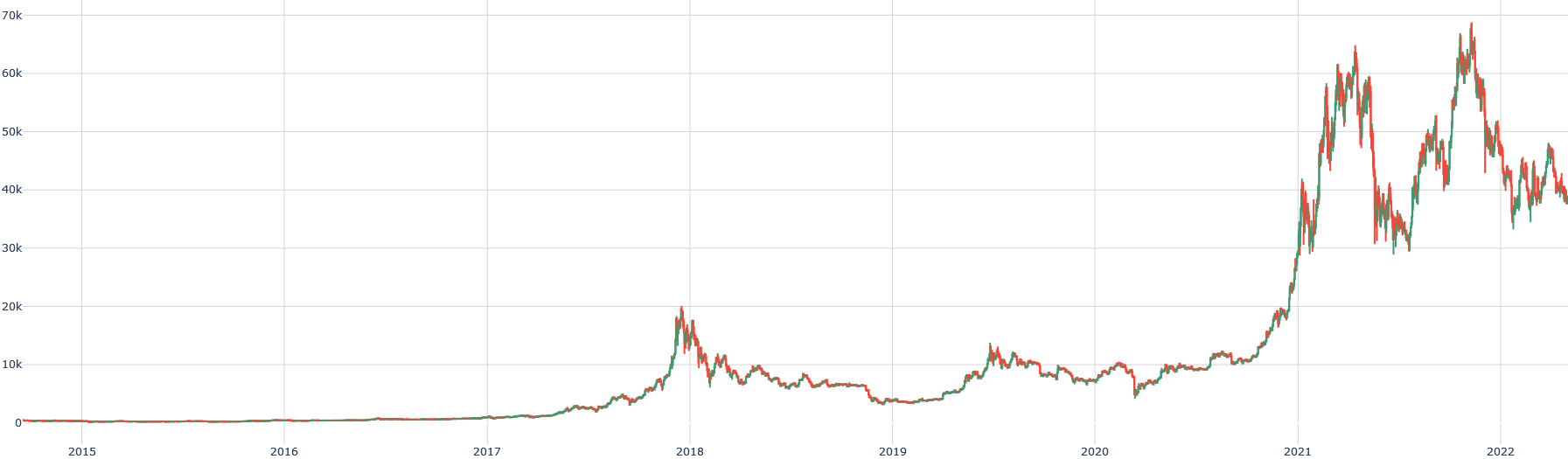
## Line Chart: Dual Time Series Analysis (2015–2022)
### Overview
The image depicts a line chart with two overlapping data series (red and green lines) plotted against a grid background. The chart spans 8 years (2015–2022) on the x-axis and a value range of 0–70,000 on the y-axis. Both lines exhibit distinct trends, with significant divergence in 2021–2022.
### Components/Axes
- **X-Axis**: Labeled "Year" with annual ticks (2015–2022). No gridlines extend beyond the axis.
- **Y-Axis**: Labeled "Value" with increments of 10,000 (0, 10k, 20k, ..., 70k). Gridlines span the full chart.
- **Legend**: Located in the bottom-right corner. Red line = "Line A"; Green line = "Line B".
- **Grid**: Light gray horizontal and vertical lines at 10k intervals.
### Detailed Analysis
- **Line A (Red)**:
- **2015–2017**: Remains near 0 (≈0–500).
- **2018**: Sharp rise to ~15,000, followed by volatility (10k–18k).
- **2019–2020**: Stabilizes between 5k–10k, with minor fluctuations.
- **2021**: Rapid ascent to ~60k, peaking at ~70k in 2022.
- **Line B (Green)**:
- **2015–2017**: Mirrors Line A’s flatline (≈0–500).
- **2018**: Peaks at ~18,000, then declines to ~8k by 2019.
- **2020**: Dips to ~4k, then rises sharply to ~65k in 2022.
- **2021–2022**: Shows sharper volatility than Line A, with a peak of ~65k in 2022.
### Key Observations
1. **2015–2017**: Both lines are nearly flat, suggesting minimal activity or baseline values.
2. **2018–2019**: Both lines experience volatility, with Line B peaking higher than Line A.
3. **2020**: Line B dips below Line A, indicating a temporary divergence.
4. **2021–2022**: Both lines surge, but Line B grows faster, reaching 65k vs. Line A’s 70k. The gap narrows in 2022.
### Interpretation
The chart likely represents economic, financial, or operational metrics (e.g., revenue, stock prices, or production output). The 2021–2022 surge aligns with post-pandemic recovery trends, suggesting external shocks (e.g., COVID-19, policy changes) drove the divergence. Line B’s sharper rise in 2022 may indicate sector-specific growth or delayed effects of interventions. The 2020 dip in Line B could reflect sector-specific vulnerabilities (e.g., travel, retail). The data underscores the importance of contextual factors in interpreting time-series trends.