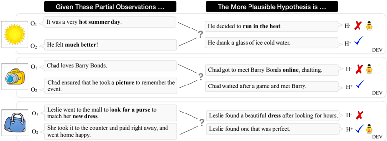
## Diagram: Hypothesis Plausibility Based on Partial Observations
### Overview
The image is a structured diagram illustrating three separate scenarios of abductive reasoning. Each scenario presents two partial observations (labeled O₁ and O₂) and two competing hypotheses (labeled H⁻ and H⁺). The diagram visually indicates which hypothesis is more plausible given the observations, using a red "X" with a person icon for the less plausible hypothesis (H⁻) and a blue checkmark for the more plausible one (H⁺). The label "DEV" appears at the end of each row.
### Components/Axes
The diagram is organized into three horizontal rows, each representing a distinct scenario. Each row contains the following components, arranged from left to right:
1. **Icon:** A simple, colored icon representing the scenario's theme (Sun, Camera, Purse).
2. **Observations Column:** A box titled "Given These Partial Observations ..." containing two text entries labeled O₁ and O₂.
3. **Hypotheses Column:** A box titled "The More Plausible Hypothesis is ..." containing two text entries labeled H⁻ and H⁺.
4. **Plausibility Indicators:** Icons placed to the right of each hypothesis:
* A red "X" next to a small person icon (indicating less plausible, H⁻).
* A blue checkmark (indicating more plausible, H⁺).
5. **Label:** The text "DEV" is positioned at the far right end of each row.
### Detailed Analysis
**Row 1 (Sun Icon):**
* **Observations:**
* O₁: "It was a very **hot** summer day."
* O₂: "He felt **much better!**"
* **Hypotheses:**
* H⁻: "He decided to **run** in the heat." (Marked with red X)
* H⁺: "He drank a glass of ice cold water." (Marked with blue checkmark)
* **Spatial Grounding:** The sun icon is top-left. The observation box is to its right. The hypothesis box is further right. The plausibility indicators are at the far right of the row.
**Row 2 (Camera Icon):**
* **Observations:**
* O₁: "Chad loves Barry Bonds."
* O₂: "Chad ensured that he took a **picture** to remember the event."
* **Hypotheses:**
* H⁻: "Chad got to meet Barry Bonds **online**, chatting." (Marked with red X)
* H⁺: "Chad waited after a game and met Barry." (Marked with blue checkmark)
* **Spatial Grounding:** The camera icon is center-left. The layout mirrors the first row.
**Row 3 (Purse Icon):**
* **Observations:**
* O₁: "Leslie went to the mall to **look for a purse** to match her **new dress**."
* O₂: "She took it to the counter and paid right away, and went home happy."
* **Hypotheses:**
* H⁻: "Leslie found a beautiful **dress** after looking for hours." (Marked with red X)
* H⁺: "Leslie found one that was perfect." (Marked with blue checkmark)
* **Spatial Grounding:** The purse icon is bottom-left. The layout is consistent with the rows above.
### Key Observations
1. **Consistent Structure:** All three rows follow an identical visual and logical template.
2. **Bold Text for Emphasis:** Key words within the observations and hypotheses are bolded (e.g., **hot**, **much better!**, **run**, **picture**, **online**, **look for a purse**, **new dress**, **dress**). This highlights the critical elements that connect or disconnect the observations from the hypotheses.
3. **Plausibility Logic:** In each case, the H⁺ hypothesis provides a direct, coherent, and common-sense link between O₁ and O₂. The H⁻ hypothesis introduces an element that is either contradictory (running in heat vs. feeling better), less likely given the context (meeting a celebrity online vs. in person after stating a desire for a picture), or misaligned with the stated goal (finding a dress when the goal was a purse).
4. **"DEV" Label:** The recurring "DEV" label at the end of each row is unexplained within the image. It may stand for "Developer," "Development," or be an identifier for the dataset or exercise.
### Interpretation
This diagram is a pedagogical or analytical tool demonstrating **abductive reasoning**—the process of inferring the most likely explanation for a set of observations. It teaches or tests the ability to select the hypothesis that best coheres with and explains the given facts.
* **What the data suggests:** The diagram asserts that for each pair of observations, one explanatory hypothesis is significantly more plausible than a competing alternative. The plausibility is determined by narrative coherence, real-world likelihood, and direct causal linkage.
* **How elements relate:** The observations (O₁, O₂) are the evidence. The hypotheses (H⁻, H⁺) are potential explanations. The diagram's core function is to map the evidence to the best explanation, visually reinforcing the correct logical inference.
* **Notable patterns:** The bolded words act as "clues." The correct hypothesis (H⁺) almost always directly incorporates or logically resolves these bolded clues, while the incorrect one (H⁻) often ignores or contradicts them. For example, in row 1, "hot" and "much better" are resolved by "ice cold water," not by "run in the heat."
* **Underlying purpose:** This format is likely used in fields like artificial intelligence (common sense reasoning), cognitive science, logic, or critical thinking education to illustrate how humans or machines can evaluate competing narratives based on partial information. The "DEV" tag may indicate this is from a development dataset for training or testing such reasoning models.