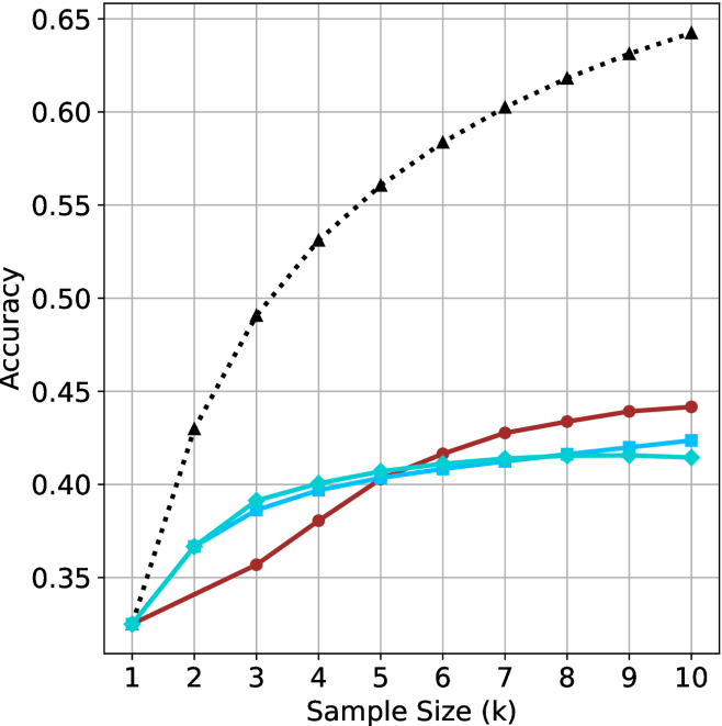
## Line Graph: Accuracy vs. Sample Size (k)
### Overview
The image is a line graph comparing the accuracy of three data series (Baseline, Model A, Model B) as a function of sample size (k) ranging from 1 to 10. The y-axis represents accuracy (0.35–0.65), and the x-axis represents sample size (k). Three distinct lines are plotted: a dotted black line (Baseline), a solid red line (Model A), and a solid blue line (Model B). The legend is positioned in the top-right corner, associating each line with its label.
### Components/Axes
- **X-axis (Sample Size, k)**: Labeled "Sample Size (k)" with integer markers from 1 to 10.
- **Y-axis (Accuracy)**: Labeled "Accuracy" with decimal markers from 0.35 to 0.65 in increments of 0.05.
- **Legend**: Located in the top-right corner, with three entries:
- **Dotted Black Line**: "Baseline (Random Guessing)"
- **Solid Red Line**: "Model A"
- **Solid Blue Line**: "Model B"
### Detailed Analysis
1. **Baseline (Black Dotted Line)**:
- Starts at approximately **0.35** when k=1.
- Increases linearly to **0.65** at k=10.
- Trend: Steady, linear growth with no curvature.
2. **Model A (Red Solid Line)**:
- Starts at **0.35** (same as Baseline) at k=1.
- Increases gradually to **0.45** at k=10.
- Trend: Slight upward curvature, slower growth than Baseline.
3. **Model B (Blue Solid Line)**:
- Starts at **0.37** (slightly above Baseline) at k=1.
- Increases to **0.43** at k=10.
- Trend: Slight upward curvature, similar to Model A but with a slightly higher initial value.
### Key Observations
- The **Baseline (Black)** shows the most significant improvement, increasing by **0.30** (from 0.35 to 0.65) as sample size grows.
- **Model A (Red)** and **Model B (Blue)** exhibit slower growth, with Model A gaining **0.10** and Model B gaining **0.06** over the same range.
- At k=10, the Baseline outperforms both models by **0.20** (Baseline: 0.65 vs. Model A: 0.45, Model B: 0.43).
- All lines show **monotonic increase** with no plateaus or declines.
### Interpretation
The data suggests that the **Baseline (Random Guessing)** method benefits disproportionately from larger sample sizes, outperforming both Model A and Model B at k=10. This could indicate:
1. **Baseline Efficiency**: The Baseline may leverage additional data more effectively, possibly due to simpler heuristics or fewer computational constraints.
2. **Model Limitations**: Model A and B may suffer from overfitting, underfitting, or suboptimal hyperparameters that limit their ability to scale with larger datasets.
3. **Data Quality**: The Baseline’s linear growth might reflect a scenario where random guessing improves with more data (e.g., in imbalanced datasets or specific problem domains).
4. **Model Design**: The slower growth of Models A and B could highlight inefficiencies in their architecture or training process, suggesting opportunities for optimization.
### Spatial Grounding
- **Legend**: Top-right corner, clearly associating colors with labels.
- **Lines**: Dotted (Baseline), solid red (Model A), solid blue (Model B), all originating from the bottom-left (k=1) and extending to the top-right (k=10).
- **Axes**: X-axis (k) at the bottom, Y-axis (Accuracy) on the left, with gridlines for reference.
### Content Details
- **Baseline Values**:
- k=1: 0.35
- k=10: 0.65
- **Model A Values**:
- k=1: 0.35
- k=10: 0.45
- **Model B Values**:
- k=1: 0.37
- k=10: 0.43
### Final Notes
The graph emphasizes the importance of sample size in model performance but raises questions about why the Baseline outperforms the models. Further investigation into the Baseline’s methodology or the models’ training data could clarify this discrepancy.