## Line Chart: LLM Loss vs. Compute (PFLOP/s-days)
### Overview
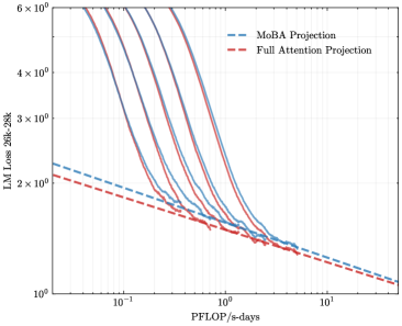
The image is a log-log line chart plotting the loss of a Large Language Model (LLM) against a measure of computational effort. It compares the projected performance of two different attention mechanisms ("MoBA" and "Full Attention") against several actual training runs represented by solid lines. The chart demonstrates the relationship between increased compute and reduced model loss.
### Components/Axes
* **Chart Type:** Log-Log Line Chart.
* **X-Axis:**
* **Label:** `PFLOP/s-days`
* **Scale:** Logarithmic, ranging from `10^-1` (0.1) to `10^1` (10).
* **Major Ticks:** `10^-1`, `10^0`, `10^1`.
* **Y-Axis:**
* **Label:** `LLM Loss (20B, 20K)`
* **Scale:** Logarithmic, ranging from `10^0` (1) to `6 × 10^0` (6).
* **Major Ticks:** `10^0`, `2 × 10^0`, `3 × 10^0`, `4 × 10^0`, `6 × 10^0`.
* **Legend:**
* **Position:** Top-right corner of the chart area.
* **Entries:**
1. `MoBA Projection` - Represented by a blue dashed line (`---`).
2. `Full Attention Projection` - Represented by a red dashed line (`---`).
* **Data Series:**
* **Projection Lines (Dashed):** Two lines extending from the left side of the chart to the bottom-right.
* **Training Run Lines (Solid):** Approximately 7-8 solid lines in various colors (including shades of purple, blue, and red). These lines are not individually labeled in the legend. They all originate from the top-left area and curve downwards to converge near the bottom-right.
### Detailed Analysis
* **Projection Trends (Dashed Lines):**
* **MoBA Projection (Blue Dashed):** Starts at a loss value slightly above `2 × 10^0` at `0.1 PFLOP/s-days`. It slopes downward linearly on the log-log plot, ending at a loss value slightly above `1 × 10^0` at `10 PFLOP/s-days`.
* **Full Attention Projection (Red Dashed):** Starts at a loss value slightly below `2 × 10^0` at `0.1 PFLOP/s-days`. It also slopes downward linearly, running parallel but consistently below the MoBA projection line. It ends at a loss value very close to `1 × 10^0` at `10 PFLOP/s-days`.
* **Training Run Trends (Solid Lines):**
* All solid lines show a steep, curved descent from high loss values (above `6 × 10^0`) at low compute (`<0.1 PFLOP/s-days`) towards lower loss values as compute increases.
* The curves are not linear; they show a steep initial drop that gradually flattens, exhibiting diminishing returns.
* The lines are tightly clustered but distinct. They appear to converge into a narrow band as they approach the bottom-right of the chart (high compute, low loss).
* At the highest compute levels shown (`~10 PFLOP/s-days`), the solid lines appear to meet or slightly undercut the dashed projection lines, with loss values approaching `1 × 10^0`.
### Key Observations
1. **Consistent Hierarchy:** The `Full Attention Projection` line is consistently below the `MoBA Projection` line across the entire compute range, suggesting a predicted lower loss for the same computational budget.
2. **Convergence of Actual Runs:** The multiple solid lines, likely representing different model configurations or training runs, all follow a similar trajectory and converge to a similar final loss value at high compute.
3. **Projection vs. Reality:** The dashed projection lines represent a simplified, linear (on log-log scale) scaling law. The actual training curves (solid lines) are more complex, showing a rapid initial improvement that slows down, eventually aligning with the projected trend at the high-compute end.
4. **Scale of Improvement:** Moving from `0.1` to `10 PFLOP/s-days` (a 100x increase in compute) corresponds to a reduction in loss from approximately `6+` to approximately `1`, a significant improvement.
### Interpretation
This chart visualizes a scaling law for LLM training. It demonstrates the fundamental principle that increasing computational resources (measured in PFLOP/s-days) leads to a predictable reduction in model loss (a key performance metric).
* **The Projections:** The dashed lines represent theoretical or extrapolated scaling laws for two different architectural approaches (MoBA vs. Full Attention). The fact that the Full Attention line is lower suggests it may be a more compute-efficient architecture according to this model, achieving lower loss for the same FLOP budget.
* **The Training Runs:** The solid lines represent empirical data from actual training experiments. Their steep initial drop shows that early in training, small increases in compute yield large performance gains. The flattening curve illustrates the law of diminishing returns—ever larger compute investments are needed for smaller incremental improvements.
* **Convergence and Validation:** The convergence of the solid training lines with the dashed projection lines at the high-compute end serves as a validation of the scaling law projection in that regime. It suggests that for sufficiently large models and training runs, the theoretical projection becomes a reliable predictor of performance.
* **Practical Implication:** The chart is a tool for resource planning. It helps answer questions like: "To achieve a target loss of `1.5`, approximately how much compute is required?" and "What is the expected performance difference between investing in a MoBA-based vs. a Full Attention-based architecture at a given scale?" The tight clustering of the solid lines also implies that, at this scale, the specific differences between those training runs have a smaller impact on final loss than the overall compute budget.