## Chart: Overlapping Distributions
### Overview
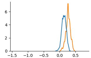
The image shows two overlapping probability distributions, one blue and one orange. Both distributions are unimodal and centered around different values on the x-axis.
### Components/Axes
* **X-axis:** Ranges from approximately -1.5 to 0.5, with tick marks at -1.5, -1.0, -0.5, 0.0, and 0.5.
* **Y-axis:** Ranges from 0 to approximately 7, with tick marks at 0, 2, 4, and 6.
* **Blue Distribution:** A unimodal distribution centered around x = 0.1, with a peak value of approximately 5.5.
* **Orange Distribution:** A unimodal distribution centered around x = 0.25, with a peak value of approximately 7.
### Detailed Analysis
* **Blue Distribution:** The blue line starts at approximately x = -0.1 with a y-value near 0, rises to a peak of approximately 5.5 at x = 0.1, and then decreases back to near 0 at approximately x = 0.3.
* **Orange Distribution:** The orange line starts at approximately x = 0 with a y-value near 0, rises to a peak of approximately 7 at x = 0.25, and then decreases back to near 0 at approximately x = 0.5.
### Key Observations
* Both distributions are unimodal.
* The orange distribution has a higher peak and is shifted to the right compared to the blue distribution.
* The blue distribution is slightly wider than the orange distribution.
### Interpretation
The chart compares two different distributions. The orange distribution has a higher probability density around x = 0.25, while the blue distribution has a higher probability density around x = 0.1. The difference in the location and height of the peaks suggests that the two distributions represent different underlying phenomena or populations. The orange distribution is more concentrated around its mean than the blue distribution.