\n
## Density Plot: Two Overlapping Distributions
### Overview
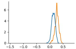
The image displays a 2D line chart, specifically a density plot or histogram, showing two overlapping probability distributions. The chart is presented on a white background with black axes. There is no chart title, axis titles, or legend present in the image.
### Components/Axes
* **X-Axis (Horizontal):**
* **Range:** Approximately -1.5 to 0.5.
* **Major Tick Marks & Labels:** Located at -1.5, -1.0, -0.5, 0.0, and 0.5.
* **Title:** Not present.
* **Y-Axis (Vertical):**
* **Range:** 0 to slightly above 6.
* **Major Tick Marks & Labels:** Located at 0, 2, 4, and 6.
* **Title:** Not present.
* **Data Series:**
* **Series 1 (Blue Line):** A single, continuous line forming a bell-shaped curve.
* **Series 2 (Orange Line):** A single, continuous line forming a bell-shaped curve, overlapping the blue line.
### Detailed Analysis
* **Blue Line Trend & Data Points:**
* **Trend:** The line starts near y=0 at x ≈ -0.2, rises steeply to a sharp peak, then descends symmetrically, tapering off to near y=0 at x ≈ 0.4. The distribution appears right-skewed.
* **Peak:** The highest point is at approximately **(x ≈ 0.1, y ≈ 5.5)**.
* **Spread:** The bulk of the distribution (where y > 1) spans from approximately x = -0.1 to x = 0.3.
* **Orange Line Trend & Data Points:**
* **Trend:** The line starts near y=0 at x ≈ 0.0, rises steeply to a sharp peak, then descends, tapering off to near y=0 at x ≈ 0.5. This distribution is also right-skewed but appears slightly wider than the blue one.
* **Peak:** The highest point is at approximately **(x ≈ 0.3, y ≈ 7.0)**. This is the global maximum of the chart.
* **Spread:** The bulk of the distribution (where y > 1) spans from approximately x = 0.1 to x = 0.45.
* **Overlap Region:** The two distributions significantly overlap between x ≈ 0.1 and x ≈ 0.3. In this region, the orange line is generally above the blue line, except near the blue line's peak.
### Key Observations
1. **Distinct Peaks:** The two distributions have clearly separated peaks. The orange distribution's peak is both higher (y ≈ 7.0 vs. y ≈ 5.5) and located further to the right on the x-axis (x ≈ 0.3 vs. x ≈ 0.1) compared to the blue distribution.
2. **Similar Shape, Different Parameters:** Both curves exhibit a similar unimodal, right-skewed shape, suggesting they may represent the same type of underlying data or process but with different mean and variance parameters.
3. **Asymmetry:** Both distributions are not perfectly symmetric; they have a longer tail extending towards the positive x-direction.
4. **Missing Context:** The lack of axis titles and a legend is a critical omission. It is impossible to know what the x and y axes represent (e.g., time, value, frequency, probability density) or what the blue and orange lines signify (e.g., different groups, models, conditions).
### Interpretation
The chart visually compares two related but distinct datasets or probability distributions. The **orange distribution** is characterized by a **higher central tendency** (peak further right) and a **greater concentration of values** (higher peak density) around its mean compared to the **blue distribution**.
**What the data suggests:** If the x-axis represents a measured value (e.g., a test score, a physical measurement, a model error), the group or condition represented by the orange line has, on average, a higher value than the blue group. The higher peak also suggests less variability or a more consistent outcome within the orange group around its central value.
**Notable Anomaly:** The most striking feature is the **complete absence of descriptive labels**. For a technical document, this renders the chart uninterpretable beyond a purely visual comparison of shapes. The viewer can deduce relative differences (orange is "higher" and "more peaked" than blue) but cannot assign any real-world meaning to these differences.
**Peircean Investigation (Reading Between the Lines):** The chart is likely a generated output from a statistical analysis (e.g., kernel density estimation) comparing two samples. The clean, minimalist style suggests it may be a figure from a scientific paper, a data analysis report, or a model evaluation dashboard where the context (axis labels, legend) was provided in accompanying text or a caption not included in this image crop. The choice of blue and orange is a common, colorblind-friendly pairing for distinguishing two categories.