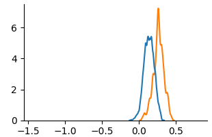
## Line Graph: Comparison of Two Data Series
### Overview
The image depicts a line graph comparing two data series (Line A and Line B) across an x-axis range of -1.5 to 0.5 and a y-axis range of 0 to 6. Both lines exhibit distinct peaks in the positive x-region, with Line B (orange) reaching a higher maximum value than Line A (blue). The lines intersect near the origin (x ≈ 0.1, y ≈ 4.5).
### Components/Axes
- **X-axis**: Labeled with numerical markers at -1.5, -1.0, -0.5, 0.0, and 0.5. No explicit title provided.
- **Y-axis**: Labeled with numerical markers at 0, 2, 4, and 6. No explicit title provided.
- **Legend**: Located in the top-right corner, associating:
- **Blue line**: "Line A"
- **Orange line**: "Line B"
### Detailed Analysis
1. **Line A (Blue)**:
- Starts near y=0 at x=-1.5.
- Gradually increases, reaching a peak of approximately **5.5** at x≈0.2.
- Declines sharply after x=0.2, returning to y=0 by x=0.5.
2. **Line B (Orange)**:
- Remains near y=0 until x≈0.0.
- Rises sharply, peaking at approximately **6.5** at x≈0.3.
- Declines gradually after x=0.3, ending near y=0 at x=0.5.
3. **Intersection Point**:
- The lines cross near x≈0.1, where both are at y≈4.5.
### Key Observations
- Line B (orange) achieves a higher maximum value (6.5 vs. 5.5) and peaks later (x=0.3 vs. x=0.2).
- Both lines exhibit symmetric decay after their respective peaks.
- The intersection at x≈0.1 suggests a crossover point where Line B surpasses Line A.
### Interpretation
The graph likely represents a comparison of two variables (e.g., growth rates, performance metrics) over time or another continuous parameter. The delayed peak of Line B and its higher magnitude suggest it may represent a slower but more intense process compared to Line A. The intersection point could indicate a critical threshold where the two variables equalize before diverging again. The sharp decline of Line A after its peak might imply a rapid saturation or exhaustion effect, while Line B’s gradual decay could reflect a more sustained or resilient trend.