## Network Diagram and Bar Charts: Original vs. Sparsified Network Comparison
### Overview
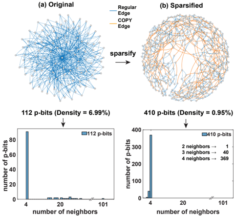
The image is a technical diagram comparing the structure and connectivity of two networks: an "Original" dense network and a "Sparsified" version. It includes two network visualizations at the top and two corresponding bar charts at the bottom that quantify the distribution of neighbor counts for the nodes (p-bits) in each network. The overall process illustrates a "sparsify" transformation that reduces network density while increasing the number of nodes.
### Components/Axes
**Top Section - Network Diagrams:**
* **(a) Original:** A dense, highly interconnected network visualization. All visible edges are blue.
* **(b) Sparsified:** A less dense network visualization. Contains both blue and orange edges.
* **Legend (Top Center):**
* `Regular Edge` - Blue line
* `COPY Edge` - Orange line
* **Process Label:** The word `sparsify` with a right-pointing arrow (`→`) is positioned between the two network diagrams, indicating the transformation from (a) to (b).
**Bottom Section - Bar Charts:**
* **Left Chart (for Original Network):**
* **Title:** `112 p-bits (Density = 6.99%)`
* **Y-axis Label:** `number of p-bits`
* **X-axis Label:** `number of neighbors`
* **X-axis Markers:** `4`, `20`, `101`
* **Legend:** A blue square labeled `112 p-bits`
* **Right Chart (for Sparsified Network):**
* **Title:** `410 p-bits (Density = 0.95%)`
* **Y-axis Label:** `number of p-bits`
* **X-axis Label:** `number of neighbors`
* **X-axis Markers:** `4`, `20`, `101`
* **Legend:** A blue square labeled `410 p-bits`
* **Embedded Text Box (Right of bars):**
* `2 neighbors → 1`
* `3 neighbors → 40`
* `4 neighbors → 369`
### Detailed Analysis
**Network Visualizations:**
1. **Original Network (a):** Composed solely of blue `Regular Edge` connections. The visual impression is of a dense, hairball-like structure with a high degree of interconnectivity.
2. **Sparsified Network (b):** Contains a mix of blue `Regular Edge` and orange `COPY Edge` connections. The orange edges appear to form a more structured, possibly hierarchical or backbone-like pattern within the remaining network. The overall visual density is markedly lower than in (a).
**Bar Chart Data - Original Network (112 p-bits):**
* **Trend:** The distribution is heavily skewed. The vast majority of p-bits have a very low number of neighbors.
* **Data Points (Approximate):**
* At `4` neighbors: The bar height is approximately **90** p-bits.
* For neighbor counts between 4 and 20: There are very small bars, each representing approximately **1-3** p-bits.
* For neighbor counts near `101`: There is one very small bar, representing approximately **1** p-bit.
* **Summary:** The network is dense (6.99%) but its nodes have a low average degree, with most nodes having only 4 connections.
**Bar Chart Data - Sparsified Network (410 p-bits):**
* **Trend:** The distribution is also concentrated at the low end but shows a slightly broader spread than the original.
* **Data Points (Precise from text box & approximate from chart):**
* At `2` neighbors: **1** p-bit.
* At `3` neighbors: **40** p-bits.
* At `4` neighbors: **369** p-bits. The bar chart visually confirms this, with the bar at 4 reaching just below the 400 mark on the y-axis.
* **Summary:** The sparsification process dramatically increased the number of nodes (from 112 to 410) while drastically reducing the network density (from 6.99% to 0.95%). The neighbor count distribution remains concentrated, with 90% (369/410) of nodes having exactly 4 neighbors.
### Key Observations
1. **Density vs. Node Count Inverse Relationship:** The transformation trades a high-density, low-node-count network for a low-density, high-node-count network.
2. **Neighbor Count Stability:** Despite the massive change in network size and density, the modal (most common) number of neighbors per node remains **4** in both networks.
3. **Introduction of COPY Edges:** The sparsified network introduces a new edge type (`COPY Edge`, orange), which is absent in the original. These edges are visually prominent and likely crucial to maintaining network function after sparsification.
4. **Extreme Skew in Original:** The original network has an extreme outlier node with ~101 neighbors, which is not present in the sparsified network's reported data.
### Interpretation
This diagram illustrates a network optimization or simplification technique, likely from the field of neuromorphic computing or probabilistic computing (given the term "p-bits"). The "sparsify" process appears to be a method for constructing a larger, more efficient, and less interconnected network from a smaller, denser one.
* **What the data suggests:** The process is not simply removing edges. It is a **re-architecting** that adds many new nodes (p-bits) while carefully controlling their connectivity. The consistent 4-neighbor structure for the vast majority of nodes in both networks suggests this may be a fundamental or optimal connectivity pattern for the system's function.
* **How elements relate:** The `COPY Edge` (orange) in the sparsified network is the key new component. It likely represents a mechanism for replicating or propagating information in a structured way that allows the larger network to function reliably with far fewer total connections (lower density). The bar charts provide the quantitative proof of the sparsification's effect on network topology.
* **Notable Anomaly:** The original network's density (6.99%) is high for a network where most nodes have only 4 neighbors. This implies the presence of a few "hub" nodes with extremely high connectivity (like the one with ~101 neighbors) that disproportionately contribute to the total edge count. The sparsification process eliminates these hubs, leading to a more homogeneous, scalable, and potentially more robust network architecture.