## 3D Surface Plot: True α - FE vs. x₁ and x₂
### Overview
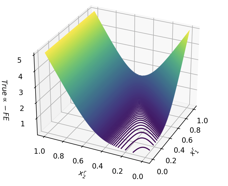
The image is a 3D surface plot visualizing the relationship between two variables, **x₁** and **x₂**, and a third variable, **True α - FE**. The surface transitions from **purple** (low values) to **yellow** (high values), with **purple contour lines** indicating regions of rapid change. The plot suggests a **non-linear relationship** between the variables, with a **valley-like structure** in the center and **peaks** at the edges.
---
### Components/Axes
- **X-axis (x₁)**: Ranges from **0.0 to 1.0** in increments of 0.2.
- **Y-axis (x₂)**: Ranges from **0.0 to 1.0** in increments of 0.2.
- **Z-axis (True α - FE)**: Ranges from **1.0 to 5.0** in increments of 1.0.
- **Surface**: A gradient from **purple** (low values) to **yellow** (high values), with **purple contour lines** concentrated in the central valley.
- **No explicit legend** is present, but the color gradient implies a mapping of **True α - FE** values to the surface.
---
### Detailed Analysis
- **Surface Shape**:
- The surface forms a **valley** (minimum) at the center (x₁ ≈ 0.5, x₂ ≈ 0.5), where **True α - FE** is approximately **1.0–2.0**.
- The edges (x₁ ≈ 0.0 or 1.0, x₂ ≈ 0.0 or 1.0) show **peaks** with **True α - FE** reaching **4.0–5.0**.
- The **purple contour lines** are tightly packed in the valley, indicating a **steep gradient** (rapid change in **True α - FE**) near the minimum.
- **Color Gradient**:
- **Purple** (low values) dominates the central valley.
- **Yellow** (high values) dominates the edges.
- Intermediate values (green to blue) transition between the valley and peaks.
- **Contour Lines**:
- The **purple contour lines** are concentrated in the valley, suggesting **local minima** or **critical points** in the function.
- No contour lines are visible on the peaks, implying **flat regions** or **plateaus** at higher **True α - FE** values.
---
### Key Observations
1. **Minimum at the Center**: The lowest **True α - FE** values (≈1.0–2.0) occur at the center of the plot (x₁ ≈ 0.5, x₂ ≈ 0.5).
2. **Peaks at the Edges**: The highest **True α - FE** values (≈4.0–5.0) are observed at the corners of the plot (e.g., x₁ ≈ 0.0, x₂ ≈ 0.0).
3. **Steep Gradient in the Valley**: The **purple contour lines** indicate a **sharp increase** in **True α - FE** as the surface moves from the valley toward the edges.
4. **No Explicit Legend**: The color gradient and contour lines serve as implicit indicators of **True α - FE** values, but no numerical scale or legend is provided.
---
### Interpretation
The plot likely represents a **mathematical function** or **physical system** where **True α - FE** depends on two parameters, **x₁** and **x₂**. The **valley** suggests an **optimal point** (minimum) for **True α - FE**, while the **peaks** indicate **suboptimal regions**. The **contour lines** highlight areas of **rapid change**, which could be critical for optimization or sensitivity analysis.
- **Peircean Insight**: The absence of a legend introduces ambiguity in interpreting the exact numerical values of **True α - FE**, but the **color gradient** and **contour lines** provide qualitative insights into the function's behavior.
- **Notable Anomalies**: The **flat regions** at the peaks (no contour lines) may indicate **plateaus** or **insensitive regions** where **True α - FE** is relatively constant.
This visualization is useful for identifying **critical points** (minima/maxima) and understanding the **sensitivity** of **True α - FE** to changes in **x₁** and **x₂**.