## Heatmap: Concentration Over Time and Space
### Overview
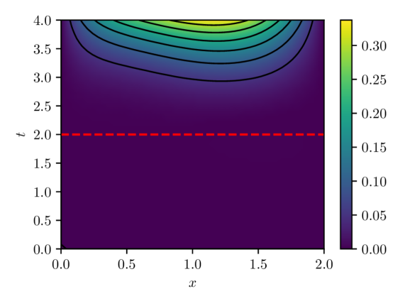
The image is a heatmap displaying the concentration of a substance over time (t) and space (x). The x-axis ranges from 0.0 to 2.0, and the t-axis ranges from 0.0 to 4.0. The color gradient represents the concentration, ranging from dark purple (0.00) to bright yellow (0.30). Black contour lines indicate specific concentration levels. A red dashed line is present at t=2.0.
### Components/Axes
* **X-axis:** Represents spatial dimension 'x', ranging from 0.0 to 2.0 in increments of 0.5.
* **Y-axis:** Represents time 't', ranging from 0.0 to 4.0 in increments of 0.5.
* **Colorbar:** Located on the right side, indicating concentration levels. The color gradient ranges from dark purple (0.00) to bright yellow (0.30), with intermediate values marked at 0.05, 0.10, 0.15, 0.20, and 0.25.
* **Contour Lines:** Black lines indicating specific concentration levels.
* **Red Dashed Line:** A horizontal red dashed line at t=2.0.
### Detailed Analysis
* **Concentration Distribution:** The concentration is highest in the upper-center region of the plot (around x=1.0 and t=4.0), indicated by the yellow color. The concentration decreases towards the bottom of the plot (lower t values) and towards the edges (x=0.0 and x=2.0).
* **Contour Lines:** The contour lines are denser in the upper region, indicating a steeper gradient of concentration change.
* **Red Dashed Line (t=2.0):** Below this line, the concentration is consistently low (dark purple). Above this line, the concentration increases, reaching its maximum near t=4.0.
* **Specific Values (Approximate):**
* At x=1.0 and t=4.0, the concentration is approximately 0.30 (yellow).
* At x=0.0 and t=0.0, the concentration is approximately 0.00 (dark purple).
* At x=2.0 and t=0.0, the concentration is approximately 0.00 (dark purple).
* **Trend:** The concentration increases with time (t) for a given spatial location (x), especially above t=2.0. The concentration also varies with spatial location (x), with the highest concentration near the center (x=1.0).
### Key Observations
* The concentration is significantly lower below t=2.0.
* The highest concentration is observed near the center of the spatial domain (x=1.0) and at the highest time point (t=4.0).
* The concentration gradient is steeper in the upper region of the plot.
### Interpretation
The heatmap illustrates the spatiotemporal distribution of a substance's concentration. The data suggests that the substance is introduced or generated after t=2.0, with the highest concentration accumulating near the center of the spatial domain over time. The red dashed line at t=2.0 serves as a clear demarcation point, separating regions of low and increasing concentration. The contour lines provide a visual representation of the concentration gradient, indicating how rapidly the concentration changes across different locations and times. The data could represent a diffusion process, a chemical reaction, or any other phenomenon where concentration varies with both space and time.