## Heatmap/Contour Plot: Spatiotemporal Value Distribution
### Overview
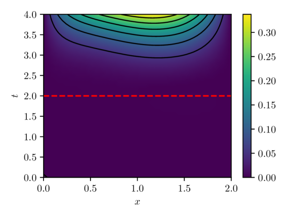
The image is a 2D contour plot (heatmap) visualizing a scalar field over a spatial dimension `x` and a temporal dimension `t`. The plot shows a region of high values concentrated at the top-center, with values decreasing radially outward. A prominent red dashed line is superimposed horizontally across the plot.
### Components/Axes
* **Main Plot Area:** A rectangular region with a color gradient representing the value of an unspecified variable.
* **X-Axis (Horizontal):**
* **Label:** `x`
* **Scale:** Linear, ranging from `0.0` to `2.0`.
* **Major Tick Markers:** `0.0`, `0.5`, `1.0`, `1.5`, `2.0`.
* **Y-Axis (Vertical):**
* **Label:** `t`
* **Scale:** Linear, ranging from `0.0` to `4.0`.
* **Major Tick Markers:** `0.0`, `0.5`, `1.0`, `1.5`, `2.0`, `2.5`, `3.0`, `3.5`, `4.0`.
* **Color Bar (Legend):**
* **Position:** Right side of the plot.
* **Scale:** Linear, ranging from `0.00` to `0.30`.
* **Major Tick Markers:** `0.00`, `0.05`, `0.10`, `0.15`, `0.20`, `0.25`, `0.30`.
* **Color Gradient:** A continuous map from dark purple (low values, ~`0.00`) through blue and green to bright yellow (high values, ~`0.30`).
* **Overlay Element:**
* A horizontal, red, dashed line spanning the full width of the plot at the coordinate `t = 2.0`.
### Detailed Analysis
* **Data Distribution & Trends:**
* The highest values (bright yellow, ~`0.30` on the color bar) are located in a concentrated region at the top-center of the plot, approximately at `x = 1.0` and `t = 4.0`.
* From this peak, the values decrease in all directions, forming concentric, elliptical contour lines. The trend is a smooth, radial decay from the top-center.
* The majority of the plot area, especially for `t < 2.5`, is dominated by the lowest values (dark purple, ~`0.00` to `0.05`).
* **Contour Lines:** Black contour lines are drawn at specific value levels. They are densely packed near the peak (`t=4.0, x=1.0`) and become more widely spaced as values decrease, indicating a steeper gradient near the maximum.
* **Red Dashed Line:** This line at `t = 2.0` serves as a clear visual marker or threshold within the temporal domain. It lies entirely within the region of very low values (dark purple).
### Key Observations
1. **Single Peak:** The data exhibits a single, well-defined maximum at the spatial and temporal boundary (`x=1.0, t=4.0`).
2. **Boundary Concentration:** The phenomenon being visualized appears to originate from or be most intense at the upper temporal boundary (`t=4.0`).
3. **Temporal Threshold:** The red line at `t=2.0` demarcates a significant drop in value. The region below this line (`t < 2.0`) shows almost uniform, minimal values.
4. **Spatial Symmetry:** The distribution is roughly symmetric about the vertical line `x = 1.0`.
### Interpretation
This plot likely represents the solution to a partial differential equation (PDE), such as a heat or diffusion equation, over a 1D spatial domain (`x`) and time (`t`). The high-value region at `(x=1.0, t=4.0)` suggests an initial condition or a source term applied at the final time `t=4.0`, with the values diffusing "backwards" in time (or representing a steady-state solution viewed in reverse). Alternatively, it could show the accumulation of a quantity over time, peaking at the end of the observed period.
The red dashed line at `t=2.0` is an annotation, likely indicating a specific time of interest for analysis, a cutoff point, or the time at which a particular event or measurement occurs. The stark contrast between the active region (`t > 2.5`) and the quiescent region (`t < 2.0`) suggests a system that undergoes a significant change or activation in the latter half of the observed timeframe. The smooth, elliptical contours are characteristic of diffusive processes, where gradients drive the spread of the quantity from regions of high concentration to low concentration.