## Heatmap: Value Distribution Across x and t Axes
### Overview
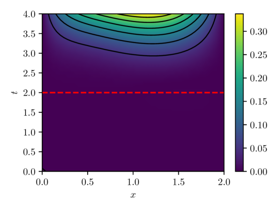
The image is a heatmap visualizing a continuous variable's distribution across two axes: `x` (horizontal, 0.0–2.0) and `t` (vertical, 0.0–4.0). The color gradient transitions from purple (low values) to yellow (high values), with a red dashed line at `t = 2.0`. A color bar on the right quantifies the values (0.00–0.30).
### Components/Axes
- **Axes**:
- `x` (horizontal): Labeled 0.0 to 2.0 in increments of 0.5.
- `t` (vertical): Labeled 0.0 to 4.0 in increments of 0.5.
- **Color Bar**:
- Positioned on the right, labeled 0.00 (purple) to 0.30 (yellow).
- Gradient matches the heatmap's color scale.
- **Red Dashed Line**:
- Horizontal line at `t = 2.0`, spanning the entire `x` range.
### Detailed Analysis
- **Color Gradient**:
- Values increase from purple (0.00) to yellow (0.30).
- Highest values (yellow) cluster in the upper-right quadrant (`x ≈ 2.0`, `t ≈ 4.0`).
- Lowest values (purple) dominate the lower-left quadrant (`x ≈ 0.0`, `t ≈ 0.0`).
- **Red Dashed Line**:
- Divides the plot into two regions:
- Below `t = 2.0`: Predominantly purple (values < 0.10).
- Above `t = 2.0`: Gradual transition to green/yellow (values > 0.10).
- **Contour Lines**:
- Black contour lines indicate value thresholds (e.g., 0.05, 0.10, 0.15, 0.20, 0.25, 0.30).
- Lines are denser in regions of rapid value change (e.g., near `x = 1.5`, `t = 3.0`).
### Key Observations
1. **Positive Correlation**: Values increase with both `x` and `t`, forming a diagonal gradient from bottom-left to top-right.
2. **Threshold Effect**: The red line at `t = 2.0` marks a clear boundary where values transition from <0.10 to >0.10.
3. **Peak Intensity**: Maximum values (0.30) are concentrated near `x = 2.0`, `t = 4.0`.
4. **Smooth Transitions**: No abrupt changes; gradients are continuous across the plot.
### Interpretation
The heatmap suggests a **bivariate relationship** where the measured variable (e.g., concentration, intensity) grows monotonically with both `x` and `t`. The red dashed line at `t = 2.0` likely represents a critical threshold (e.g., a phase transition or operational limit). The absence of outliers or anomalies indicates a well-behaved, deterministic relationship. The color bar’s scale (0.00–0.30) implies the variable is normalized or scaled for comparison.
**Note**: No textual labels or embedded data tables are present beyond axis titles and the color bar. The image relies entirely on visual encoding for interpretation.