## Diagram: Model Performance and Masking
### Overview
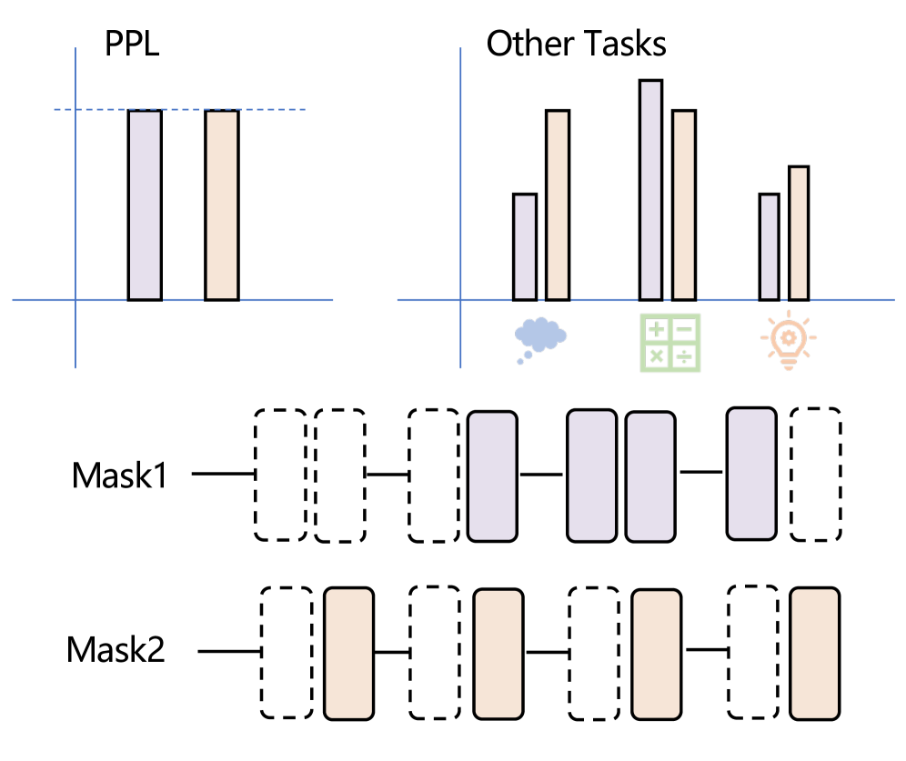
The image presents a diagram comparing the performance of two models, likely with different masking strategies, on two sets of tasks: "PPL" (Perplexity) and "Other Tasks." The diagram includes bar charts representing performance on these tasks and visual representations of the masking strategies used (Mask1 and Mask2).
### Components/Axes
* **PPL Chart:**
* X-axis: Implied categories for two models.
* Y-axis: Perplexity score (lower is better). No explicit scale is provided.
* Horizontal dashed line: Represents a performance threshold or target.
* **Other Tasks Chart:**
* X-axis: Three task categories represented by icons: a cloud (likely representing natural language understanding or generation), a calculator (likely representing arithmetic or reasoning), and a lightbulb (likely representing knowledge or problem-solving).
* Y-axis: Performance metric (higher is better). No explicit scale is provided.
* **Masking Strategies:**
* Mask1: A sequence of rectangular blocks, some solid (purple) and some dashed.
* Mask2: A sequence of rectangular blocks, some solid (orange) and some dashed.
* Horizontal lines connect the blocks, indicating a sequence or flow.
### Detailed Analysis
**PPL Chart:**
* Two bars are shown. The left bar is purple, and the right bar is orange.
* The height of the purple bar is approximately equal to the height of the orange bar.
* Both bars reach the horizontal dashed line.
**Other Tasks Chart:**
* Three pairs of bars are shown, corresponding to the three task categories.
* For the cloud task: The purple bar is shorter than the orange bar. Purple bar height is ~ 0.4, orange bar height is ~0.6.
* For the calculator task: The purple bar is taller than the orange bar. Purple bar height is ~ 0.9, orange bar height is ~0.7.
* For the lightbulb task: The purple bar is shorter than the orange bar. Purple bar height is ~ 0.4, orange bar height is ~0.6.
**Masking Strategies:**
* **Mask1 (Purple):** Dashed-Solid-Solid-Dashed-Solid-Dashed
* **Mask2 (Orange):** Dashed-Solid-Dashed-Dashed-Solid-Solid
### Key Observations
* On the PPL task, both models perform similarly, reaching the target performance level.
* On the "Other Tasks," the models exhibit different performance profiles across the three task categories. Mask1 (purple) performs better on the calculator task, while Mask2 (orange) performs better on the cloud and lightbulb tasks.
* The masking strategies differ in the arrangement of solid and dashed blocks, suggesting different approaches to information processing or attention.
### Interpretation
The diagram suggests that the two models, employing different masking strategies, achieve comparable performance on the PPL task. However, their performance diverges on other tasks. Mask1, with its specific masking pattern, seems to excel at tasks represented by the calculator icon (potentially arithmetic or logical reasoning). Mask2, with its alternative masking pattern, appears to be more effective on tasks represented by the cloud and lightbulb icons (potentially natural language understanding and knowledge-based tasks).
The masking strategies likely influence how the models process information, leading to these performance differences. The solid blocks may represent active processing or attention, while the dashed blocks may represent masked or ignored information. The specific arrangement of these blocks could be optimized for different types of tasks.
The diagram highlights the importance of masking strategies in model performance and suggests that different strategies may be better suited for different tasks. Further investigation would be needed to understand the specific mechanisms by which these masking strategies influence performance.