## Bar Chart: PPL vs. Other Tasks with Masking
### Overview
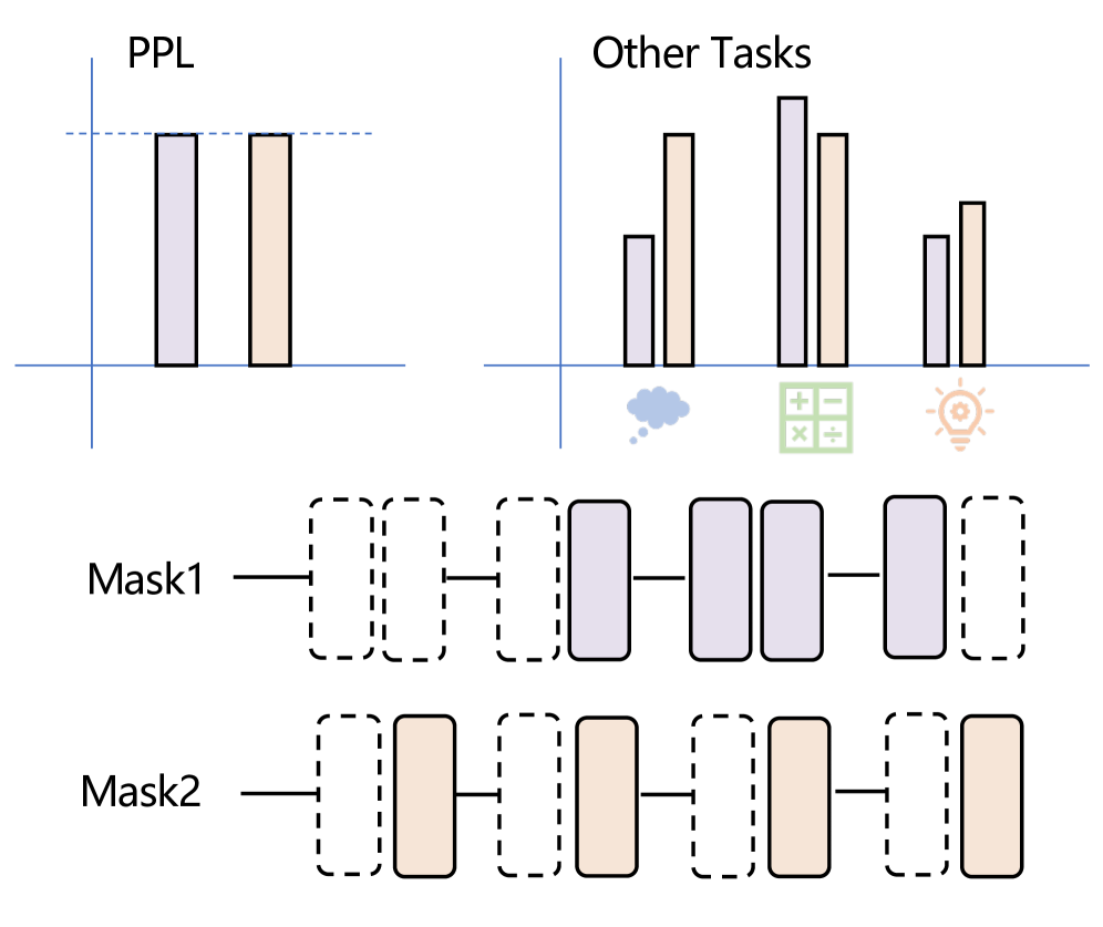
The image presents a comparison between "PPL" (Perplexity) and "Other Tasks" using bar charts. Below these charts are two mask visualizations, labeled "Mask1" and "Mask2", which appear to correspond to the bars in the charts above. The image aims to visually represent the impact of masking on performance metrics.
### Components/Axes
* **Titles:** "PPL" (left chart), "Other Tasks" (right chart), "Mask1" (bottom-left), "Mask2" (bottom-right).
* **Horizontal Line:** A light blue horizontal line separates the bar charts from the mask visualizations.
* **Y-axis:** The Y-axis is not explicitly labeled, but represents a relative scale of performance or value.
* **X-axis:** The X-axis is not explicitly labeled, but represents different categories or tasks. There are 6 categories.
* **Legend:** The "Other Tasks" chart includes a legend with three icons: a cloud, a plus/minus symbol, and a lightbulb. These icons likely represent different sub-categories within "Other Tasks".
* **Masks:** "Mask1" and "Mask2" are represented as dashed rectangles, with some rectangles filled in, indicating masked or unmasked portions.
### Detailed Analysis or Content Details
**PPL Chart:**
The PPL chart consists of 6 bars.
* Bar 1 (leftmost): Approximately 0.75 (blue).
* Bar 2: Approximately 0.8 (grey).
* Bar 3: Approximately 0.85 (grey).
* Bar 4: Approximately 0.8 (grey).
* Bar 5: Approximately 0.75 (grey).
* Bar 6 (rightmost): Approximately 0.8 (grey).
**Other Tasks Chart:**
The "Other Tasks" chart consists of 6 bars.
* Bar 1 (leftmost): Approximately 0.4 (grey).
* Bar 2: Approximately 0.6 (grey).
* Bar 3: Approximately 0.9 (grey).
* Bar 4: Approximately 0.95 (grey).
* Bar 5: Approximately 0.7 (grey).
* Bar 6 (rightmost): Approximately 0.6 (grey).
**Legend Mapping (Other Tasks):**
* Cloud Icon: Associated with the first bar (approximately 0.4).
* Plus/Minus Icon: Associated with the second and third bars (approximately 0.6 and 0.9).
* Lightbulb Icon: Associated with the fourth, fifth, and sixth bars (approximately 0.95, 0.7, and 0.6).
**Mask Visualizations:**
* **Mask1:** The first, third, fourth, and fifth rectangles are unmasked (white interior with dashed border). The second and sixth rectangles are masked (filled with light orange).
* **Mask2:** The second, third, fourth, and sixth rectangles are unmasked (white interior with dashed border). The first and fifth rectangles are masked (filled with light orange).
### Key Observations
* The PPL values are generally higher than the "Other Tasks" values.
* The "Other Tasks" chart shows significant variation in performance across the different sub-categories (represented by the legend icons).
* The masks appear to selectively mask different portions of the data, potentially representing different masking strategies.
* Mask1 and Mask2 mask different sets of bars, suggesting different masking approaches.
### Interpretation
The image likely illustrates the effect of masking on model performance in natural language processing. "PPL" represents the perplexity of a language model, a measure of how well it predicts a sample of text. "Other Tasks" represent other NLP tasks. The masks indicate which parts of the input data are being masked or hidden from the model.
The higher PPL values suggest that the model performs worse when predicting the full text compared to the "Other Tasks". The masks are used to investigate how masking different parts of the input affects performance on both PPL and the other tasks.
The different masking patterns in Mask1 and Mask2 suggest that different masking strategies are being tested. The goal is likely to identify masking strategies that improve model robustness or generalization ability. The variation in performance across the "Other Tasks" sub-categories suggests that some tasks are more sensitive to masking than others.
The image is a visual aid for understanding the impact of masking on model performance, and it highlights the importance of carefully considering masking strategies in NLP applications.