\n
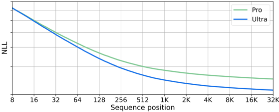
## Line Chart: Negative Log Likelihood vs. Sequence Position
### Overview
The image presents a line chart comparing the Negative Log Likelihood (NLL) for two models, "Pro" and "Ultra", across varying sequence positions. The chart illustrates how the NLL changes as the sequence position increases, indicating model performance.
### Components/Axes
* **X-axis:** Sequence position, ranging from 8 to 32K (32,000). The scale is logarithmic, with markers at 8, 16, 32, 64, 128, 256, 512, 1K (1,000), 2K (2,000), 4K (4,000), 8K (8,000), 16K (16,000), and 32K.
* **Y-axis:** Negative Log Likelihood (NLL). The scale is linear, but the exact range is not explicitly labeled.
* **Legend:** Located in the top-right corner, identifying the two data series:
* "Pro" - represented by a green line.
* "Ultra" - represented by a blue line.
* **Grid:** A light gray grid is present, aiding in the readability of the chart.
### Detailed Analysis
* **Ultra (Blue Line):** The blue line representing "Ultra" starts at approximately NLL = 5.5 at sequence position 8. It exhibits a steep downward slope initially, decreasing rapidly to approximately NLL = 2.5 at sequence position 256. The slope continues to decrease, leveling off around NLL = 1.5 at sequence position 8K, and reaching approximately NLL = 1.2 at sequence position 32K.
* **Pro (Green Line):** The green line representing "Pro" starts at approximately NLL = 4.0 at sequence position 8. It also shows a downward trend, but less steep than the "Ultra" line. It decreases to approximately NLL = 2.5 at sequence position 512. The slope continues to decrease, leveling off around NLL = 1.7 at sequence position 8K, and reaching approximately NLL = 1.5 at sequence position 32K.
### Key Observations
* The "Ultra" model consistently exhibits a lower NLL than the "Pro" model across all sequence positions, indicating better performance.
* Both models demonstrate diminishing returns as the sequence position increases. The rate of NLL decrease slows down significantly after 2K.
* The difference in NLL between the two models is most pronounced at lower sequence positions (8-512) and becomes less significant at higher sequence positions (8K-32K).
### Interpretation
The chart suggests that the "Ultra" model outperforms the "Pro" model in terms of negative log likelihood, implying a better fit to the data or a more accurate prediction capability. The decreasing NLL with increasing sequence position for both models indicates that they become more confident in their predictions as they process longer sequences. The diminishing returns observed at higher sequence positions suggest that there is a limit to the benefit of processing increasingly longer sequences. The convergence of the two lines at higher sequence positions indicates that the performance gap between the models narrows as the sequence length increases. This could be due to the models reaching a point where they have captured most of the relevant information from the sequence, or due to limitations in the models' capacity to process very long sequences effectively. The chart provides valuable insights into the performance characteristics of the two models and can inform decisions about model selection and sequence length optimization.