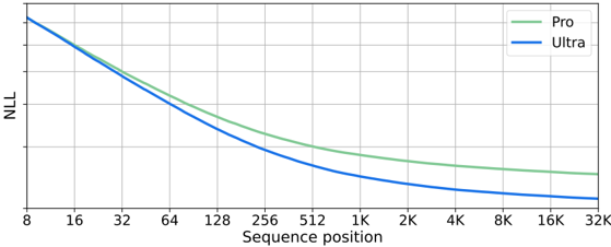
## Line Chart: NLL vs. Sequence Position for Two Models
### Overview
The image displays a line chart comparing the performance of two models, labeled "Pro" and "Ultra," across a range of sequence positions. The chart plots Negative Log-Likelihood (NLL) on the y-axis against Sequence Position on the x-axis. Both lines show a decreasing trend, indicating that NLL improves (decreases) as the sequence position increases. The "Ultra" model consistently achieves a lower NLL than the "Pro" model across the entire observed range.
### Components/Axes
* **Chart Type:** Line chart with two data series.
* **X-Axis:**
* **Label:** "Sequence position"
* **Scale:** Logarithmic (base 2).
* **Markers/Ticks:** 8, 16, 32, 64, 128, 256, 512, 1K, 2K, 4K, 8K, 16K, 32K.
* **Y-Axis:**
* **Label:** "NLL" (Negative Log-Likelihood).
* **Scale:** Linear. The axis has grid lines but no explicit numerical labels. The top of the axis corresponds to a higher NLL value, and the bottom to a lower value.
* **Legend:**
* **Position:** Top-right corner of the chart area.
* **Series 1:** "Pro" - Represented by a green line.
* **Series 2:** "Ultra" - Represented by a blue line.
* **Grid:** A light gray grid is present, with vertical lines at each x-axis tick and horizontal lines dividing the y-axis range.
### Detailed Analysis
**Trend Verification:**
* **Pro (Green Line):** The line slopes downward from left to right. The descent is steep for lower sequence positions (8 to ~256) and becomes progressively shallower, approaching a near-horizontal asymptote for positions beyond 4K.
* **Ultra (Blue Line):** Also slopes downward from left to right, following a similar shape to the Pro line. It is positioned strictly below the Pro line at all visible points.
**Data Point Extraction (Approximate Values):**
*Note: The y-axis lacks numerical labels. Values are estimated based on the grid lines, assuming the top grid line represents a value of ~10 and the bottom grid line represents ~0. This introduces significant uncertainty in absolute values, but the relative comparison between the two lines is clear.*
| Sequence Position | Pro (Green) - Approx. NLL | Ultra (Blue) - Approx. NLL | Notes |
| :--- | :--- | :--- | :--- |
| 8 | ~10.0 (Top of axis) | ~10.0 (Top of axis) | Both lines start at approximately the same high point. |
| 16 | ~8.5 | ~8.3 | Ultra begins to show a slight advantage. |
| 32 | ~7.0 | ~6.7 | |
| 64 | ~5.8 | ~5.4 | |
| 128 | ~4.8 | ~4.3 | |
| 256 | ~4.0 | ~3.5 | |
| 512 | ~3.4 | ~2.9 | |
| 1K | ~3.0 | ~2.5 | |
| 2K | ~2.7 | ~2.2 | |
| 4K | ~2.5 | ~2.0 | |
| 8K | ~2.4 | ~1.9 | |
| 16K | ~2.3 | ~1.8 | |
| 32K | ~2.2 | ~1.7 | The gap between the lines appears consistent in the latter half. |
### Key Observations
1. **Consistent Superiority:** The "Ultra" model (blue line) demonstrates a lower NLL than the "Pro" model (green line) at every sequence position from 16 onward.
2. **Diminishing Returns:** Both models show the most dramatic improvement in NLL (steepest slope) for sequence positions between 8 and 256. The rate of improvement slows significantly for positions greater than 1K.
3. **Parallel Trajectories:** After the initial divergence, the two lines follow nearly parallel paths, maintaining a relatively constant performance gap in the logarithmic sequence space.
4. **Asymptotic Behavior:** Both curves appear to be approaching an asymptotic lower bound for NLL as sequence position increases towards 32K, suggesting a performance limit for the given task/model architecture.
### Interpretation
This chart likely illustrates the scaling behavior of two language models (or similar sequence-processing models) on a specific evaluation task measured by Negative Log-Likelihood (lower is better).
* **What the data suggests:** The "Ultra" model is more effective than the "Pro" model at modeling the target data distribution, as evidenced by its consistently lower NLL. The advantage is present across all context lengths but is established early and maintained.
* **How elements relate:** The x-axis (Sequence position) represents the length of the context or input sequence the model is processing. The y-axis (NLL) is a standard loss metric indicating how "surprised" the model is by the actual data; lower values mean better prediction. The downward trend for both models confirms that they become more accurate (less surprised) when given more context, which is a desirable property.
* **Notable patterns/anomalies:** The most significant pattern is the clear and consistent separation between the two models. There are no crossovers or anomalies; the "Ultra" model is unambiguously better. The shape of the curves—rapid initial improvement followed by saturation—is typical of learning curves and suggests that the most critical information for the task is captured within the first few hundred to a thousand tokens, with diminishing returns for longer contexts. The lack of explicit y-axis labels is a minor limitation for extracting absolute performance metrics.