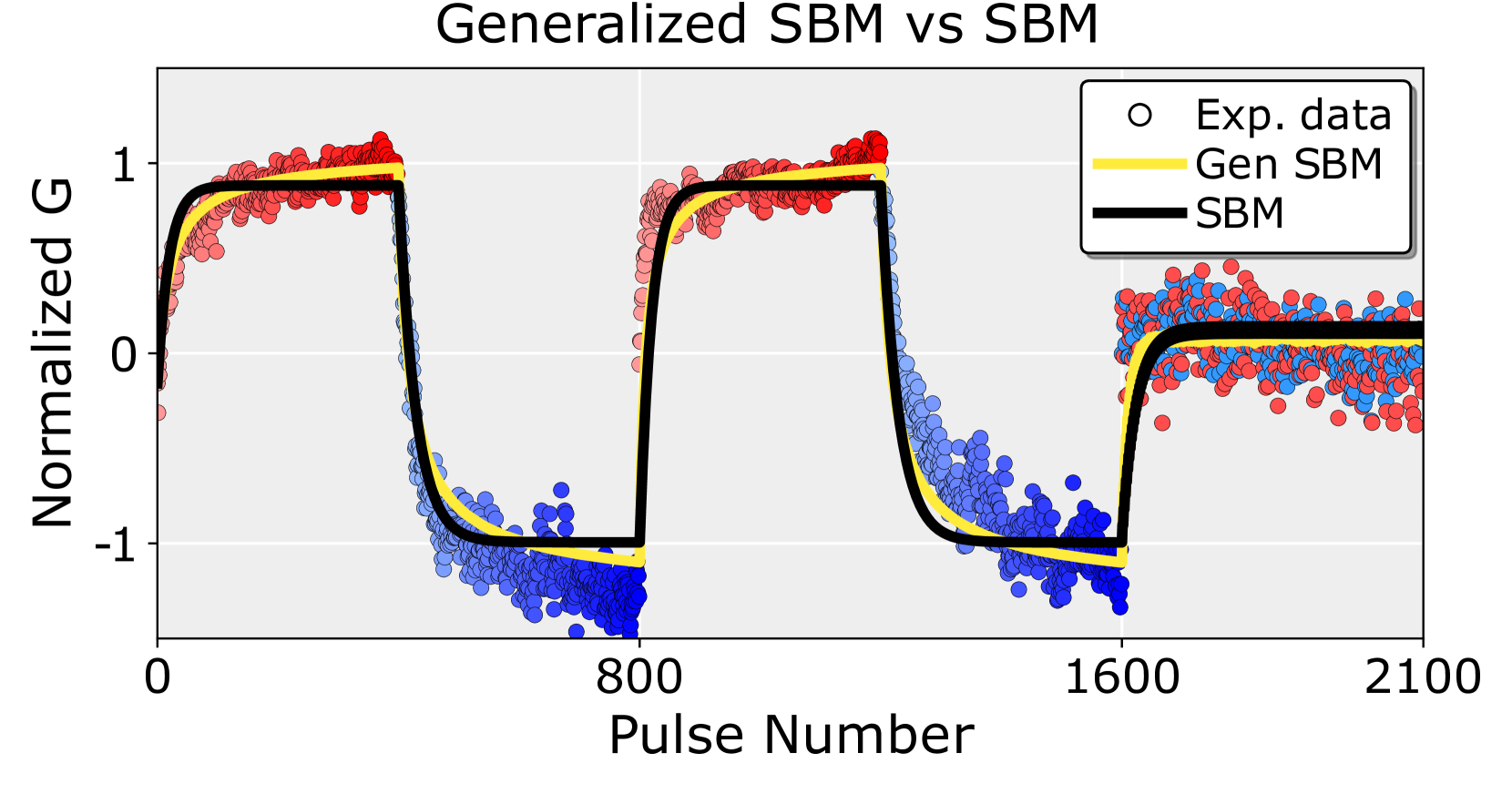
## Chart: Generalized SBM vs SBM
### Overview
This image is a scientific line and scatter plot comparing experimental data to two theoretical models: a "Generalized SBM" (Gen SBM) and a standard "SBM". The chart displays the evolution of a normalized quantity ("G") over a sequence of pulses. The data exhibits a clear, repeating, square-wave-like pattern with two stable states.
### Components/Axes
* **Title:** "Generalized SBM vs SBM" (centered at the top).
* **Y-Axis:**
* **Label:** "Normalized G" (rotated vertically on the left).
* **Scale:** Linear, ranging from approximately -1.3 to +1.3.
* **Major Tick Marks:** -1, 0, 1.
* **X-Axis:**
* **Label:** "Pulse Number" (centered at the bottom).
* **Scale:** Linear, ranging from 0 to 2100.
* **Major Tick Marks:** 0, 800, 1600, 2100.
* **Legend:** Located in the top-right corner of the plot area.
* **Entry 1:** "Exp. data" represented by an open black circle symbol (○).
* **Entry 2:** "Gen SBM" represented by a solid yellow line.
* **Entry 3:** "SBM" represented by a solid black line.
* **Data Series:**
* **Experimental Data (Exp. data):** Plotted as individual circular markers. The markers are colored in two distinct groups: red and blue. The red markers cluster around the high state (~1), and the blue markers cluster around the low state (~-1). The transition regions contain a mix of both colors.
* **Gen SBM Model:** A solid yellow line that follows the central trend of the experimental data points.
* **SBM Model:** A solid black line that also follows the central trend, closely overlapping with the yellow "Gen SBM" line for most of the plot.
### Detailed Analysis
The plot shows three complete cycles of a periodic signal, with a fourth cycle beginning.
1. **Cycle 1 (Pulse Number ~0 to ~800):**
* **Trend:** The signal starts near 0, rapidly rises to a plateau near +1, holds until approximately pulse 400, then rapidly falls to a plateau near -1, holding until pulse 800.
* **Data Points:** Red markers dominate the +1 plateau. Blue markers dominate the -1 plateau. The rising and falling edges show a mix of red and blue markers.
* **Models:** Both the yellow (Gen SBM) and black (SBM) lines trace a sharp, square-wave-like path, rising to ~0.95 and falling to ~-1.05. They are nearly indistinguishable in this cycle.
2. **Cycle 2 (Pulse Number ~800 to ~1600):**
* **Trend:** Identical pattern to Cycle 1: rapid rise to +1 plateau, then rapid fall to -1 plateau.
* **Data Points:** Similar distribution of red (high) and blue (low) markers.
* **Models:** Both models again closely follow the data. The yellow line (Gen SBM) appears to have a slightly smoother transition at the top of the rising edge compared to the black line (SBM).
3. **Cycle 3 (Pulse Number ~1600 to ~2100):**
* **Trend:** The signal rises from -1 but does not reach the previous high of +1. Instead, it plateaus at a lower value, approximately +0.2 to +0.3.
* **Data Points:** The markers in this region are a dense mix of red and blue, indicating higher variance or a different state. They cluster around the new, lower plateau level.
* **Models:** Both models adjust to this new behavior. The yellow (Gen SBM) and black (SBM) lines rise and plateau at approximately +0.15, fitting the central tendency of the noisy data in this region.
### Key Observations
* **Periodic Behavior:** The system demonstrates a clear, repeating, bistable behavior for the first two cycles, switching between normalized G values of ~1 and ~-1.
* **Model Agreement:** Both the "Gen SBM" (yellow) and "SBM" (black) models provide an excellent fit to the experimental data's central trend throughout all cycles, including the anomalous third cycle.
* **Third Cycle Anomaly:** The third cycle breaks the established pattern. The system does not return to the -1 state after pulse 1600 but instead settles at a new, positive, but sub-maximal value (~0.2). The experimental data in this region is notably noisier.
* **Data Color Coding:** The experimental data points are colored red and blue. While not explicitly defined in the legend, the spatial clustering strongly suggests red corresponds to the "high" state (G ~ 1) and blue to the "low" state (G ~ -1). The mixed colors during transitions and in the third cycle indicate regions of instability or state switching.
* **Visual Model Difference:** The primary visual difference between the two models is that the "Gen SBM" (yellow line) appears to have slightly rounded corners at the peaks and troughs compared to the sharper corners of the "SBM" (black line), suggesting it may be a smoothed or generalized version.
### Interpretation
This chart likely presents results from a physics or engineering experiment involving a pulsed system (e.g., a spin system, an optical device, or an electronic circuit) where a measurable quantity "G" is normalized. The "SBM" probably stands for a standard theoretical model (e.g., "Spin Boson Model" or "Standard Behavioral Model").
The data demonstrates that the system can be driven between two stable states (bistability) for a number of cycles. The close fit of both models indicates they successfully capture the fundamental dynamics of this switching behavior.
The critical finding is the **anomaly in the third cycle**. The system's failure to return to the -1 state and its settling at a new, noisier plateau suggests a change in experimental conditions, a degradation effect, or the onset of a new physical regime not accounted for in the initial periodic model. The fact that both models, especially the "Generalized SBM," still approximate the mean of this new state implies they may have parameters flexible enough to describe this alternate behavior, or that the anomaly is a known, modelable effect. The increased noise in the third cycle's data points further supports the idea that the system has entered a less stable or more complex dynamical phase.