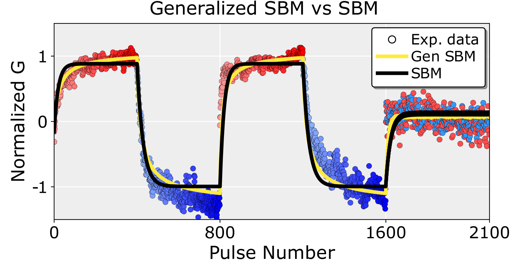
## Chart: Generalized SBM vs SBM
### Overview
The image is a chart comparing the performance of a Standard Binding Model (SBM) and a Generalized SBM against experimental data. The chart plots "Normalized G" on the y-axis against "Pulse Number" on the x-axis. The experimental data is represented by scattered points, while the SBM and Generalized SBM are represented by lines. The experimental data points are colored, transitioning from blue to red as the pulse number increases within each pulse cycle.
### Components/Axes
* **Title:** Generalized SBM vs SBM
* **X-axis:** Pulse Number, with tick marks at 0, 800, 1600, and 2100.
* **Y-axis:** Normalized G, with tick marks at -1, 0, and 1.
* **Legend (Top-Right):**
* Exp. data (represented by open circles)
* Gen SBM (represented by a yellow line)
* SBM (represented by a black line)
### Detailed Analysis
* **Experimental Data (Exp. data):** The experimental data is shown as scattered points. The color of the points transitions from blue to red within each pulse cycle. The data shows a cyclical pattern, with rapid increases and decreases in "Normalized G" corresponding to the pulses.
* From Pulse Number 0 to approximately 400, the data points transition from blue to red as the Normalized G increases from approximately -1 to 1.
* From Pulse Number 400 to approximately 800, the data points transition from red to blue as the Normalized G decreases from approximately 1 to -1.
* From Pulse Number 800 to approximately 1200, the data points transition from blue to red as the Normalized G increases from approximately -1 to 1.
* From Pulse Number 1200 to approximately 1600, the data points transition from red to blue as the Normalized G decreases from approximately 1 to -1.
* From Pulse Number 1600 to 2100, the data points are a mix of red and blue, with the Normalized G fluctuating around 0.
* **Generalized SBM (Gen SBM):** The Generalized SBM is represented by a yellow line. It generally follows the trend of the experimental data, but with smoother transitions.
* From Pulse Number 0 to approximately 400, the yellow line increases from approximately -1 to 1.
* From Pulse Number 400 to approximately 800, the yellow line decreases from approximately 1 to -1.
* From Pulse Number 800 to approximately 1200, the yellow line increases from approximately -1 to 1.
* From Pulse Number 1200 to approximately 1600, the yellow line decreases from approximately 1 to -1.
* From Pulse Number 1600 to 2100, the yellow line fluctuates around 0.
* **SBM:** The SBM is represented by a black line. It shows sharp, step-like changes in "Normalized G".
* From Pulse Number 0 to approximately 400, the black line increases sharply from approximately -1 to 1.
* From Pulse Number 400 to approximately 800, the black line decreases sharply from approximately 1 to -1.
* From Pulse Number 800 to approximately 1200, the black line increases sharply from approximately -1 to 1.
* From Pulse Number 1200 to approximately 1600, the black line decreases sharply from approximately 1 to -1.
* From Pulse Number 1600 to 2100, the black line fluctuates around 0.
### Key Observations
* The experimental data exhibits a cyclical pattern corresponding to the pulses.
* The Generalized SBM provides a smoother approximation of the experimental data compared to the SBM.
* The SBM shows sharp transitions, indicating an idealized, step-like response.
* After pulse number 1600, the experimental data and the models converge around a Normalized G value of approximately 0.
### Interpretation
The chart compares the performance of two models (SBM and Generalized SBM) in predicting experimental data. The Generalized SBM appears to be a better fit for the experimental data, as it captures the smoother transitions observed in the data. The SBM, with its sharp transitions, represents a more idealized model that doesn't fully capture the nuances of the experimental data. The convergence of all three data sets after pulse number 1600 suggests a steady-state condition is reached. The color gradient in the experimental data suggests a time-dependent process within each pulse cycle, which the Generalized SBM captures better than the standard SBM.