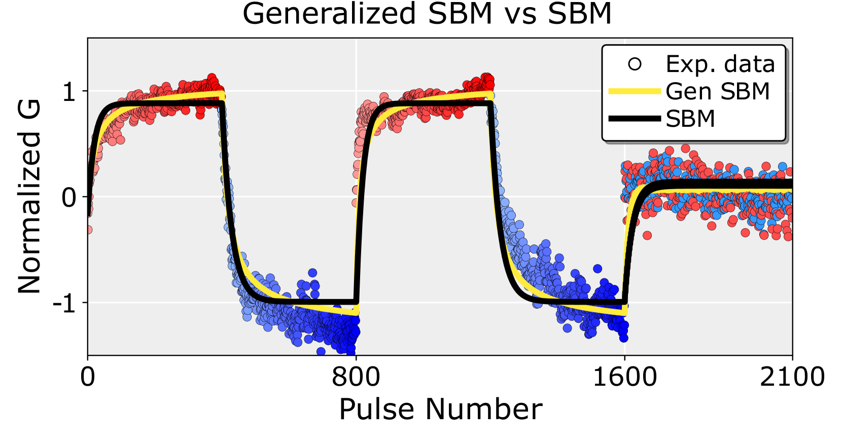
## Line Chart: Generalized SBM vs SBM
### Overview
The image presents a line chart comparing "Generalized SBM" and "SBM" against "Experimental Data" as a function of "Pulse Number". The y-axis represents "Normalized G". The chart displays three distinct curves, each representing one of the aforementioned data sets.
### Components/Axes
* **Title:** "Generalized SBM vs SBM" (centered at the top)
* **X-axis:** "Pulse Number" (ranging from approximately 0 to 2100)
* **Y-axis:** "Normalized G" (ranging from approximately -1.5 to 1.2)
* **Legend:** Located in the top-right corner.
* "Exp. data" (represented by red circles)
* "Gen SBM" (represented by a yellow line)
* "SBM" (represented by a black line)
* **Gridlines:** Light gray vertical gridlines are present throughout the chart.
### Detailed Analysis
The chart shows three curves plotted against Pulse Number.
* **Exp. data (Red Circles):** The data points are scattered, but generally follow a pattern of rapid increase from approximately 0 to 1 around Pulse Number 200, a rapid decrease to approximately -1 around Pulse Number 800, another increase to 1 around Pulse Number 1600, and then a leveling off around 0. The data points are most densely clustered around the transitions between these states.
* Around Pulse Number 200: Normalized G is approximately 1.
* Around Pulse Number 800: Normalized G is approximately -1.
* Around Pulse Number 1600: Normalized G is approximately 1.
* Around Pulse Number 2100: Normalized G is approximately 0.
* **Gen SBM (Yellow Line):** This line exhibits a step-like function. It remains at approximately 1 until Pulse Number 200, then drops sharply to approximately -1 around Pulse Number 800, rises sharply to approximately 1 around Pulse Number 1600, and then remains relatively stable around 0.
* From 0 to 200: Normalized G is approximately 1.
* From 200 to 800: Normalized G drops from 1 to -1.
* From 800 to 1600: Normalized G rises from -1 to 1.
* From 1600 to 2100: Normalized G is approximately 0.
* **SBM (Black Line):** This line also exhibits a step-like function, similar to "Gen SBM", but with a slightly different shape. It remains at approximately 1 until Pulse Number 200, then drops sharply to approximately -1 around Pulse Number 800, rises sharply to approximately 1 around Pulse Number 1600, and then remains relatively stable around 0.
* From 0 to 200: Normalized G is approximately 1.
* From 200 to 800: Normalized G drops from 1 to -1.
* From 800 to 1600: Normalized G rises from -1 to 1.
* From 1600 to 2100: Normalized G is approximately 0.
### Key Observations
* The "Gen SBM" and "SBM" lines are very similar in shape, suggesting that the "Generalized SBM" is a close approximation of the "SBM".
* The "Exp. data" shows more variability and a smoother transition between states compared to the step-like behavior of the models.
* The experimental data appears to lag slightly behind the model predictions, particularly during the transitions.
* The chart shows a repeating pattern, suggesting a cyclical behavior related to the "Pulse Number".
### Interpretation
The chart compares a model ("SBM" and "Generalized SBM") to experimental data ("Exp. data"). The "Normalized G" value appears to represent a state variable that oscillates between approximately -1 and 1 in response to the "Pulse Number". The models attempt to capture this behavior, and the chart demonstrates how well they align with the experimental observations. The differences between the models and the experimental data suggest that the models may not fully capture the complexity of the underlying system. The smoother transitions in the experimental data indicate that the state changes are not instantaneous, as assumed by the step-like models. The repeating pattern suggests that the system is driven by a periodic input (the "Pulse"). The slight lag in the experimental data could be due to measurement delays or inherent system response times. The chart is a validation of the model against real-world data, and highlights areas where the model could be improved.