## Line Chart: Function 'f' vs. Alpha 'α'
### Overview
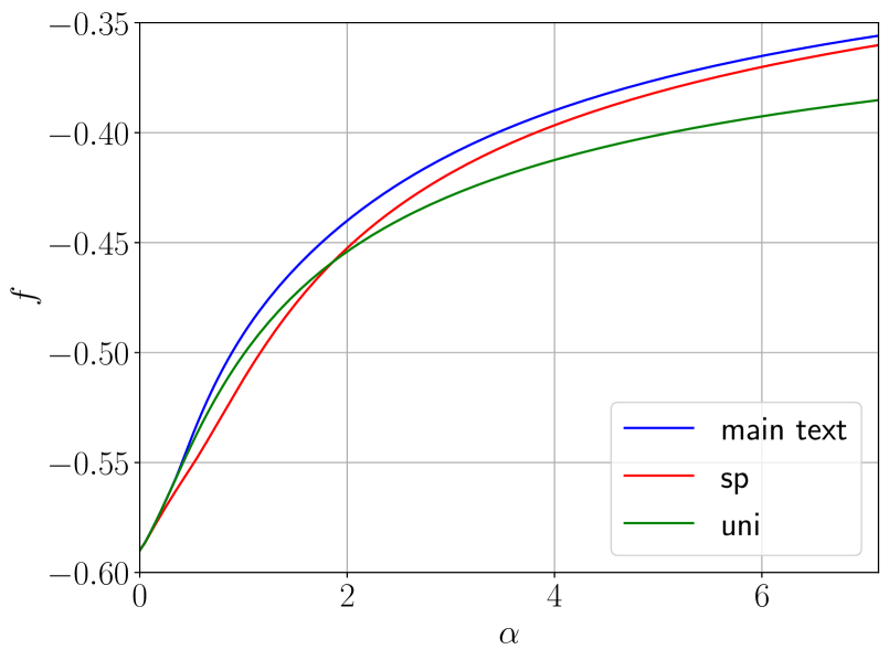
The image presents a line chart illustrating the relationship between a function 'f' (on the y-axis) and a parameter 'α' (alpha, on the x-axis). Three distinct lines are plotted, each representing a different condition or variable: "main text", "sp", and "uni". The chart displays how the function 'f' changes as 'α' varies from approximately 0 to 6.
### Components/Axes
* **X-axis:** Labeled 'α' (alpha). Scale ranges from approximately 0 to 6, with gridlines at intervals of 2.
* **Y-axis:** Labeled 'f'. Scale ranges from approximately -0.60 to -0.35, with gridlines at intervals of 0.05.
* **Legend:** Located in the top-right corner of the chart. Contains the following entries:
* "main text" - represented by a blue line.
* "sp" - represented by a red line.
* "uni" - represented by a green line.
### Detailed Analysis
* **"main text" (Blue Line):** The line starts at approximately (-0.58, 0) and increases, approaching a plateau around (-0.38, 6). The slope is steepest at the beginning (α = 0) and gradually decreases as α increases.
* (0, -0.58)
* (2, -0.45)
* (4, -0.41)
* (6, -0.38)
* **"sp" (Red Line):** The line begins at approximately (-0.59, 0) and increases, approaching a plateau around (-0.34, 6). It has a similar trend to the "main text" line, but consistently exhibits a higher 'f' value for any given 'α'. The slope is also steepest at the beginning and decreases as α increases.
* (0, -0.59)
* (2, -0.43)
* (4, -0.38)
* (6, -0.34)
* **"uni" (Green Line):** The line starts at approximately (-0.60, 0) and increases, approaching a plateau around (-0.40, 6). It has a similar trend to the other two lines, but consistently exhibits the lowest 'f' value for any given 'α'. The slope is also steepest at the beginning and decreases as α increases.
* (0, -0.60)
* (2, -0.48)
* (4, -0.42)
* (6, -0.40)
### Key Observations
* All three lines exhibit a similar upward trend, indicating that as 'α' increases, 'f' also increases (becomes less negative).
* The "sp" line consistently has the highest 'f' value, followed by "main text", and then "uni". This suggests that the variable represented by "sp" has the greatest impact on increasing 'f'.
* The rate of increase in 'f' decreases as 'α' increases for all three lines, indicating diminishing returns.
* The lines appear to be converging as 'α' approaches 6, suggesting that the differences between the three conditions become less pronounced at higher values of 'α'.
### Interpretation
The chart likely represents the behavior of a system or model where 'α' is a control parameter and 'f' is a performance metric or output. The three lines ("main text", "sp", "uni") could represent different configurations or treatments within the system. The data suggests that increasing 'α' generally improves the performance metric 'f', but the effect is most pronounced at lower values of 'α'. The "sp" configuration consistently outperforms the others, indicating it is the most effective setting. The convergence of the lines at higher 'α' values suggests that the system may be approaching a saturation point, where further increases in 'α' yield diminishing returns. The negative values of 'f' suggest that the metric represents a cost, error, or some other undesirable quantity that is being minimized.