## Line Chart: Comparison of Function f vs. Parameter α for Three Methods
### Overview
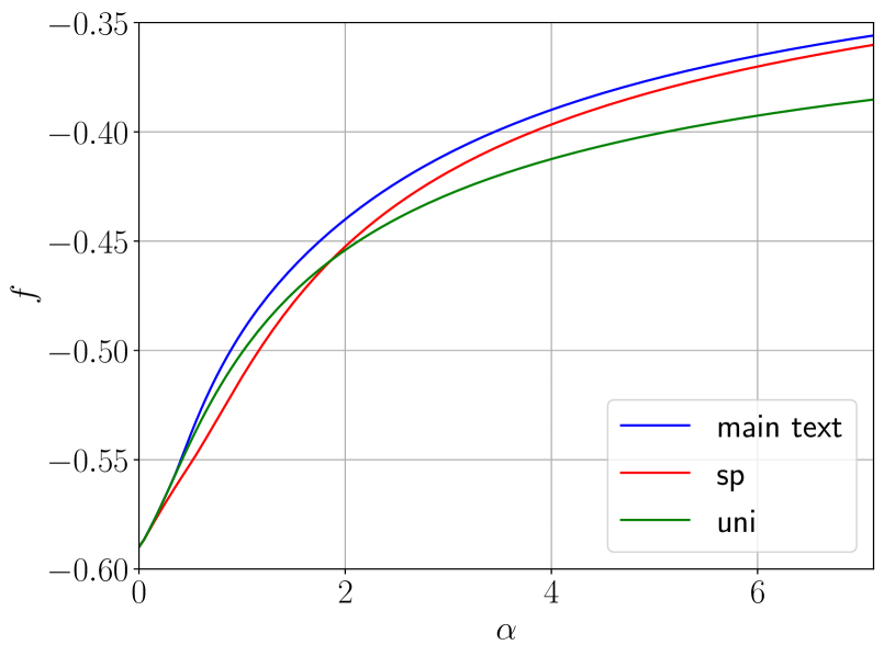
This image is a line chart plotting a function `f` against a parameter `α`. It displays three distinct curves, each representing a different method or dataset labeled "main text", "sp", and "uni". All curves show an increasing, concave-down trend, starting from a common point and diverging as `α` increases.
### Components/Axes
* **X-Axis (Horizontal):**
* **Label:** `α` (Greek letter alpha).
* **Scale:** Linear scale ranging from 0 to approximately 7.
* **Major Tick Marks:** Located at 0, 2, 4, and 6.
* **Y-Axis (Vertical):**
* **Label:** `f`.
* **Scale:** Linear scale ranging from -0.60 to -0.35.
* **Major Tick Marks:** Located at -0.60, -0.55, -0.50, -0.45, -0.40, and -0.35.
* **Legend:**
* **Position:** Bottom-right corner of the chart area.
* **Entries:**
1. **Blue Line:** Labeled "main text".
2. **Red Line:** Labeled "sp".
3. **Green Line:** Labeled "uni".
* **Grid:** A light gray grid is present, with vertical lines at the major x-ticks and horizontal lines at the major y-ticks.
### Detailed Analysis
**Trend Verification:** All three data series exhibit the same fundamental trend: they are monotonically increasing (sloping upward) and concave down (the rate of increase slows as `α` grows). They all originate from the same point at `α=0`.
**Data Series & Approximate Values:**
1. **"main text" (Blue Line):**
* **Trend:** This is the uppermost curve throughout the entire range after `α=0`. It shows the highest values of `f` for any given `α`.
* **Key Points (Approximate):**
* At `α = 0`: `f ≈ -0.59`
* At `α = 2`: `f ≈ -0.45`
* At `α = 4`: `f ≈ -0.40`
* At `α = 6`: `f ≈ -0.37`
* At `α ≈ 7`: `f ≈ -0.355`
2. **"sp" (Red Line):**
* **Trend:** This is the middle curve. It lies below the blue line but above the green line for all `α > 0`.
* **Key Points (Approximate):**
* At `α = 0`: `f ≈ -0.59` (same starting point)
* At `α = 2`: `f ≈ -0.46`
* At `α = 4`: `f ≈ -0.41`
* At `α = 6`: `f ≈ -0.38`
* At `α ≈ 7`: `f ≈ -0.36`
3. **"uni" (Green Line):**
* **Trend:** This is the lowest curve. It diverges downward from the other two most significantly as `α` increases.
* **Key Points (Approximate):**
* At `α = 0`: `f ≈ -0.59` (same starting point)
* At `α = 2`: `f ≈ -0.47`
* At `α = 4`: `f ≈ -0.42`
* At `α = 6`: `f ≈ -0.39`
* At `α ≈ 7`: `f ≈ -0.385`
### Key Observations
* **Common Origin:** All three methods yield an identical value of `f ≈ -0.59` when the parameter `α` is zero.
* **Divergence:** The performance or output (`f`) of the three methods diverges as `α` increases. The "main text" method consistently produces the highest (least negative) `f` value, followed by "sp", with "uni" producing the lowest.
* **Convergence of Slope:** While the absolute values differ, the shapes of the curves are similar, suggesting the underlying relationship between `f` and `α` is of the same functional form for all three methods, differing only in a scaling or offset parameter.
### Interpretation
This chart likely compares the performance or behavior of three different models, algorithms, or theoretical approaches ("main text", "sp", "uni") as a function of a controlling parameter `α`. The function `f` could represent a metric like free energy, a log-likelihood, or an optimization objective where higher (less negative) values are typically better.
The key takeaway is that the method labeled **"main text" outperforms the "sp" and "uni" methods** across the entire tested range of `α > 0`, achieving higher `f` values. The "uni" method shows the poorest performance. The fact that all methods start at the same point suggests they share a common baseline or initial condition, but their response to increasing `α` differs. This could indicate that the "main text" method is more efficient, better optimized, or incorporates a more accurate model of the system being studied. The concave-down shape indicates diminishing returns: increasing `α` continues to improve `f`, but at a progressively slower rate.