## Scatter Plot: Energy vs. Number of Satisfied Clauses
### Overview
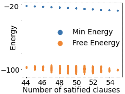
The image is a scatter plot comparing two energy metrics—**Min Energy** (blue dots) and **Free Energy** (orange dots)—across a range of **number of satisfied clauses** (x-axis). The y-axis represents **Energy** values, with both metrics showing distinct trends.
### Components/Axes
- **X-axis**: "Number of satisfied clauses" with ticks at 44, 46, 48, 50, 52, 54.
- **Y-axis**: "Energy" with values ranging from -100 to -20.
- **Legend**:
- **Blue dots**: "Min Energy"
- **Orange dots**: "Free Energy"
- **Spatial Placement**:
- Legend is positioned in the **top-right** corner.
- Blue dots (Min Energy) are clustered near the **top** of the y-axis (around -20).
- Orange dots (Free Energy) are clustered near the **bottom** of the y-axis (around -100).
### Detailed Analysis
- **Min Energy (Blue Dots)**:
- All data points are **approximately -20** with minimal variation.
- Slight downward trend as the number of satisfied clauses increases (e.g., from -20 at 44 to -20 at 54).
- No significant outliers; points are tightly grouped.
- **Free Energy (Orange Dots)**:
- All data points are **approximately -100** with minor fluctuations.
- Slight upward trend (less negative) as the number of satisfied clauses increases (e.g., from -100 at 44 to -100 at 54).
- Some variability in the orange dots (e.g., slight dips around 48–50), but no extreme outliers.
### Key Observations
1. **Min Energy** remains nearly constant across all values of satisfied clauses, hovering around **-20**.
2. **Free Energy** is consistently **lower** (more negative) than Min Energy, averaging around **-100**.
3. Both metrics show **minimal variation** with the number of satisfied clauses, suggesting stability in the system.
4. The **legend** clearly distinguishes the two metrics, with no ambiguity in color coding.
### Interpretation
- The **Min Energy** and **Free Energy** metrics represent different energy states, with Free Energy being significantly lower (more negative) than Min Energy. This could imply that Free Energy is a more favorable or optimized state in the context of the system being analyzed.
- The **stability** of both metrics across the range of satisfied clauses suggests that the system’s energy is relatively insensitive to changes in the number of satisfied clauses.
- The **slight downward trend** in Min Energy and **slight upward trend** in Free Energy may indicate minor adjustments in energy as the system approaches higher clause satisfaction, but these changes are negligible.
- The **lack of outliers** in both datasets suggests a consistent and predictable relationship between the variables.
This plot likely reflects a thermodynamic or optimization scenario where energy states are evaluated against clause satisfaction, with Free Energy serving as a critical metric for system efficiency or stability.