\n
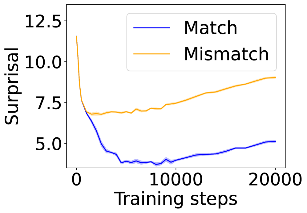
## Line Chart: Surprisal vs. Training Steps
### Overview
The image displays a line chart comparing the "Surprisal" metric over the course of "Training steps" for two distinct conditions: "Match" and "Mismatch." The chart illustrates how the model's performance, as measured by surprisal, evolves during training for these two scenarios.
### Components/Axes
* **Chart Type:** Line chart with two data series.
* **X-Axis:**
* **Label:** "Training steps"
* **Scale:** Linear scale from 0 to 20,000.
* **Major Tick Marks:** 0, 10000, 20000.
* **Y-Axis:**
* **Label:** "Surprisal"
* **Scale:** Linear scale from approximately 4.0 to 13.0.
* **Major Tick Marks:** 5.0, 7.5, 10.0, 12.5.
* **Legend:**
* **Position:** Top-right corner of the plot area.
* **Series 1:** "Match" - represented by a solid blue line.
* **Series 2:** "Mismatch" - represented by a solid orange line.
* **Data Representation:** Each line is accompanied by a semi-transparent shaded area of the same color, likely representing a confidence interval or standard deviation across multiple runs.
### Detailed Analysis
**Trend Verification & Data Points:**
1. **"Match" Series (Blue Line):**
* **Visual Trend:** The line exhibits a sharp, steep decline from the start, followed by a shallow, gradual upward trend.
* **Data Points (Approximate):**
* At Step 0: Surprisal ≈ 12.5
* The line drops rapidly, reaching a minimum value between steps 5,000 and 10,000. The lowest point appears to be around step 7,500, with a Surprisal value of approximately 4.0.
* From step 10,000 onward, the line shows a slow, steady increase.
* At Step 20,000: Surprisal ≈ 5.0
2. **"Mismatch" Series (Orange Line):**
* **Visual Trend:** The line shows an initial decline, followed by a consistent, moderate upward trend for the remainder of the training steps.
* **Data Points (Approximate):**
* At Step 0: Surprisal ≈ 12.5 (similar starting point to the Match series).
* The line declines, but less steeply than the blue line, reaching a local minimum around step 2,500 with a Surprisal of approximately 7.0.
* From step 2,500 onward, the line trends upward with minor fluctuations.
* At Step 10,000: Surprisal ≈ 7.5
* At Step 20,000: Surprisal ≈ 9.0
**Spatial Grounding:** The legend is positioned in the upper right quadrant of the chart, clearly associating the blue line with "Match" and the orange line with "Mismatch." The shaded confidence bands are consistently placed around their respective lines throughout the entire x-axis range.
### Key Observations
1. **Diverging Paths:** While both conditions start at a similar high surprisal level, their trajectories diverge significantly after the initial training phase (approximately step 2,500).
2. **Minimum Points:** The "Match" condition achieves a much lower minimum surprisal (~4.0) compared to the "Mismatch" condition (~7.0).
3. **Post-Minimum Behavior:** After reaching their respective minima, both series show an increase in surprisal as training continues to 20,000 steps. The rate of increase is steeper for the "Mismatch" series.
4. **Final Gap:** By the end of the plotted training (20,000 steps), a substantial gap exists between the two conditions, with "Mismatch" surprisal (~9.0) being significantly higher than "Match" surprisal (~5.0).
### Interpretation
This chart demonstrates a clear performance dichotomy in a model's training process based on data alignment ("Match" vs. "Mismatch").
* **What the data suggests:** The "Surprisal" metric, which typically measures how unexpected or "surprising" data is to a model (lower is better), indicates that the model learns to predict "Match" data much more effectively than "Mismatch" data. The initial steep drop for both suggests rapid early learning. However, the model's ability to minimize surprisal for mismatched data hits a floor early on and then deteriorates, while it continues to optimize for matched data to a much greater degree.
* **How elements relate:** The x-axis (Training steps) is the independent variable, showing the progression of the learning process. The y-axis (Surprisal) is the dependent performance metric. The two lines represent contrasting experimental conditions. The divergence implies that the nature of the training data (matched vs. mismatched) has a profound and lasting impact on the model's learned representations and predictive performance.
* **Notable trends/anomalies:** The most notable trend is the sustained increase in surprisal for the "Mismatch" condition after step 2,500. This could indicate **overfitting to the training distribution**—the model becomes increasingly specialized on the "matched" type of data it sees during training, causing its performance on "mismatched" data to worsen over time. The slight rise in the "Match" curve after its minimum might also suggest the onset of overfitting or a change in the training dynamics at later stages. The chart provides strong visual evidence that data congruence is critical for this model's learning efficiency and final performance.