\n
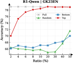
## Line Chart: Accuracy vs. Ratio for Different Data Selection Methods
### Overview
The image presents a line chart comparing the accuracy of a model under different data selection ratios, specifically for "Full", "Bottom", "Random", and "Top" data subsets. The chart is titled "R1-Qwen | GK23EN" at the top center. The x-axis represents the "Ratio (%)" and the y-axis represents "Accuracy (%)".
### Components/Axes
* **Title:** R1-Qwen | GK23EN
* **X-axis Label:** Ratio (%)
* Scale: 2, 4, 6, 8, 10, 20, 30, 40, 50
* **Y-axis Label:** Accuracy (%)
* Scale: 66, 68, 70, 72, 74, 76, 78, 80
* **Legend:** Located in the top-right corner.
* Full: Grey dashed line with 'x' markers
* Bottom: Blue line with diamond markers
* Random: Green line with triangle markers
* Top: Red line with circle markers
### Detailed Analysis
* **Full (Grey):** The "Full" data line is relatively flat, starting at approximately 79% accuracy at Ratio 2% and remaining around 79% up to Ratio 50%.
* **Bottom (Blue):** The "Bottom" data line shows a slight upward trend. It begins at approximately 66.5% accuracy at Ratio 2%, increases to around 68.5% at Ratio 20%, and then rises to approximately 70.5% at Ratio 50%.
* **Random (Green):** The "Random" data line exhibits a decreasing trend from Ratio 2% to Ratio 20%, starting at approximately 66.5% and decreasing to around 65%. It then increases sharply from Ratio 20% to Ratio 50%, reaching approximately 72% accuracy.
* **Top (Red):** The "Top" data line shows a strong upward trend from Ratio 2% to Ratio 8%, increasing from approximately 70% to 78.5%. It then plateaus, remaining around 78.5% to 79% from Ratio 8% to Ratio 50%.
**Data Points (Approximate):**
| Ratio (%) | Full (%) | Bottom (%) | Random (%) | Top (%) |
|---|---|---|---|---|
| 2 | 79 | 66.5 | 66.5 | 70 |
| 4 | 79 | 67 | 66 | 76 |
| 6 | 79 | 67.5 | 66 | 78 |
| 8 | 79 | 68 | 66.5 | 78.5 |
| 10 | 79 | 68 | 65.5 | 78.5 |
| 20 | 79 | 68.5 | 65 | 78.5 |
| 30 | 79 | 68.5 | 66 | 78.5 |
| 40 | 79 | 69 | 69 | 78.5 |
| 50 | 79 | 70.5 | 72 | 78.5 |
### Key Observations
* The "Top" data selection consistently yields the highest accuracy, especially at lower ratios.
* The "Full" data provides a stable, high level of accuracy.
* The "Random" data selection performs the worst initially but shows a significant increase in accuracy at higher ratios.
* The "Bottom" data selection shows a modest improvement in accuracy as the ratio increases.
### Interpretation
The chart demonstrates the impact of different data selection strategies on model accuracy. Selecting the "Top" data (presumably the most informative samples) leads to the best performance, particularly when only a small portion of the data is used. Using the "Full" dataset provides a consistently high accuracy, suggesting that all data contributes positively. The "Random" selection is initially less effective but improves with a larger ratio, indicating that even random samples can be valuable when sufficient data is available. The "Bottom" data selection shows the least improvement, suggesting that the least informative samples contribute little to the model's performance. The plateauing of the "Top" and "Full" lines suggests diminishing returns as the ratio approaches 100%. This data suggests a strategy of prioritizing the most informative data samples ("Top") can be highly effective, especially when computational resources or data availability are limited.