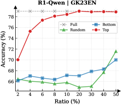
## Line Chart: R1-Qwen | GK23EN Accuracy vs. Ratio
### Overview
The chart compares the accuracy performance of four different configurations (Full, Bottom, Random, Top) across varying ratios (2% to 50%). Accuracy is measured on the y-axis (66%–78%), while the x-axis represents the ratio percentage. The legend is positioned at the top-right corner, with distinct line styles and markers for each configuration.
### Components/Axes
- **X-axis (Ratio %)**: Labeled "Ratio (%)", with ticks at 2, 4, 6, 8, 10, 20, 30, 40, 50.
- **Y-axis (Accuracy %)**: Labeled "Accuracy (%)", with ticks at 66, 68, 70, 72, 74, 76, 78.
- **Legend**: Located at the top-right, with:
- **Full**: Gray dashed line (flat line at ~78%).
- **Bottom**: Blue squares (line starts at ~66%, rises to ~70% by 50%).
- **Random**: Green triangles (line fluctuates between ~65%–67%, spikes to ~72% at 50%).
- **Top**: Red circles (line starts at ~70%, rises sharply to ~78% by 8%, then plateaus).
### Detailed Analysis
1. **Top (Red Circles)**:
- Starts at ~70% accuracy at 2% ratio.
- Sharp upward trend to ~78% by 8% ratio.
- Plateaus at ~78% from 8% to 50% ratio.
- **Key Trend**: Highest accuracy, with diminishing returns after 8%.
2. **Full (Gray Dashed Line)**:
- Flat line at ~78% accuracy across all ratios.
- **Key Trend**: Consistent performance, unaffected by ratio changes.
3. **Bottom (Blue Squares)**:
- Starts at ~66% at 2% ratio.
- Gradual increase to ~70% by 50% ratio.
- **Key Trend**: Slow, linear improvement with ratio.
4. **Random (Green Triangles)**:
- Fluctuates between ~65%–67% for ratios 2%–40%.
- Sharp spike to ~72% at 50% ratio.
- **Key Trend**: Unstable performance until 50%, where accuracy jumps abruptly.
### Key Observations
- **Top Configuration**: Dominates in accuracy, achieving ~78% with minimal ratio (8%).
- **Full Configuration**: Matches Top’s peak accuracy but maintains it consistently.
- **Random Configuration**: Exhibits erratic behavior, with a significant outlier at 50%.
- **Bottom Configuration**: Shows steady but suboptimal improvement.
### Interpretation
The data suggests that the **Top** and **Full** configurations are the most effective, with Top achieving peak accuracy at lower ratios and Full maintaining stability. The **Random** configuration’s abrupt spike at 50% may indicate a threshold effect or data anomaly, as its performance is otherwise inconsistent. The **Bottom** configuration demonstrates gradual improvement but remains the least accurate overall. The chart highlights the importance of ratio optimization for Top and Full configurations, while Random’s performance requires further investigation to determine reliability.