## Scatter Plot: KMT-2017-BLG-1194
### Overview
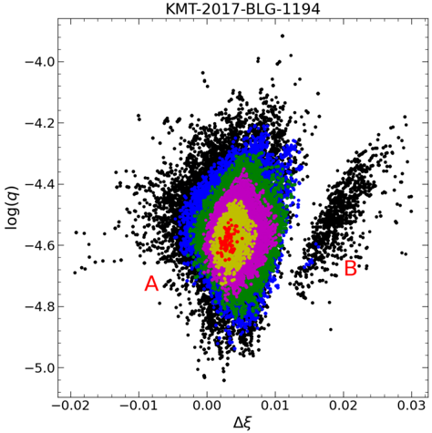
The image is a scatter plot showing the relationship between log(q) and Δξ. The plot displays a dense cluster of points, with different colored regions indicating varying densities or confidence levels. There are two distinct clusters, labeled A and B.
### Components/Axes
* **Title:** KMT-2017-BLG-1194
* **X-axis:** Δξ, ranging from approximately -0.02 to 0.03. Axis markers are present at -0.02, -0.01, 0.00, 0.01, 0.02, and 0.03.
* **Y-axis:** log(q), ranging from approximately -5.0 to -4.0. Axis markers are present at -5.0, -4.8, -4.6, -4.4, -4.2, and -4.0.
* **Data Points:** The plot contains a high density of data points, primarily concentrated in two clusters. The main cluster is centered around (0, -4.5), and a smaller cluster is located around (0.02, -4.6).
* **Colored Regions:** Concentric regions of different colors (red, yellow, magenta, green, blue) surround the main cluster, indicating varying densities or confidence levels. The red region is the most concentrated, followed by yellow, magenta, green, and blue.
### Detailed Analysis
* **Cluster A:** Located at approximately (-0.01, -4.75). This point lies outside the main cluster.
* **Cluster B:** Located at approximately (0.02, -4.65). This is a smaller, distinct cluster separate from the main concentration.
* **Red Region:** The innermost region, centered around (0, -4.55), represents the highest density of data points.
* **Yellow Region:** Surrounds the red region, indicating a slightly lower density.
* **Magenta Region:** Surrounds the yellow region, indicating a further decrease in density.
* **Green Region:** Surrounds the magenta region, indicating a lower density than the magenta region.
* **Blue Region:** The outermost colored region, indicating the lowest density among the colored regions.
* **Black Data Points:** The black data points form the outer layer of the main cluster and also constitute the entirety of cluster B.
### Key Observations
* The data points are heavily concentrated in the main cluster, with density decreasing outwards from the center.
* Cluster B is a distinct, smaller cluster located away from the main concentration.
* The colored regions provide a visual representation of the density distribution within the main cluster.
### Interpretation
The scatter plot likely represents the results of a simulation or experiment, where log(q) and Δξ are two parameters being investigated. The high density of points in the central cluster suggests a strong correlation or convergence of results around those values. The colored regions could represent confidence intervals or probability densities, with the red region indicating the most likely values. Cluster B might represent a secondary solution or a different mode of behavior in the system being studied. The labels A and B likely highlight specific points of interest or outliers within the data.