\n
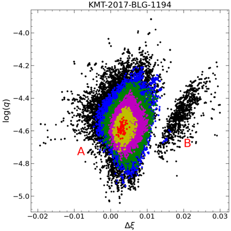
## Scatter Plot: KMT-2017-BLG-1194
### Overview
The image presents a scatter plot displaying the relationship between Δξ (Delta Xi) and log(q). The plot appears to represent data from microlensing event KMT-2017-BLG-1194. The data points are densely clustered in a central region, with sparser points extending outwards, particularly towards the right. The plot uses color to indicate density of points. Two points, labeled 'A' and 'B', are highlighted in red.
### Components/Axes
* **Title:** KMT-2017-BLG-1194 (Top-center)
* **X-axis:** Δξ (Delta Xi) - Ranges approximately from -0.02 to 0.03.
* **Y-axis:** log(q) - Ranges approximately from -5.0 to -4.0.
* **Data Points:** Black dots representing individual data points.
* **Color Gradient:** A color gradient is used to represent the density of data points, ranging from dark blue (highest density) to green, pink/magenta, and finally to black (lowest density).
* **Labels:** 'A' and 'B' are red labels marking specific data points.
### Detailed Analysis
The data points are concentrated around Δξ ≈ 0. The density of points decreases as Δξ moves away from zero in either direction. The Y-axis, log(q), shows a wider distribution, with a concentration of points around log(q) ≈ -4.5.
* **Point A:** Located at approximately Δξ ≈ -0.005 and log(q) ≈ -4.7. It is within the high-density region (dark blue/green).
* **Point B:** Located at approximately Δξ ≈ 0.015 and log(q) ≈ -4.6. It is also within the high-density region (dark blue/green).
The color gradient indicates the following:
* **Dark Blue:** Highest density of points, centered around Δξ ≈ 0 and log(q) ≈ -4.5.
* **Green:** Medium-high density, surrounding the dark blue region.
* **Pink/Magenta:** Medium density, extending outwards from the green region.
* **Black:** Lowest density, representing sparse data points.
The data exhibits a roughly elliptical shape, elongated along the Δξ axis. The highest concentration of points forms a central, dense core.
### Key Observations
* The data is heavily concentrated around Δξ = 0, suggesting a strong preference for this value.
* The distribution of log(q) is broader, indicating a wider range of possible values.
* Points A and B are located within the high-density region, suggesting they are representative of the main population.
* The color gradient effectively visualizes the density of data points, highlighting the central concentration.
### Interpretation
This scatter plot likely represents the results of a microlensing event analysis. Δξ and log(q) are parameters related to the alignment and mass ratio of the lensing system. The concentration of points around Δξ = 0 suggests a near-perfect alignment between the source, lens, and observer. The distribution of log(q) provides information about the mass ratio of the lens and source stars.
The elliptical shape of the distribution could be due to observational biases or intrinsic properties of the lensing system. The highlighted points A and B may represent particularly interesting or significant data points within the event, potentially corresponding to specific features of the light curve. The color gradient is a useful tool for identifying regions of high and low data density, which can help to identify potential anomalies or outliers.
The plot demonstrates the characteristics of a microlensing event, where the bending of light from a distant source star by the gravity of a foreground lens star creates a temporary brightening of the source. The parameters Δξ and log(q) are crucial for characterizing the lensing event and inferring the properties of the lens star.