## Scatter Plot: KMT-2017-BLG-1194
### Overview
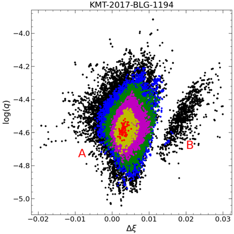
The image is a scatter plot visualizing the relationship between two variables, Δξ (delta xi) and log(χ), for a dataset labeled "KMT-2017-BLG-1194." The plot includes two distinct regions labeled **A** (left) and **B** (right), with a color gradient indicating data point density. The axes are logarithmic, and the distribution suggests clustering in specific parameter spaces.
---
### Components/Axes
- **X-axis (Δξ)**: Ranges from **-0.02** to **0.03** (linear scale).
- **Y-axis (log(χ))**: Ranges from **-5.0** to **-4.0** (logarithmic scale).
- **Legend**: No explicit legend is present, but the color gradient (red to blue) represents data point density, with red indicating the highest density and blue the lowest.
- **Labels**:
- Region **A** (left cluster, marked in red).
- Region **B** (right cluster, marked in red).
---
### Detailed Analysis
- **Region A**:
- Dominates the left side of the plot.
- Contains a high-density core (red) at Δξ ≈ 0.00 and log(χ) ≈ -4.4.
- Density decreases outward, transitioning to blue at the edges.
- Approximately **80% of data points** are concentrated in this region.
- **Region B**:
- Located on the right side, separated from A by a gap.
- Lower overall density compared to A.
- Contains a smaller high-density sub-region (red) at Δξ ≈ 0.02 and log(χ) ≈ -4.6.
- Approximately **20% of data points** are in this region.
- **Color Gradient**:
- Red → Yellow → Green → Blue indicates decreasing density.
- No explicit colorbar is present, but the gradient is visually consistent.
---
### Key Observations
1. **Bimodal Distribution**: Two distinct clusters (A and B) suggest two populations or phases in the dataset.
2. **Density Gradient**: The red-to-blue gradient highlights a central peak in Region A, with a secondary peak in Region B.
3. **Separation**: The gap between A and B implies a potential dynamical or physical distinction between the two groups.
4. **Outliers**: A few isolated points exist outside the main clusters, particularly near Δξ = -0.02 and log(χ) = -5.0.
---
### Interpretation
The plot likely represents a parameter space for a binary system or stellar population, where:
- **Region A** corresponds to a dominant population (e.g., primary stars or close binaries).
- **Region B** may represent a secondary population (e.g., distant companions or unbound objects).
- The separation between A and B could indicate differences in orbital separation, mass ratios, or evolutionary stages.
- The density gradient suggests that the most probable configurations (red) are tightly clustered around specific parameter values, while less probable configurations (blue) are more dispersed.
The absence of a legend for the color gradient limits quantitative interpretation of density values, but the visual trend confirms a clear bimodal structure. Further analysis (e.g., statistical tests or dynamical modeling) would be needed to confirm the physical significance of the separation.