## Line Chart with Multiple Curves: LLM Loss vs. Compute
### Overview
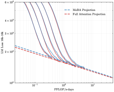
The image is a technical line chart plotted on a log-log scale. It compares the scaling behavior of two different projection methods for Large Language Models (LLMs) as a function of computational resources. The chart shows multiple solid-line curves, each representing a different model configuration or size, alongside two dashed-line trend projections.
### Components/Axes
* **Chart Type:** Line chart with multiple series on a log-log scale.
* **X-Axis:**
* **Label:** `PFLOP/s-days`
* **Scale:** Logarithmic (base 10).
* **Range:** Approximately from `10^-1` (0.1) to `10^1` (10).
* **Major Tick Marks:** Visible at `10^-1`, `10^0` (1), and `10^1`.
* **Y-Axis:**
* **Label:** `LLM Loss (diff-16k)`
* **Scale:** Logarithmic (base 10).
* **Range:** Approximately from `10^0` (1) to `6 x 10^2` (600).
* **Major Tick Marks:** Visible at `10^0`, `2 x 10^2`, `3 x 10^2`, `4 x 10^2`, and `6 x 10^2`.
* **Legend:**
* **Position:** Top-right corner of the plot area.
* **Items:**
1. `MoBA Projection` - Represented by a blue dashed line (`--`).
2. `Full Attention Projection` - Represented by a red dashed line (`--`).
* **Data Series (Solid Lines):** There are approximately 7-8 distinct solid curves in various colors (dark blue, purple, magenta, etc.). These are not individually labeled in the legend. They all follow a similar pattern: starting at high loss values on the left (low compute) and decreasing as they move to the right (higher compute).
### Detailed Analysis
* **Trend Verification:**
* **Solid Curves (All):** Each solid curve slopes steeply downward from left to right, indicating that LLM loss decreases significantly as the computational budget (PFLOP/s-days) increases. The curves are roughly parallel in their steep descent phase.
* **MoBA Projection (Blue Dashed Line):** This line has a shallow, consistent downward slope across the entire x-axis range. It starts at a loss value of approximately `2.2 x 10^2` at `10^-1` PFLOP/s-days and ends near `1.2 x 10^0` at `10^1` PFLOP/s-days.
* **Full Attention Projection (Red Dashed Line):** This line also slopes downward but is positioned slightly below the MoBA line for most of the chart. It starts at a loss value of approximately `2.0 x 10^2` at `10^-1` PFLOP/s-days and converges with the MoBA line near `1.2 x 10^0` at `10^1` PFLOP/s-days.
* **Data Point Relationships:**
* The solid curves appear to represent actual model training runs or more detailed scaling laws. They descend much more steeply than the two dashed projection lines.
* All solid curves intersect and merge with the dashed projection lines in the region between `10^0` (1) and `10^1` (10) PFLOP/s-days. This suggests the projections model the asymptotic behavior at high compute.
* At the lowest compute (`~10^-1`), the solid curves show a wide spread of loss values, from roughly `2.5 x 10^2` to over `6 x 10^2`. This spread narrows dramatically as compute increases.
### Key Observations
1. **Steep Initial Descent:** The primary solid curves show a very strong scaling relationship: small increases in compute at the low end yield massive reductions in loss.
2. **Convergence at High Compute:** All data series, both solid and dashed, converge to a very similar loss value (approximately `1.2`) at the highest compute level shown (`10^1` PFLOP/s-days). This indicates diminishing returns; adding more compute beyond this point yields smaller improvements.
3. **Projection Comparison:** The `Full Attention Projection` (red dashed) consistently predicts a slightly lower loss than the `MoBA Projection` (blue dashed) for the same compute budget, until they converge at the far right.
4. **Lack of Series Labels:** The individual solid curves are not labeled, making it impossible to determine what specific variable (e.g., model size, data size, architecture variant) they represent without external context.
### Interpretation
This chart is a **scaling law analysis** for LLMs. It visually answers the question: "How does model performance (measured by loss) improve as we allocate more computational resources?"
* **What the data suggests:** The steep solid curves demonstrate the "classical" scaling regime where performance improves rapidly with compute. The dashed lines represent projected scaling laws, likely extrapolated from a smaller set of data points. The convergence suggests a fundamental limit or a point of severe diminishing returns for the given model family and training setup.
* **Relationship between elements:** The solid lines are the empirical data or high-fidelity simulations. The dashed lines are simplified, predictive models of that data. The chart's purpose is to validate these projection methods (MoBA vs. Full Attention) by showing how well they match the trend of the solid curves, especially in the high-compute extrapolation region.
* **Notable Anomaly/Insight:** The most significant insight is the **dramatic change in scaling efficiency**. The slope of the solid curves is much steeper than the slope of the dashed projections at low compute. This implies that the simple power-law projected by the dashed lines does not fully capture the dynamics at lower compute budgets, where other factors may be dominant. The projections become accurate only in the high-compute, low-loss asymptotic regime.
* **Peircean Investigation:** The chart is an **abductive** reasoning tool. It presents observed data (solid lines) and competing explanatory models (dashed projections). The viewer is meant to infer which projection better explains the observed trend and can be trusted for future predictions. The `Full Attention Projection` appears to be a marginally better fit (slightly lower loss) across the range before convergence. The lack of labels on the solid lines is a critical gap, preventing a full understanding of what is being scaled.