## Line Chart: Power and Clock Frequency Over Time
### Overview
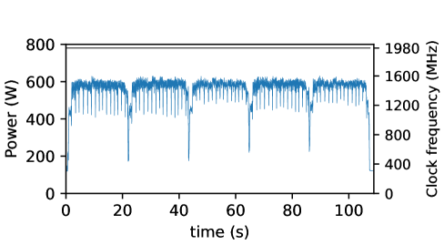
The image depicts a dual-axis line chart showing two time-series datasets: **Power (W)** and **Clock frequency (MHz)**. The x-axis represents time (0–100 seconds), while the left y-axis (Power) ranges from 0–800 W, and the right y-axis (Clock frequency) ranges from 0–1980 MHz. Two blue lines are plotted: one for Power (left axis) and one for Clock frequency (right axis).
---
### Components/Axes
- **X-axis**: Time (s), linear scale from 0 to 100 seconds.
- **Left Y-axis**: Power (W), linear scale from 0 to 800 W.
- **Right Y-axis**: Clock frequency (MHz), linear scale from 0 to 1980 MHz.
- **Lines**:
- **Power (W)**: Solid blue line with periodic sharp drops.
- **Clock frequency (MHz)**: Dashed blue line with a single sharp drop at the end.
---
### Detailed Analysis
1. **Power (W)**:
- Baseline: ~600 W (stable between 0–100 s).
- Periodic drops: Occur at ~20, 40, 60, 80, and 100 seconds, with power plummeting to ~200 W before recovering.
- Uncertainty: Drops are abrupt (~100 W/sec) but precise in timing.
2. **Clock frequency (MHz)**:
- Baseline: ~1600 MHz (stable between 0–95 s).
- Final drop: At ~100 seconds, frequency collapses from ~1600 MHz to ~400 MHz.
- Uncertainty: Drop is instantaneous (~1200 MHz/sec).
---
### Key Observations
- **Periodic Power Drops**: Regular intervals (every ~20 s) suggest cyclical events (e.g., sensor readings, system checks).
- **Final Clock Frequency Collapse**: A single catastrophic drop at the end of the timeline, unrelated to earlier Power fluctuations.
- **Divergent Behavior**: Power and Clock frequency trends are mostly independent except for the final synchronized drop at 100 s.
---
### Interpretation
1. **Power Drops**:
- Likely represent transient events (e.g., voltage regulation, load switching) causing temporary power spikes/drops. The regularity implies a controlled or repetitive process.
2. **Clock Frequency Collapse**:
- The abrupt frequency drop at 100 s may indicate a system failure (e.g., thermal shutdown, power loss) or intentional shutdown sequence. Its independence from earlier Power fluctuations suggests a separate failure mode.
3. **System Relationship**:
- While Power and Clock frequency are decoupled for most of the timeline, their synchronized drop at 100 s implies a shared dependency on a critical system component (e.g., power supply failure).
4. **Anomalies**:
- The Clock frequency drop at 100 s is an outlier compared to its stability earlier. This could signal a boundary condition (e.g., end of test, system reset).
---
### Conclusion
The chart reveals a system operating under periodic stress (Power drops) but maintaining stable performance (Clock frequency) until a critical failure at 100 s. The dual-axis visualization highlights the interplay between power management and clock stability, with the final collapse suggesting a systemic vulnerability.