## Bar Chart: Overlap Ratio vs. Percentage
### Overview
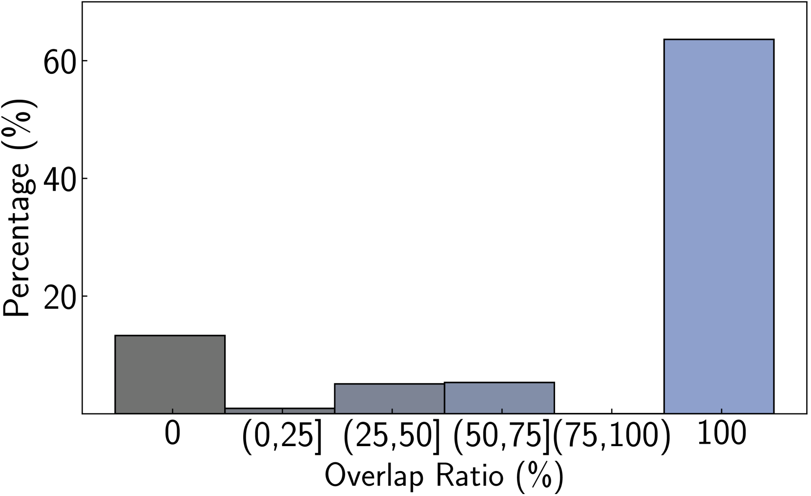
The image is a bar chart showing the relationship between "Overlap Ratio (%)" on the x-axis and "Percentage (%)" on the y-axis. The chart displays the distribution of data across different overlap ratio intervals.
### Components/Axes
* **X-axis:** "Overlap Ratio (%)" with categories: 0, (0,25], (25,50], (50,75], (75,100], 100
* **Y-axis:** "Percentage (%)" with a scale from 0 to 60, marked at intervals of 20 (0, 20, 40, 60).
### Detailed Analysis
* **Category 0:** The bar is dark gray and reaches approximately 13% on the y-axis.
* **Category (0,25]:** The bar is a lighter shade of gray and reaches approximately 2% on the y-axis.
* **Category (25,50]:** The bar is a lighter shade of gray and reaches approximately 6% on the y-axis.
* **Category (50,75]:** The bar is a lighter shade of gray and reaches approximately 6% on the y-axis.
* **Category (75,100]:** There is no bar for this category, implying a percentage of 0%.
* **Category 100:** The bar is light blue and reaches approximately 63% on the y-axis.
### Key Observations
* The percentage is highest when the overlap ratio is 100%.
* The percentage is relatively high when the overlap ratio is 0%.
* The percentages for overlap ratios between (0,25], (25,50], and (50,75] are very low.
* There is no data for the overlap ratio between (75,100].
### Interpretation
The bar chart indicates that the data is heavily skewed towards two extremes: either there is no overlap (0% overlap ratio), or there is a complete overlap (100% overlap ratio). The low percentages for the intermediate overlap ratios suggest that partial overlaps are rare in the dataset represented by this chart. The high percentage at 100% overlap ratio suggests that complete overlaps are the most common scenario.