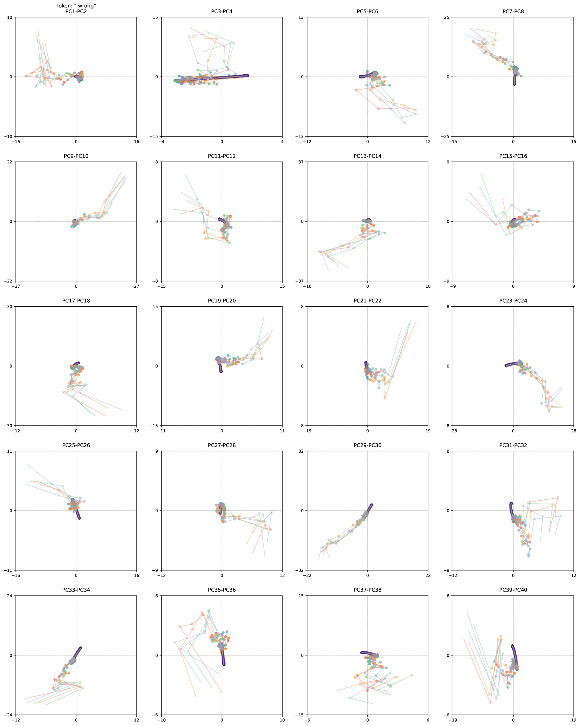
## Scatter Plot Grid: Principal Component Analysis of "wrong" Token
### Overview
The image presents a grid of 20 scatter plots, each displaying the relationship between two principal components (PCs). The plots are arranged in a 4x5 grid. Each plot shows multiple data series, represented by lines connecting data points. The data points are colored, but there is no explicit legend provided to define what each color represents. The plots appear to show the trajectory of data points in the PC space.
### Components/Axes
Each scatter plot has the following characteristics:
* **Title:** Each plot is titled with the corresponding PC pair (e.g., "PC1-PC2", "PC3-PC4", etc.). The overall title is "Token: 'wrong'".
* **Axes:** Each plot has an x-axis and a y-axis, representing the two PCs in the title.
* **Axis Labels:** The axes are not explicitly labeled with units or descriptions.
* **Axis Scales:** The scales vary between plots, but each axis has tick marks and numerical values.
* **Data Series:** Each plot contains multiple data series, represented by lines connecting data points. The lines are colored in shades of blue, green, and orange.
* **Gridlines:** Each plot has dashed gridlines at zero on both axes.
Here's a breakdown of the axes ranges for each plot:
* **PC1-PC2:** x-axis: -16 to 16, y-axis: -10 to 10
* **PC3-PC4:** x-axis: -4 to 4, y-axis: -15 to 15
* **PC5-PC6:** x-axis: -12 to 12, y-axis: -13 to 13
* **PC7-PC8:** x-axis: -15 to 15, y-axis: -25 to 25
* **PC9-PC10:** x-axis: -27 to 27, y-axis: -22 to 22
* **PC11-PC12:** x-axis: -15 to 15, y-axis: -8 to 8
* **PC13-PC14:** x-axis: -10 to 10, y-axis: -37 to 37
* **PC15-PC16:** x-axis: -9 to 9, y-axis: -9 to 9
* **PC17-PC18:** x-axis: -12 to 12, y-axis: -30 to 30
* **PC19-PC20:** x-axis: -11 to 11, y-axis: -15 to 15
* **PC21-PC22:** x-axis: -19 to 19, y-axis: -8 to 8
* **PC23-PC24:** x-axis: -28 to 28, y-axis: -9 to 9
* **PC25-PC26:** x-axis: -16 to 16, y-axis: -11 to 11
* **PC27-PC28:** x-axis: -9 to 9, y-axis: -8 to 8
* **PC29-PC30:** x-axis: -16 to 16, y-axis: -32 to 32
* **PC31-PC32:** x-axis: -12 to 12, y-axis: -8 to 8
* **PC33-PC34:** x-axis: -12 to 12, y-axis: -24 to 24
* **PC35-PC36:** x-axis: -10 to 10, y-axis: -6 to 6
* **PC37-PC38:** x-axis: -6 to 6, y-axis: -15 to 15
* **PC39-PC40:** x-axis: -19 to 19, y-axis: -6 to 6
### Detailed Analysis
Each plot shows the relationship between two principal components. The data points are connected by lines, suggesting a temporal sequence or trajectory. The colors of the lines vary, but without a legend, it's impossible to determine what each color represents.
**Observations for specific plots:**
* **PC1-PC2:** Data points cluster near the origin (0,0).
* **PC3-PC4:** A dark purple/blue line segment is present, indicating a strong movement along a specific trajectory.
* **PC5-PC6:** Similar to PC1-PC2, data points cluster near the origin.
* **PC7-PC8:** A dark purple/blue line segment is present, indicating a strong movement along a specific trajectory.
* **PC9-PC10:** Data points spread out more, with some trajectories moving away from the origin.
* **PC11-PC12:** A dark purple/blue line segment is present, indicating a strong movement along a specific trajectory.
* **PC13-PC14:** Data points cluster near the origin.
* **PC15-PC16:** Data points cluster near the origin.
* **PC17-PC18:** Data points cluster near the origin.
* **PC19-PC20:** A dark purple/blue line segment is present, indicating a strong movement along a specific trajectory.
* **PC21-PC22:** A dark purple/blue line segment is present, indicating a strong movement along a specific trajectory.
* **PC23-PC24:** A dark purple/blue line segment is present, indicating a strong movement along a specific trajectory.
* **PC25-PC26:** Data points spread out more, with some trajectories moving away from the origin.
* **PC27-PC28:** Data points cluster near the origin.
* **PC29-PC30:** Data points spread out more, with some trajectories moving away from the origin.
* **PC31-PC32:** A dark purple/blue line segment is present, indicating a strong movement along a specific trajectory.
* **PC33-PC34:** A dark purple/blue line segment is present, indicating a strong movement along a specific trajectory.
* **PC35-PC36:** Data points cluster near the origin.
* **PC37-PC38:** Data points cluster near the origin.
* **PC39-PC40:** A dark purple/blue line segment is present, indicating a strong movement along a specific trajectory.
### Key Observations
* The data points tend to cluster near the origin in many of the plots.
* Some plots (e.g., PC3-PC4, PC7-PC8, PC11-PC12, PC19-PC20, PC21-PC22, PC23-PC24, PC31-PC32, PC33-PC34, PC39-PC40) show a distinct dark purple/blue line segment, suggesting a specific pattern or trajectory in those PC combinations.
* The scales of the axes vary significantly between plots, indicating that the variance captured by each PC pair differs.
### Interpretation
The plots likely represent the results of a Principal Component Analysis (PCA) performed on a dataset related to the token "wrong". PCA is a dimensionality reduction technique that identifies the principal components, which are the directions of maximum variance in the data.
The clustering of data points near the origin in many plots suggests that those PC combinations do not contribute significantly to the overall variance. The plots with distinct trajectories (dark purple/blue line segments) indicate that those PC combinations capture important patterns or relationships in the data.
Without a legend, it's impossible to determine what each color represents. It could be different classes, time points, or other variables. The presence of the dark purple/blue line segment in several plots suggests that it might represent a specific state or condition associated with the "wrong" token.
The varying axis scales indicate that the principal components capture different amounts of variance. Components with larger scales are more important in explaining the overall variability in the data.