## Diagram: Color Temperature and Time-of-Day Progression
### Overview
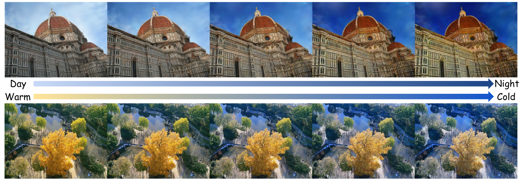
The image is a technical comparative diagram demonstrating the visual effects of two different color grading or white balance adjustments across two distinct scenes. It consists of two horizontal rows, each containing five sequential images. The top row shows a progression from "Day" to "Night," while the bottom row shows a progression from "Warm" to "Cold." The diagram visually explains how color temperature and lighting affect the mood and appearance of a photograph.
### Components/Axes
* **Layout:** Two horizontal rows of five images each.
* **Labels & Legends:**
* **Top Row:** A horizontal arrow spans the width of the row. The left end is labeled **"Day"** and the right end is labeled **"Night"**. The arrow itself has a gradient fill, transitioning from a light blue/white on the left to a dark blue on the right.
* **Bottom Row:** A similar horizontal arrow spans the row. The left end is labeled **"Warm"** and the right end is labeled **"Cold"**. The arrow has a gradient fill, transitioning from a pale yellow/cream on the left to a medium blue on the right.
* **Image Content:**
* **Top Row Subject:** The Florence Cathedral (Santa Maria del Fiore), focusing on Brunelleschi's dome and the ornate facade.
* **Bottom Row Subject:** An aerial view of a park or garden with a prominent tree displaying autumn foliage (yellow/orange leaves), a pond, pathways, and surrounding green trees.
### Detailed Analysis
**Top Row (Day to Night Progression):**
* **Image 1 (Far Left - "Day"):** The scene is brightly lit. The sky is a pale, slightly hazy blue. The building's stone appears in its natural, warm beige and white tones. Shadows are soft.
* **Image 2:** The sky becomes a slightly deeper blue. The overall scene contrast increases subtly.
* **Image 3:** The sky is a clear, medium blue. The building's facade shows more defined shadows and highlights, suggesting a lower sun angle.
* **Image 4:** The sky transitions to a deep, rich blue. The building's stone takes on a cooler, slightly bluish cast. Artificial lights may be beginning to illuminate the facade, creating warmer spots against the cool ambient light.
* **Image 5 (Far Right - "Night"):** The sky is a very dark, deep blue, almost navy. The building is dramatically lit, likely by artificial floodlights, making the warm stone glow against the cold, dark sky. The contrast is highest here.
**Bottom Row (Warm to Cold Progression):**
* **Image 1 (Far Left - "Warm"):** The entire scene has a strong yellow/golden color cast. The autumn tree is a vibrant, saturated yellow-orange. The greens of other trees and the water in the pond appear warm and slightly yellowish.
* **Image 2:** The yellow cast is reduced. The autumn tree remains a strong yellow, but other elements begin to show more neutral or slightly cooler greens.
* **Image 3:** The color balance appears closest to neutral or "natural." The autumn tree is a clear yellow, the other trees are a standard green, and the water reflects a more neutral sky.
* **Image 4:** A cool, blueish tint becomes apparent. The yellow of the autumn tree is muted, leaning towards a pale yellow or chartreuse. The greens of other trees take on a bluish-green hue.
* **Image 5 (Far Right - "Cold"):** The scene has a strong blue color cast. The autumn tree appears as a pale, desaturated yellow-white. All greens are distinctly blue-green. The overall mood is cool and wintry.
### Key Observations
1. **Consistent Progression:** Both rows demonstrate a smooth, linear transition across five steps from one extreme (Day/Warm) to the opposite extreme (Night/Cold).
2. **Subject Interaction:** The effect of the color shift is highly dependent on the subject matter. The architectural scene (top) primarily shows changes in ambient light and sky color, while the natural scene (bottom) shows dramatic shifts in the perceived color of foliage and water.
3. **Color vs. Luminance:** The "Day to Night" progression involves changes in both **color temperature** (warmer to cooler) and **luminance** (bright to dark). The "Warm to Cold" progression primarily involves a shift in **color temperature/hue** (yellow to blue) with less dramatic change in overall brightness.
4. **Legend Alignment:** The gradient arrows serve as direct legends. The visual change in the images perfectly aligns with the gradient in the corresponding arrow (e.g., the "Night" images have the same deep blue tone as the right end of the top arrow).
### Interpretation
This diagram is a practical tool for photographers, colorists, or digital artists. It visually deconstructs two fundamental concepts in image processing:
1. **Time of Day Simulation:** The top row illustrates how to grade a daytime shot to appear as if it were taken at dusk or night. This involves not just darkening the image but crucially shifting the color balance towards blue (simulating cooler ambient skylight) while often adding warm, localized highlights (simulating artificial lights). The progression shows the intermediate steps, which are useful for creating believable time-lapse effects or adjusting the mood of a scene.
2. **Color Grading Presets:** The bottom row demonstrates the application of a "color temperature" or "white balance" slider. Moving from "Warm" to "Cold" applies an increasingly strong blue color filter. This is a common technique to evoke different emotions: warmth (yellow) suggests comfort, nostalgia, or golden hour; coolness (blue) suggests sterility, sadness, or winter. The diagram shows how this global adjustment affects different colors in a scene, notably desaturating warm tones (the yellow tree) as the cool cast intensifies.
**Underlying Principle:** The diagram emphasizes that color is not an absolute property in photography but a malleable element that defines time, atmosphere, and emotion. The side-by-side comparison of an urban and a natural scene highlights that the same color grading technique will produce visually distinct results depending on the existing colors within the frame.