\n
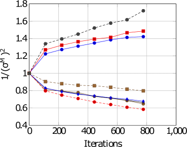
## Line Chart: Convergence of 1/(σM)^2 vs. Iterations
### Overview
The image presents a line chart illustrating the relationship between 1/(σM)^2 (likely representing inverse variance) and the number of iterations. Four distinct data series are plotted, each represented by a different line style and color. The chart appears to demonstrate the convergence behavior of a model or algorithm as the number of iterations increases.
### Components/Axes
* **X-axis:** "Iterations", ranging from 0 to 1000, with gridlines at 100-iteration intervals.
* **Y-axis:** "1/(σM)^2", ranging from 0.4 to 1.8, with gridlines at 0.2 intervals.
* **Data Series:** Four lines are present, distinguished by color and marker style.
* **Red Line with Circle Markers:** Appears to represent a relatively fast convergence, initially decreasing and then increasing.
* **Blue Line with Circle Markers:** Shows a slower initial decrease, followed by a more gradual increase.
* **Gray Line with Circle Markers:** Exhibits a consistent upward trend.
* **Brown Line with Square Markers:** Shows a relatively stable value, with a slight downward trend.
* **Legend:** There is no explicit legend present in the image.
### Detailed Analysis
Let's analyze each line's behavior and approximate data points.
* **Red Line (Circles):** This line starts at approximately 1.0 at 0 iterations. It decreases to a minimum of around 0.65 at approximately 600 iterations, then increases to approximately 1.5 at 1000 iterations.
* **Blue Line (Circles):** This line begins at approximately 1.25 at 0 iterations. It decreases to a minimum of around 0.75 at approximately 400 iterations, then increases to approximately 1.45 at 1000 iterations.
* **Gray Line (Circles):** This line starts at approximately 1.4 at 0 iterations and consistently increases to approximately 1.7 at 1000 iterations.
* **Brown Line (Squares):** This line begins at approximately 0.9 at 0 iterations and decreases slightly to approximately 0.78 at 1000 iterations.
### Key Observations
* The red and blue lines both exhibit a U-shaped curve, suggesting an initial decrease in variance followed by an increase. This could indicate an initial period of learning followed by overfitting or instability.
* The gray line shows a consistent increase in 1/(σM)^2, suggesting a continuous increase in the model's confidence or a divergence in the solution.
* The brown line remains relatively stable, indicating a consistent level of variance throughout the iterations.
* All lines converge towards different values as the number of iterations increases.
### Interpretation
The chart likely represents the convergence of a model's parameters during an iterative optimization process. The y-axis, 1/(σM)^2, is a measure of the precision or confidence in the model's parameters. A higher value indicates greater confidence.
The different lines likely represent different model configurations, optimization algorithms, or datasets. The U-shaped curves of the red and blue lines suggest that the models initially improve (variance decreases) but then start to overfit or become unstable (variance increases) as the number of iterations increases. The gray line's continuous increase suggests that the corresponding model is diverging or becoming less reliable. The brown line's stability suggests a more robust or well-regularized model.
The absence of a legend makes it difficult to definitively interpret the meaning of each line. However, the overall trend suggests that the optimization process is not always straightforward and that careful monitoring of the model's variance is crucial to prevent overfitting or divergence. The chart highlights the importance of choosing appropriate optimization algorithms and regularization techniques to ensure stable and reliable model convergence.